Implementing a block widget
In this tutorial, you will learn how to implement a more complex CKEditor 5 plugin.
You will build a “Simple box” feature, which will allow the user to insert a custom box with a title and body fields into the document. You will utilize the widget utilities and work with the model-view conversion to program the behavior of this feature properly. Later, you will create a UI that inserts new simple boxes into the document using the toolbar button.
If you want to see the final product of this tutorial before you plunge in, check out the demo.
If you want to use this tutorial with CDN, follow the steps in the Adapt this tutorial to CDN section.
This tutorial will reference various parts of the CKEditor 5 architecture section as you go. While reading them is not necessary to finish this tutorial, it is recommended to read these guides at some point to get a better understanding of the mechanisms used in this tutorial.
If you want to use your own event handler for events triggered by your widget, you must wrap it with a container that has a data-cke-ignore-events attribute to exclude it from the editor’s default handlers. Refer to Exclude DOM events from default handlers for more details.
The easiest way to get started is to grab the starter project using the commands below.
npx -y degit ckeditor/ckeditor5-tutorials-examples/block-widget/starter-files block-widget
cd block-widget

npm install
npm run dev
It will create a new directory called block-widget with the necessary files. The npm install command will install all dependencies, and npm run dev will start the development server.
The editor with some basic plugins is created in the main.js file.
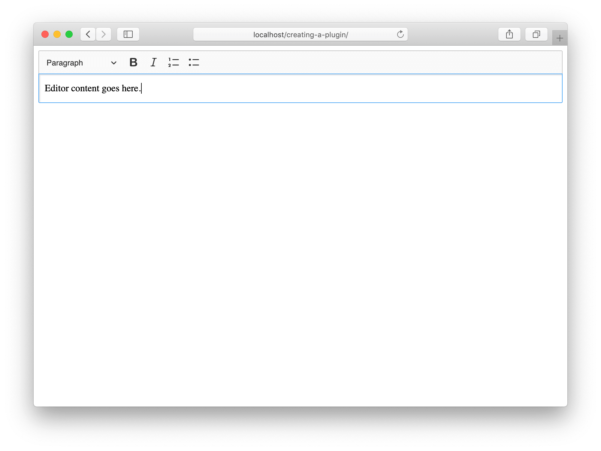
Open the URL displayed in your terminal. If everything went well, you should see a CKEditor 5 instance in your browser like this:
Once the editor is up and running, you can start implementing the plugin. You can keep the entire plugin code in a single file; however, it is recommended to split its “editing” and “UI” layers and create a master plugin that loads both. This way, you ensure better separation of concerns and allow for recomposing the features (for example, picking the editing part of an existing feature but writing your own UI for it). All official CKEditor 5 plugins follow this pattern.
Additionally, you will split the code of commands, buttons, and other “self-contained” components into separate files, too. In order not to mix up these files with your project’s main.js file, create this directory structure:
├── main.js
├── index.html
├── node_modules
├── package.json
├── simplebox
│   ├── simplebox.js
│   ├── simpleboxediting.js
│   └── simpleboxui.js
└─ ...
Now define the three plugins.
First, the master (glue) plugin. Its role is to simply load the “editing” and “UI” parts.
// simplebox/simplebox.js

import SimpleBoxEditing from './simpleboxediting';
import SimpleBoxUI from './simpleboxui';
import { Plugin } from 'ckeditor5';

export default class SimpleBox extends Plugin {
    static get requires() {
        return [ SimpleBoxEditing, SimpleBoxUI ];
    }
}
Now, the remaining two plugins:
// simplebox/simpleboxui.js

import { Plugin } from 'ckeditor5';

export default class SimpleBoxUI extends Plugin {
    init() {
        console.log( 'SimpleBoxUI#init() got called' );
    }
}
// simplebox/simpleboxediting.js

import { Plugin } from 'ckeditor5';

export default class SimpleBoxEditing extends Plugin {
    init() {
        console.log( 'SimpleBoxEditing#init() got called' );
    }
}
Finally, you need to load the SimpleBox plugin in your main.js file:
// main.js

import SimpleBox from './simplebox/simplebox';                                 // ADDED

ClassicEditor
    .create( {
        attachTo: document.querySelector( '#editor' ),
        licenseKey: 'GPL', // Or '<YOUR_LICENSE_KEY>'.
        plugins: [
            Essentials, Paragraph, Heading, List, Bold, Italic,
            SimpleBox                                                          // ADDED
        ],
        toolbar: [ 'heading', 'bold', 'italic', 'numberedList', 'bulletedList' ]
    } );
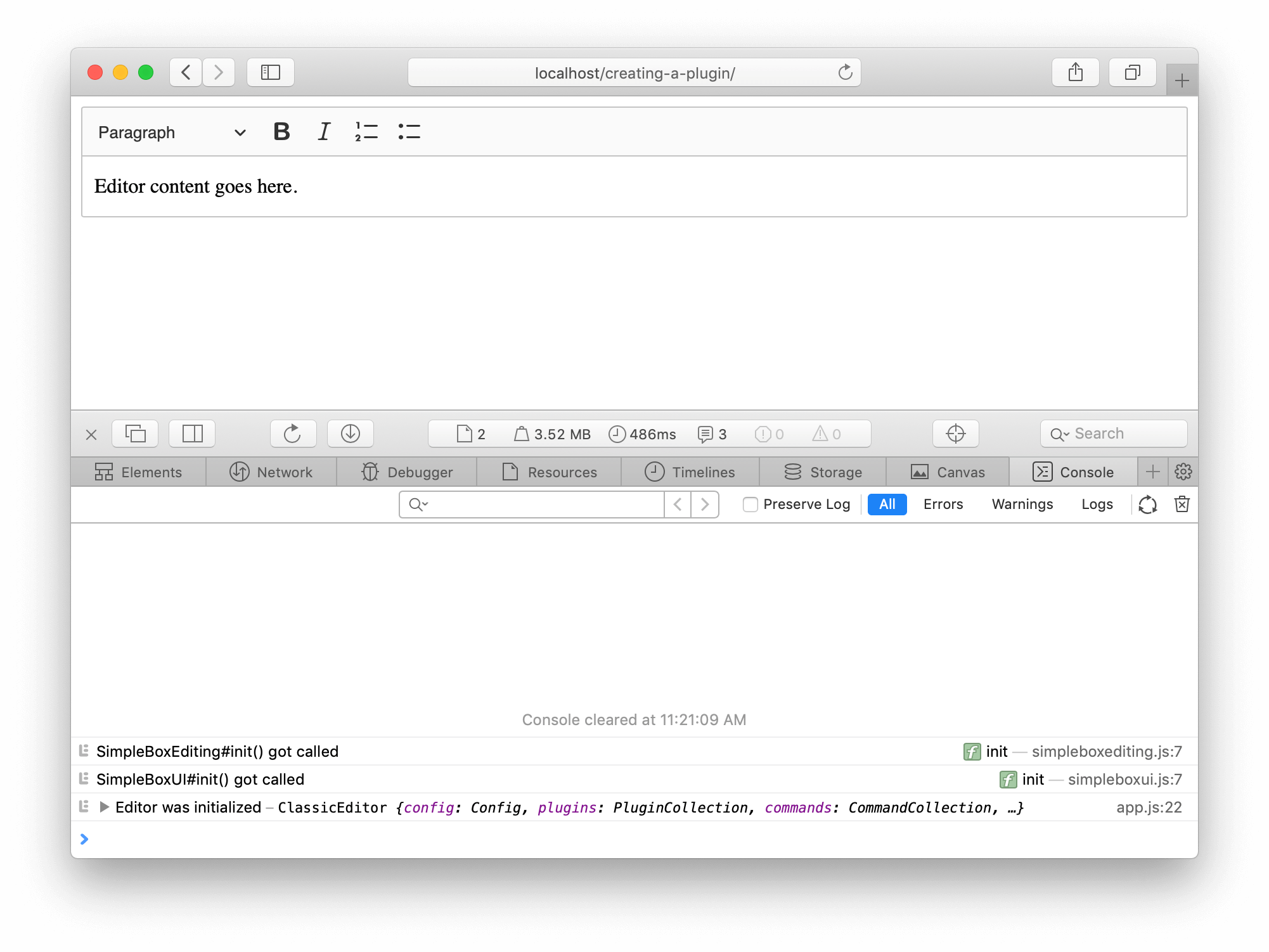
Your page will refresh, and you should see that the editor loaded the SimpleBoxEditing and SimpleBoxUI plugins:
CKEditor 5 implements an MVC architecture and its custom data model, while still being a tree structure, does not map to the DOM 1:1. You can think about the model as an even more semantic representation of the editor content, while the DOM is one of its possible representations.
Read more about the editing engine architecture.
Since your simple box feature is meant to be a box with a title and description fields, define its model representation like this:
<simpleBox>
    <simpleBoxTitle></simpleBoxTitle>
    <simpleBoxDescription></simpleBoxDescription>
</simpleBox>
You need to start by defining the model’s schema. You need to describe three elements and their types, as well as the allowed parent and children.
Read more about the schema.
Update the SimpleBoxEditing plugin with this definition.
// simplebox/simpleboxediting.js

import { Plugin } from 'ckeditor5';

export default class SimpleBoxEditing extends Plugin {
    init() {
        console.log( 'SimpleBoxEditing#init() got called' );

        this._defineSchema();                                                  // ADDED
    }

    _defineSchema() {                                                          // ADDED
        const schema = this.editor.model.schema;

        schema.register( 'simpleBox', {
            // Behaves like a self-contained block object (e.g. a block image)
            // allowed in places where other blocks are allowed (e.g. directly in the root).
            inheritAllFrom: '$blockObject'
        } );

        schema.register( 'simpleBoxTitle', {
            // Cannot be split or left by the caret.
            isLimit: true,

            allowIn: 'simpleBox',

            // Allow content which is allowed in blocks (i.e. text with attributes).
            allowContentOf: '$block'
        } );

        schema.register( 'simpleBoxDescription', {
            // Cannot be split or left by the caret.
            isLimit: true,

            allowIn: 'simpleBox',

            // Allow content which is allowed in the root (e.g. paragraphs).
            allowContentOf: '$root'
        } );
    }
}
Defining the schema will not affect the editor, yet. It is the information used by plugins and the editor engine to understand how actions such as pressing the Enter key, clicking an element, typing text, inserting an image, etc., should behave.
For the simple box plugin to start doing anything, you need to define model-view converters. Do that now!
Converters inform the editor how to convert the view to the model (for example, when loading data to the editor or handling pasted content) and how to render the model to the view (for editing purposes, or when retrieving the editor data).
Read more about the conversion in the editor.
It is the moment when you need to think about how you want to render the <simpleBox> element and its children to the DOM (what the user will see) and to the data. CKEditor 5 allows converting the model to a different structure for editing purposes and a different one to be stored as “data” or exchanged with other applications when copying and pasting the content. However, for simplicity, use the identical representation in both pipelines for now.
The structure in the view that you want to achieve:
<section class="simple-box">
    <h1 class="simple-box-title"></h1>
    <div class="simple-box-description"></div>
</section>
Use the conversion.elementToElement() method to define all the converters.
You need to define converters for three model elements. Update the SimpleBoxEditing plugin with this code:
// simplebox/simpleboxediting.js

import { Plugin } from 'ckeditor5';

export default class SimpleBoxEditing extends Plugin {
    init() {
        console.log( 'SimpleBoxEditing#init() got called' );

        this._defineSchema();
        this._defineConverters();                                              // ADDED
    }

    _defineSchema() {
        // Previously registered schema.
        // ...
    }

    _defineConverters() {                                                      // ADDED
        const conversion = this.editor.conversion;

        conversion.elementToElement( {
            model: 'simpleBox',
            view: {
                name: 'section',
                classes: 'simple-box'
            }
        } );

        conversion.elementToElement( {
            model: 'simpleBoxTitle',
            view: {
                name: 'h1',
                classes: 'simple-box-title'
            }
        } );

        conversion.elementToElement( {
            model: 'simpleBoxDescription',
            view: {
                name: 'div',
                classes: 'simple-box-description'
            }
        } );
    }
}
Once you have the converters, you can try to see the simple box in action. You have not defined a way to insert a new simple box into the document yet, so load it via the editor data. To do that, you need to modify the index.html file:
<!DOCTYPE html>
<html lang="en">
    <head>
        <meta charset="utf-8">
        <title>CKEditor 5 Framework – Implementing a simple widget</title>

        <style>
            .simple-box {
                padding: 10px;
                margin: 1em 0;

                background: rgba( 0, 0, 0, 0.1 );
                border: solid 1px hsl(0, 0%, 77%);
                border-radius: 2px;
            }

            .simple-box-title, .simple-box-description {
                padding: 10px;
                margin: 0;

                background: #FFF;
                border: solid 1px hsl(0, 0%, 77%);
            }

            .simple-box-title {
                margin-bottom: 10px;
            }
        </style>
    </head>
    <body>
        <div id="editor">
            <p>This is a simple box:</p>

            <section class="simple-box">
                <h1 class="simple-box-title">Box title</h1>
                <div class="simple-box-description">
                    <p>The description goes here.</p>
                    <ul>
                        <li>It can contain lists,</li>
                        <li>and other block elements like headings.</li>
                    </ul>
                </div>
            </section>
        </div>

        <script type="module" src="./main.js"></script>
    </body>
</html>
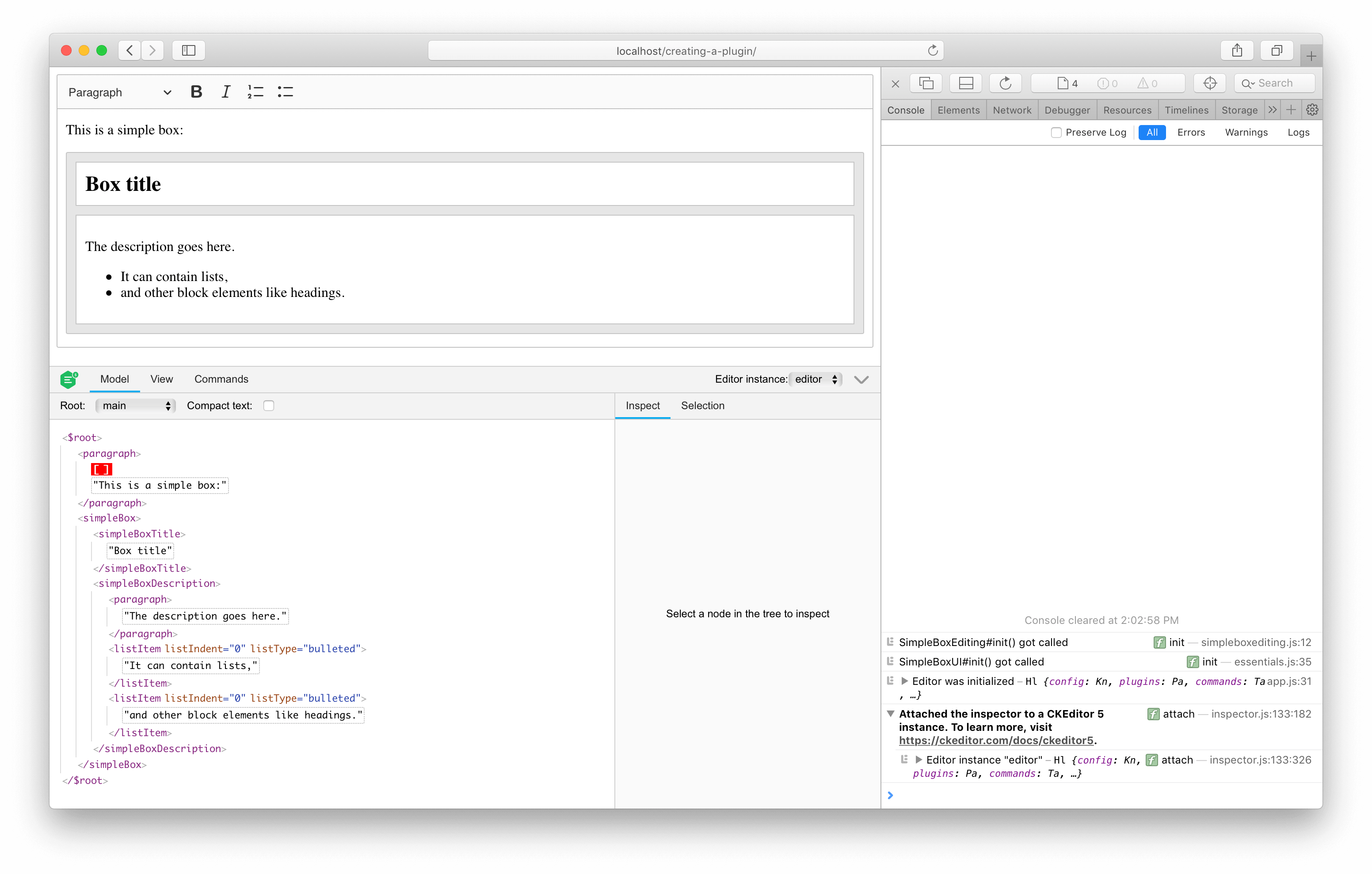
Voilà – this is your first simple box instance:
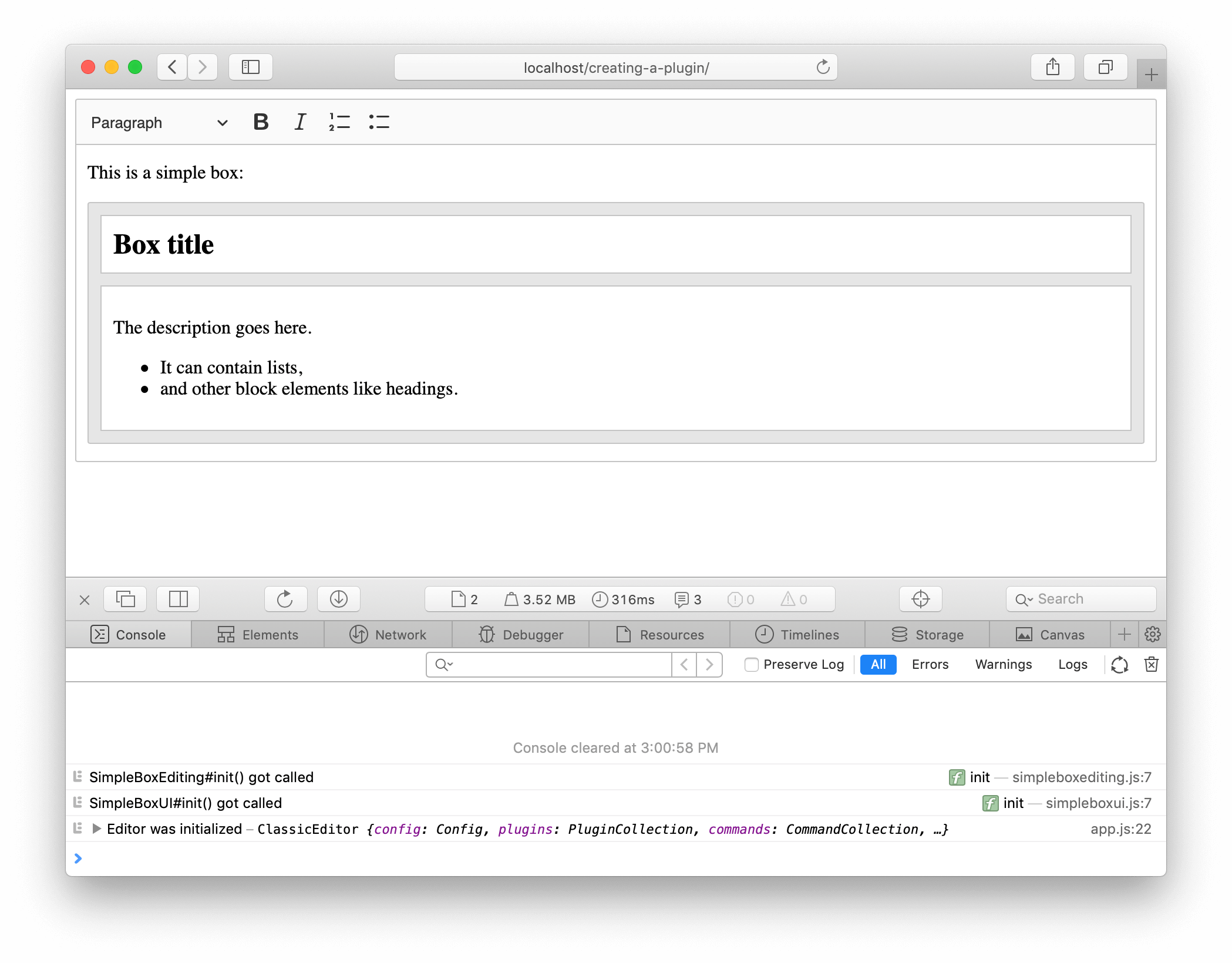
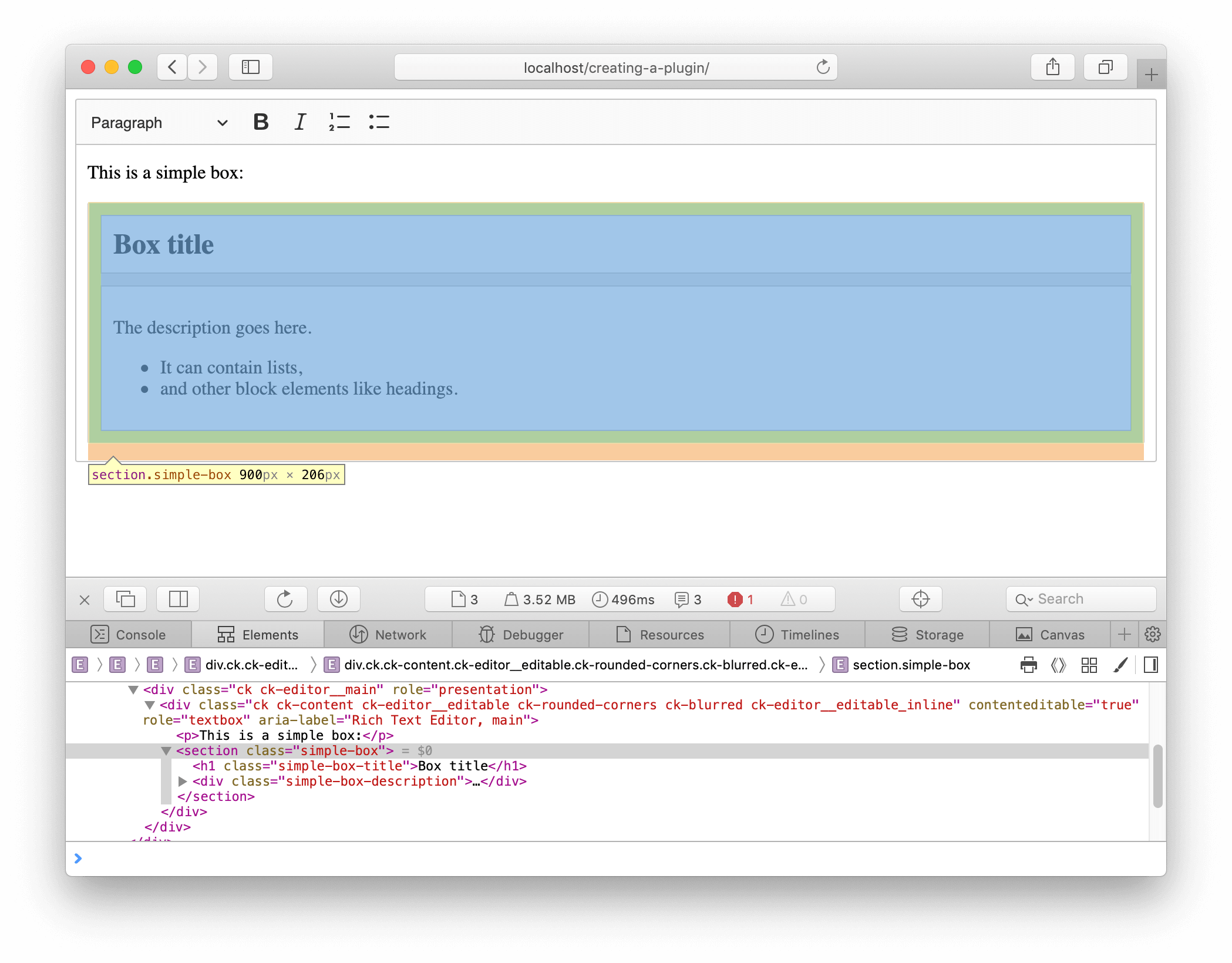
The HTML that you added to the index.html file is your editor’s data. It is what editor.getData() would return. Also, for now, this is also the DOM structure that the CKEditor 5 engine renders in the editable region:
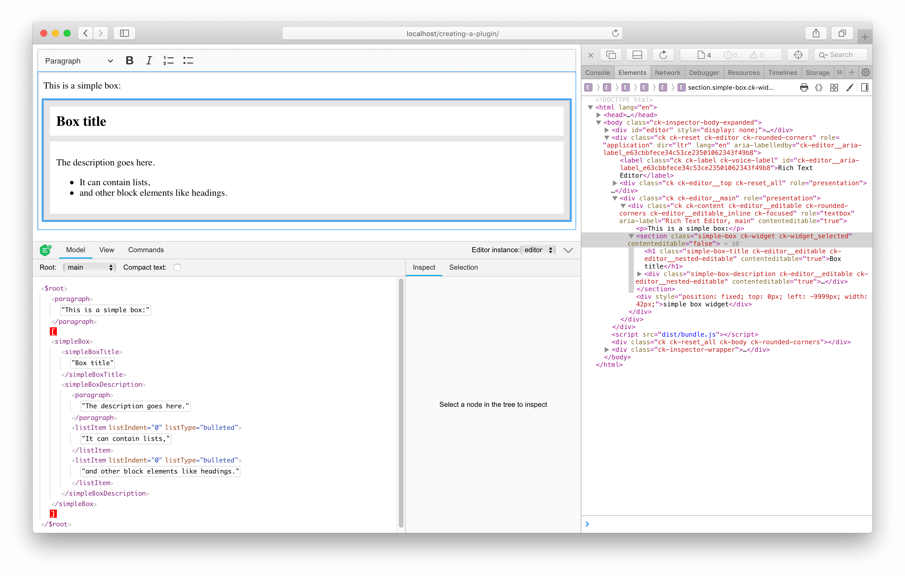
However, what’s in the model? To learn that, use the official CKEditor 5 inspector. Once installed, you need to load it in the main.js file:
// main.js

import SimpleBox from './simplebox/simplebox';

import CKEditorInspector from '@ckeditor/ckeditor5-inspector';                 // ADDED

ClassicEditor
    .create( {
        attachTo: document.querySelector( '#editor' ),
        licenseKey: 'GPL', // Or '<YOUR_LICENSE_KEY>'.
        plugins: [
            Essentials, Paragraph, Heading, List, Bold, Italic,
            SimpleBox
        ],
        toolbar: [ 'heading', 'bold', 'italic', 'numberedList', 'bulletedList' ]
    } )
    .then( editor => {
        console.log( 'Editor was initialized', editor );

        CKEditorInspector.attach( { 'editor': editor } );

        window.editor = editor;
    } );
After refreshing the page, you will see the inspector:
You will see the following HTML-like string:
<paragraph>[]This is a simple box:</paragraph>
<simpleBox>
    <simpleBoxTitle>Box title</simpleBoxTitle>
    <simpleBoxDescription>
        <paragraph>The description goes here.</paragraph>
        <listItem listIndent="0" listType="bulleted">It can contain lists,</listItem>
        <listItem listIndent="0" listType="bulleted">and other block elements like headings.</listItem>
    </simpleBoxDescription>
</simpleBox>
As you can see, this structure is quite different than the HTML input/output. If you look closely, you will also notice the [] characters in the first paragraph – this is the selection position.
Play with the editor features a bit (bold, italic, headings, lists, selection) to see the changes in the model structure.
You can also use some useful helpers like getData() and setData() to learn more about the state of the editor model or write assertions in tests.
It is time to check if the simple box behaves like you would like it to. You can observe the following:
- You can type text in the title. Pressing Enter will not split it, and Backspace will not delete it entirely. It is because it was marked as an
isLimitelement in the schema. - You cannot apply a list in the title and cannot turn it into a heading (other than
<h1 class="simple-box-title">, which it is already). It is because it allows only the content that is allowed in other block elements (like paragraphs). You can, however, apply italic inside the title (because italic is permitted in different blocks). - The description behaves similarly to the title, but it allows more content inside – lists and other headings.
- If you try to select the entire simple box instance and press Delete, it will be deleted as a whole. The same when you copy and paste it. It is because it was marked as an
isObjectelement in the schema. - You cannot easily select the entire simple box instance by clicking it. Also, the cursor pointer does not change when you hover it. In other words, it seems a bit unresponsive. The reason is that you have not yet defined the view behavior.
Pretty cool so far, right? With little code, you were able to define the behavior of your simple box plugin, which maintains the integrity of these elements. The engine ensures that the user does not break these instances.
See what else you can improve.
In CKEditor 5 the widget system is mostly handled by the engine. Some of it is contained withing the (@ckeditor/ckeditor5-widget) package and some have to be handled by other utilities provided by CKEditor 5 Framework.
CKEditor 5 implementation is, therefore, open for extensions and recomposition. You can choose the behaviors that you want (just like you did so far in this tutorial by defining a schema) and skip others, or implement them by yourself.
The converters that you defined convert the model <simpleBox*> elements to plain ContainerElements in the view (and back during upcasting).
You want to change this behavior a bit so the structure created in the editing view is enhanced with the toWidget() and toWidgetEditable() utilities. You do not want to affect the data view, though. Therefore, you will need to define converters for the editing and data downcasting separately.
If you find the concept of downcasting and upcasting confusing, read the introduction to conversion.
Now it is time to revisit the _defineConverters() method that you defined earlier. You will use the elementToElement() upcast helper and the elementToElement() downcast helper instead of the two-way elementToElement() converter helper.
Additionally, ensure that the Widget plugin is loaded. If you omit it, the elements in the view will have all the classes (like ck-widget), but there will be no “behaviors” loaded (for example, clicking a widget will not select it).
// simplebox/simpleboxediting.js

// ADDED 2 imports.
import { Plugin, Widget, toWidget, toWidgetEditable } from 'ckeditor5';

export default class SimpleBoxEditing extends Plugin {
    static get requires() {                                                    // ADDED
        return [ Widget ];
    }

    init() {
        console.log( 'SimpleBoxEditing#init() got called' );

        this._defineSchema();
        this._defineConverters();
    }

    _defineSchema() {
        // Previously registered schema.
        // ...
    }

    _defineConverters() {                                                      // MODIFIED
        const conversion = this.editor.conversion;

        // <simpleBox> converters.
        conversion.for( 'upcast' ).elementToElement( {
            model: 'simpleBox',
            view: {
                name: 'section',
                classes: 'simple-box'
            }
        } );
        conversion.for( 'dataDowncast' ).elementToElement( {
            model: 'simpleBox',
            view: {
                name: 'section',
                classes: 'simple-box'
            }
        } );
        conversion.for( 'editingDowncast' ).elementToElement( {
            model: 'simpleBox',
            view: ( modelElement, { writer: viewWriter } ) => {
                const section = viewWriter.createContainerElement( 'section', { class: 'simple-box' } );

                return toWidget( section, viewWriter, { label: 'simple box widget' } );
            }
        } );

        // <simpleBoxTitle> converters.
        conversion.for( 'upcast' ).elementToElement( {
            model: 'simpleBoxTitle',
            view: {
                name: 'h1',
                classes: 'simple-box-title'
            }
        } );
        conversion.for( 'dataDowncast' ).elementToElement( {
            model: 'simpleBoxTitle',
            view: {
                name: 'h1',
                classes: 'simple-box-title'
            }
        } );
        conversion.for( 'editingDowncast' ).elementToElement( {
            model: 'simpleBoxTitle',
            view: ( modelElement, { writer: viewWriter } ) => {
                // Note: You use a more specialized createEditableElement() method here.
                const h1 = viewWriter.createEditableElement( 'h1', { class: 'simple-box-title' } );

                return toWidgetEditable( h1, viewWriter );
            }
        } );

        // <simpleBoxDescription> converters.
        conversion.for( 'upcast' ).elementToElement( {
            model: 'simpleBoxDescription',
            view: {
                name: 'div',
                classes: 'simple-box-description'
            }
        } );
        conversion.for( 'dataDowncast' ).elementToElement( {
            model: 'simpleBoxDescription',
            view: {
                name: 'div',
                classes: 'simple-box-description'
            }
        } );
        conversion.for( 'editingDowncast' ).elementToElement( {
            model: 'simpleBoxDescription',
            view: ( modelElement, { writer: viewWriter } ) => {
                // Note: You use a more specialized createEditableElement() method here.
                const div = viewWriter.createEditableElement( 'div', { class: 'simple-box-description' } );

                return toWidgetEditable( div, viewWriter );
            }
        } );
    }
}
Now, you should see how your simple box plugin has changed.
You should observe that:
- The
<section>,<h1>, and<div>elements have thecontentEditableattribute on them (plus some classes). This attribute tells the browser whether an element is considered editable. Passing the element throughtoWidget()will make its content non-editable. Conversely, passing it throughtoWidgetEditable()will make its content editable again. - You can now click the widget (the gray area) to select it. Once the widget is selected, it is easier to copy and paste.
- The widget and its nested editable regions react to hovering, selection, and focus (outline).
In other words, the simple box instance became much more responsive.
Additionally, if you call editor.getData(), you will get the same HTML as before the simple box became a widget. It is thanks to using toWidget() and toNestedEditable() only in the editingDowncast pipeline.
This is all you need from the model and the view layers for now. In terms of being editable and data input/output, it is fully functional. Now find a way to insert new simple boxes into the document!
A command is a combination of an action and a state. You can interact with most of the editor features by the commands they expose. This allows not only for executing these features (like making a fragment of text bold) but also checking if this action can be executed in the selection’s current location as well as observing other state properties (such as whether the currently selected text was made bold).
For a simple box, the situation is simple:
- You need an “insert a new simple box” action.
- You need a “can you insert a new simple box here (at the current selection position)” check.
Create a new file insertsimpleboxcommand.js in the simplebox/ directory. You will use the model.insertObject() method, which will be able to, for example, split a paragraph if you try to insert a simple box in the middle of it (which is not allowed by the schema).
// simplebox/insertsimpleboxcommand.js

import { Command } from 'ckeditor5';

export default class InsertSimpleBoxCommand extends Command {
    execute() {
        this.editor.model.change( writer => {
            // Insert <simpleBox>*</simpleBox> at the current selection position
            // in a way that will result in creating a valid model structure.
            this.editor.model.insertObject( createSimpleBox( writer ) );
        } );
    }

    refresh() {
        const model = this.editor.model;
        const selection = model.document.selection;
        const allowedIn = model.schema.findAllowedParent( selection.getFirstPosition(), 'simpleBox' );

        this.isEnabled = allowedIn !== null;
    }
}

function createSimpleBox( writer ) {
    const simpleBox = writer.createElement( 'simpleBox' );
    const simpleBoxTitle = writer.createElement( 'simpleBoxTitle' );
    const simpleBoxDescription = writer.createElement( 'simpleBoxDescription' );

    writer.append( simpleBoxTitle, simpleBox );
    writer.append( simpleBoxDescription, simpleBox );

    // There must be at least one paragraph for the description to be editable.
    // See https://github.com/ckeditor/ckeditor5/issues/1464.
    writer.appendElement( 'paragraph', simpleBoxDescription );

    return simpleBox;
}
Import the command and register it in the SimpleBoxEditing plugin:
// simplebox/simpleboxediting.js

import { Plugin, Widget, toWidget, toWidgetEditable } from 'ckeditor5';

import InsertSimpleBoxCommand from './insertsimpleboxcommand';                 // ADDED

export default class SimpleBoxEditing extends Plugin {
    static get requires() {
        return [ Widget ];
    }

    init() {
        console.log( 'SimpleBoxEditing#init() got called' );

        this._defineSchema();
        this._defineConverters();

        // ADDED
        this.editor.commands.add( 'insertSimpleBox', new InsertSimpleBoxCommand( this.editor ) );
    }

    _defineSchema() {
        // Previously registered schema.
        // ...
    }

    _defineConverters() {
        // Previously defined converters.
        // ...
    }
}
You can now execute this command to insert a new simple box. Call:
editor.execute( 'insertSimpleBox' );
It should result in:
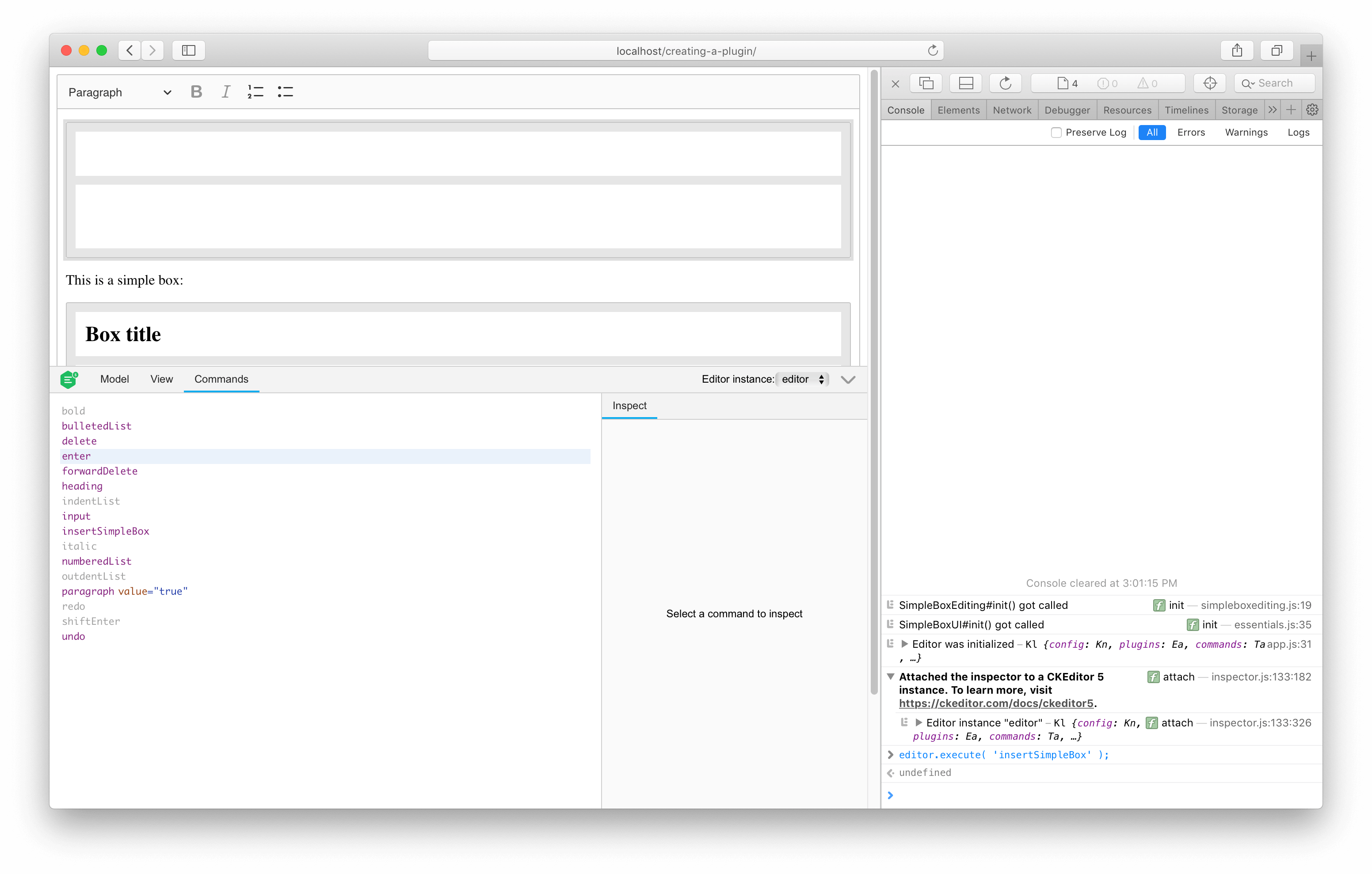
You can also try inspecting the isEnabled property value (or just checking it in the CKEditor 5 inspector):
console.log( editor.commands.get( 'insertSimpleBox' ).isEnabled );
It is always true except when the selection is in one place, in another simple box’s title. You can also observe that executing the command when the selection is in that place takes no effect.
Change one more thing before you move forward – disallow simpleBox inside simpleBoxDescription, too. This can be done by defining a custom child check:
// simplebox/simpleboxediting.js

// Previously imported packages.
// ...

export default class SimpleBoxEditing extends Plugin {
    static get requires() {
        return [ Widget ];
    }

    init() {
        console.log( 'SimpleBoxEditing#init() got called' );

        this._defineSchema();
        this._defineConverters();

        this.editor.commands.add( 'insertSimpleBox', new InsertSimpleBoxCommand( this.editor ) );
    }

    _defineSchema() {
        const schema = this.editor.model.schema;

        schema.register( 'simpleBox', {
            // Behaves like a self-contained block object (e.g. a block image)
            // allowed in places where other blocks are allowed (e.g. directly in the root).
            inheritAllFrom: '$blockObject'
        } );

        schema.register( 'simpleBoxTitle', {
            // Cannot be split or left by the caret.
            isLimit: true,

            allowIn: 'simpleBox',

            // Allow content which is allowed in blocks (i.e. text with attributes).
            allowContentOf: '$block'
        } );

        schema.register( 'simpleBoxDescription', {
            // Cannot be split or left by the caret.
            isLimit: true,

            allowIn: 'simpleBox',

            // Allow content which is allowed in the root (e.g. paragraphs).
            allowContentOf: '$root'
        } );

        // ADDED
        schema.addChildCheck( ( context, childDefinition ) => {
            if ( context.endsWith( 'simpleBoxDescription' ) && childDefinition.name == 'simpleBox' ) {
                return false;
            }
        } );
    }

    _defineConverters() {
        // Previously defined converters.
        // ...
    }
}
Now the command should also be disabled when the selection is inside the description of another simple box instance.
It is time to allow the editor users to insert the widget into the content. The best way to do that is through a UI button in the toolbar. You can quickly create one using the ButtonView class brought by the UI framework of CKEditor 5.
The button should execute the command when clicked and become inactive if the widget cannot be inserted into some particular position of the selection (as defined in the schema).
See what it looks like in practice and extend the SimpleBoxUI plugin created earlier:
// simplebox/simpleboxui.js

import { ButtonView, Plugin } from 'ckeditor5';

export default class SimpleBoxUI extends Plugin {
    init() {
        console.log( 'SimpleBoxUI#init() got called' );

        const editor = this.editor;
        const t = editor.t;

        // The "simpleBox" button must be registered among the UI components of the editor
        // to be displayed in the toolbar.
        editor.ui.componentFactory.add( 'simpleBox', locale => {
            // The state of the button will be bound to the widget command.
            const command = editor.commands.get( 'insertSimpleBox' );

            // The button will be an instance of ButtonView.
            const buttonView = new ButtonView( locale );

            buttonView.set( {
                // The t() function helps localize the editor. All strings enclosed in t() can be
                // translated and change when the language of the editor changes.
                label: t( 'Simple Box' ),
                withText: true,
                tooltip: true
            } );

            // Bind the state of the button to the command.
            buttonView.bind( 'isOn', 'isEnabled' ).to( command, 'value', 'isEnabled' );

            // Execute the command when the button is clicked (executed).
            this.listenTo( buttonView, 'execute', () => editor.execute( 'insertSimpleBox' ) );

            return buttonView;
        } );
    }
}
The last thing you need to do is tell the editor to display the button in the toolbar. To do that, you will need to slightly modify the code that runs the editor instance and include the button in the toolbar configuration:
ClassicEditor
    .create( {
        attachTo: document.querySelector( '#editor' ),
        licenseKey: 'GPL', // Or '<YOUR_LICENSE_KEY>'.
        plugins: [ Essentials, Paragraph, Heading, List, Bold, Italic, SimpleBox ],
        // Insert the "simpleBox" button into the editor toolbar.
        toolbar: [ 'heading', 'bold', 'italic', 'numberedList', 'bulletedList', 'simpleBox' ]
    } )
    .then( editor => {
        // This code runs after the editor initialization.
        // ...
    } )
    .catch( error => {
        // Error handling if something goes wrong during initialization.
        // ...
    } );
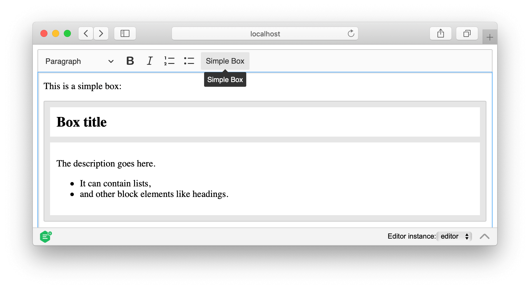
Refresh the web page and try it yourself:
So far, you have created a simple box widget with a button to insert it into the editor. But what if you want to add some controls to the widget itself? For example, you might want to allow users to toggle some widget properties without having to delete and recreate the widget.
In this section, you will add a contextual toolbar that appears when the simple box widget is selected. This toolbar will contain a toggle button to mark the box as “secret,” which will blur its content to hide sensitive information.
First, you need to extend the simple box schema to support a new secret attribute. This attribute will be a boolean value that determines whether the box content should be blurred.
Update the schema definition in the SimpleBoxEditing plugin:
// simplebox/simpleboxediting.js

// Previously imported packages.
// ...

export default class SimpleBoxEditing extends Plugin {
    static get requires() {
        return [ Widget ];
    }

    init() {
        console.log( 'SimpleBoxEditing#init() got called' );

        this._defineSchema();
        this._defineConverters();

        this.editor.commands.add( 'insertSimpleBox', new InsertSimpleBoxCommand( this.editor ) );
    }

    _defineSchema() {
        const schema = this.editor.model.schema;

        schema.register( 'simpleBox', {
            inheritAllFrom: '$blockObject',

            // Added: Allow the 'secret' boolean attribute on simpleBox elements.
            allowAttributes: [ 'secret' ]
        } );

        // schema.register( 'simpleBoxTitle', {
        // 	...
        // } );
        //
        // schema.register( 'simpleBoxDescription', {
        // 	...
        // } );
        //
        // schema.addChildCheck( ( context, childDefinition ) => {
        // 	...
        // } );
    }

    _defineConverters() {
        // Previously defined converters.
        // ...
    }
}
The allowAttributes property tells the schema that the simpleBox element can have a secret attribute.
Now you need to create a command that will toggle the secret attribute. Create a new file togglesimpleboxsecretcommand.js:
// simplebox/togglesimpleboxsecretcommand.js

import { Command } from 'ckeditor5';

export default class ToggleSimpleBoxSecretCommand extends Command {
    refresh() {
        const editor = this.editor;
        const element = getClosestSelectedSimpleBoxElement( editor.model.document.selection );

        // Enable the command only when a simple box is selected.
        this.isEnabled = !!element;

        // Set the command value to the current state of the 'secret' attribute.
        this.value = !!( element && element.getAttribute( 'secret' ) );
    }

    execute( options = {} ) {
        const editor = this.editor;
        const model = editor.model;
        const simpleBox = getClosestSelectedSimpleBoxElement( model.document.selection );

        // Toggle the current state if no value is provided.
        const newValue = options.value === undefined ? !this.value : options.value;

        if ( simpleBox ) {
            model.change( writer => {
                if ( newValue ) {
                    // Set the 'secret' attribute to true when enabling.
                    writer.setAttribute( 'secret', true, simpleBox );
                } else {
                    // Remove the attribute entirely when disabling.
                    writer.removeAttribute( 'secret', simpleBox );
                }
            } );
        }
    }
}

function getClosestSelectedSimpleBoxElement( selection ) {
    const selectedElement = selection.getSelectedElement();

    // First, check if the selection is directly on a simple box.
    if ( !!selectedElement && selectedElement.is( 'element', 'simpleBox' ) ) {
        return selectedElement;
    } else {
        // Otherwise, find the closest simple box ancestor.
        return selection.getFirstPosition().findAncestor( 'simpleBox' );
    }
}
The command checks if the selection is inside a simple box and enables itself accordingly. The value property reflects the current state of the secret attribute (either true or undefined).
The execute() method accepts an optional options parameter with a value property. If no value is provided, the command automatically toggles the current state (hence its name, a “toggle” command). You can also explicitly pass a value if needed, but for most use cases, calling editor.execute( 'toggleSimpleBoxSecret' ) without parameters is sufficient.
This follows the common CKEditor 5 pattern for boolean attributes: use true for enabled or remove the attribute entirely (resulting in undefined), rather than setting it to false. This is the same approach used by features like links and their decorators.
Register this command in the SimpleBoxEditing plugin:
// simplebox/simpleboxediting.js

import { Plugin, Widget, toWidget, toWidgetEditable } from 'ckeditor5';

import InsertSimpleBoxCommand from './insertsimpleboxcommand';
// Added: Import the new command.
import ToggleSimpleBoxSecretCommand from './togglesimpleboxsecretcommand';

export default class SimpleBoxEditing extends Plugin {
    static get requires() {
        return [ Widget ];
    }

    init() {
        console.log( 'SimpleBoxEditing#init() got called' );

        this._defineSchema();
        this._defineConverters();

        this.editor.commands.add( 'insertSimpleBox', new InsertSimpleBoxCommand( this.editor ) );

        // Added: Register the command to toggle the secret state.
        this.editor.commands.add( 'toggleSimpleBoxSecret', new ToggleSimpleBoxSecretCommand( this.editor ) );
    }


    _defineSchema() {
        // Previously registered schema.
        // ...
    }

    _defineConverters() {
        // Previously defined converters.
        // ...
    }
}
Next, you need to update the converters to handle the secret attribute. You need to convert it from the view to the model (upcast) and from the model to the view (downcast to both data and editing views).
Update the _defineConverters() method in the SimpleBoxEditing plugin:
// simplebox/simpleboxediting.js

// Previously imported packages.
// ...

export default class SimpleBoxEditing extends Plugin {
    static get requires() {
        return [ Widget ];
    }

    init() {
        console.log( 'SimpleBoxEditing#init() got called' );

        this._defineSchema();
        this._defineConverters();

        this.editor.commands.add( 'insertSimpleBox', new InsertSimpleBoxCommand( this.editor ) );
        this.editor.commands.add( 'toggleSimpleBoxSecret', new ToggleSimpleBoxSecretCommand( this.editor ) );
    }

    _defineSchema() {
        // Previously registered schema.
        // ...
    }

    _defineConverters() {

        // <simpleBox> converters
        // (no changes)

        // Changed: Set custom property for widget detection.
        conversion.for( 'editingDowncast' ).elementToElement( {
            model: 'simpleBox',
            view: ( modelElement, { writer: viewWriter } ) => {
                const section = viewWriter.createContainerElement( 'section', { class: 'simple-box' } );

                // Set custom property to later check the view element.
                viewWriter.setCustomProperty( 'simpleBox', true, section );

                return toWidget( section, viewWriter, { label: 'simple box widget' } );
            }
        } );

        // Added: Handle the 'secret' attribute conversion between model and view.
        conversion.attributeToAttribute( {
            model: 'secret',
            view: {
                name: 'section',
                key: 'class',
                value: 'secret'
            }
        } );

        // <simpleBoxTitle> converters
        // (no changes)
        // ...

        // <simpleBoxDescription> converters
        // (no changes)
        // ...
    }
}
The element converters remain unchanged. The new part is the attribute conversion using the two-way attributeToAttribute() helper.
This single converter handles both directions: it maps the secret CSS class from the view to the secret model attribute (upcast). It also converts the model’s secret attribute back to a CSS class in both editing and data views (downcast).
Note that you also added a custom property to the widget in the editing downcast converter using setCustomProperty(). This custom property serves as a marker to identify simple box widgets in the view layer. Without this property, you would need to rely solely on CSS classes or element structure, which is less reliable.
You do not need to update the createSimpleBox() function because new simple boxes should not have the secret attribute by default (it will be undefined).
Now you can create a button that will toggle the secret attribute. You will use the SwitchButtonView class, which is a button with an on/off state.
Update the SimpleBoxUI plugin:
// simplebox/simpleboxui.js

// Added: Import SwitchButtonView for the toggle button.
import { ButtonView, SwitchButtonView, Plugin } from 'ckeditor5';

export default class SimpleBoxUI extends Plugin {
    init() {
        console.log( 'SimpleBoxUI#init() got called' );

        const editor = this.editor;
        const t = editor.t;

        editor.ui.componentFactory.add( 'simpleBox', locale => {
            // ... existing simpleBox button code ...
        } );

        // Added: Register the "secretSimpleBox" switch button for toggling the secret state.
        editor.ui.componentFactory.add( 'secretSimpleBox', locale => {
            const command = editor.commands.get( 'toggleSimpleBoxSecret' );
            const switchButton = new SwitchButtonView( locale );

            switchButton.set( {
                label: t( 'Secret box' ),
                withText: true
            } );

            // Bind the switch's state to the command's value and enabled state.
            switchButton.bind( 'isOn', 'isEnabled' ).to( command, 'value', 'isEnabled' );

        // Execute the command when the switch is toggled.
        // The command will automatically toggle based on its current state.
        this.listenTo( switchButton, 'execute', () => {
            editor.execute( 'toggleSimpleBoxSecret' );
        } );

            return switchButton;
        } );
    }
}
The switch button is bound to the toggleSimpleBoxSecret command. When clicked, it executes the command without any parameters, and the command automatically toggles its state based on its current value.
Now you need to create a plugin that will register the widget toolbar using the WidgetToolbarRepository plugin. This plugin manages all widget toolbars in the editor and handles their positioning and visibility.
Create a new file simpleboxtoolbar.js:
// simplebox/simpleboxtoolbar.js

import { Plugin, WidgetToolbarRepository } from 'ckeditor5';

export default class SimpleBoxToolbar extends Plugin {
    static get requires() {
        return [ WidgetToolbarRepository ];
    }

    afterInit() {
        const editor = this.editor;
        const widgetToolbarRepository = editor.plugins.get( WidgetToolbarRepository );

        // Register a new toolbar for the simple box widget.
        widgetToolbarRepository.register( 'simpleBoxToolbar', {
            // Toolbar items come from the editor configuration.
            items: editor.config.get( 'simpleBox.toolbar' ),

            // Callback to determine which view element the toolbar should be attached to.
            getRelatedElement: getClosestSimpleBoxWidget
        } );
    }
}

function getClosestSimpleBoxWidget( selection ) {
    const selectionPosition = selection.getFirstPosition();

    if ( !selectionPosition ) {
        return null;
    }

    // Check if the selected element itself is a simple box widget.
    const viewElement = selection.getSelectedElement();

    if ( viewElement && isSimpleBoxWidget( viewElement ) ) {
        return viewElement;
    }

    // Otherwise, search up the view hierarchy for a simple box widget.
    let parent = selectionPosition.parent;

    while ( parent ) {
        if ( parent.is( 'element' ) && isSimpleBoxWidget( parent ) ) {
            return parent;
        }

        parent = parent.parent;
    }

    return null;
}

function isSimpleBoxWidget( viewElement ) {
    // Check if the element has our custom property and is a widget.
    return !!viewElement.getCustomProperty( 'simpleBox' ) && isWidget( viewElement );
}
The SimpleBoxToolbar plugin registers a widget toolbar in the afterInit() method. The toolbar configuration is read from the editor configuration under the simpleBox.toolbar property. The getRelatedElement function is a callback that returns the view element to which the toolbar should be attached. It searches for the closest simple box widget in the view hierarchy.
The helper function isSimpleBoxWidget() checks if a view element is a simple box widget by looking for the custom property you set earlier in the editing downcast converter.
Now register this plugin in the master SimpleBox plugin:
// simplebox/simplebox.js

import SimpleBoxEditing from './simpleboxediting';
import SimpleBoxUI from './simpleboxui';
// Added: Import the new toolbar plugin.
import SimpleBoxToolbar from './simpleboxtoolbar';
import { Plugin } from 'ckeditor5';

export default class SimpleBox extends Plugin {
    static get requires() {
        // Changed: Include the toolbar plugin in the requirements.
        return [ SimpleBoxEditing, SimpleBoxUI, SimpleBoxToolbar ];
    }
}
Finally, add the toolbar configuration to the editor setup in main.js:
// main.js

import SimpleBox from './simplebox/simplebox';

ClassicEditor
    .create( {
        attachTo: document.querySelector( '#editor' ),
        licenseKey: 'GPL', // Or '<YOUR_LICENSE_KEY>'.
        plugins: [
            Essentials, Paragraph, Heading, List, Bold, Italic,
            SimpleBox
        ],
        toolbar: [ 'heading', 'bold', 'italic', 'numberedList', 'bulletedList', 'simpleBox' ],
        // Added toolbar configuration.
        simpleBox: {
            toolbar: [ 'secretSimpleBox' ]
        }
    } );
The last step is to add CSS styles that will blur the content of a secret simple box. Add these styles to your index.html file:
.simple-box.secret .simple-box-title,
.simple-box.secret .simple-box-description {
    filter: blur(4px);
    user-select: none;
    pointer-events: none;
}

.simple-box.secret::before {
    content: "Secret content";
    position: absolute;
    top: 50%;
    left: 50%;
    transform: translate(-50%, -50%);
    background: rgba(0, 0, 0, 0.7);
    color: white;
    padding: 8px 16px;
    border-radius: 4px;
    font-size: 14px;
    z-index: 1;
}
These styles apply a blur effect to the title and description when the box is marked as secret. They also display a “Secret content” label on top of the blurred content.
Now, when you select a simple box widget, a contextual toolbar will appear with a “Secret box” toggle. Clicking it will blur the content of the box, making it unreadable. You can click it again to reveal the content.
This pattern of using WidgetToolbarRepository is used throughout CKEditor 5 for features like images, tables, and other widgets. It provides a consistent way to add contextual controls to widgets without cluttering the main toolbar.
You can see the block widget implementation in action in the editor below. You can also check out the full source code of this tutorial if you want to develop your own block widgets.
This is a simple box:
Box title
The description goes here.
- It can contain lists,
- and other block elements like headings.
If you got lost at any point in the tutorial or want to go straight to the solution, there is a repository with the final project available.
npx -y degit ckeditor/ckeditor5-tutorials-examples/block-widget/final-project final-project
cd final-project

npm install
npm run dev
If you want to use the editor from CDN, you can adapt this tutorial by following these steps.
First, clone the repository the same way as before. But do not install the dependencies. Instead, open the index.html file and add the following tags:
<!DOCTYPE html>
<html lang="en">
    <head>
        <meta charset="UTF-8" />
        <meta name="viewport" content="width=device-width, initial-scale=1.0" />
        <title>CKEditor 5 Framework – tutorial CDN</title>
        <link rel="stylesheet" href="https://cdn.ckeditor.com/ckeditor5/48.3.1/ckeditor5.css" />
    </head>
    <body>
        <div id="editor">
            <p>Hello world!</p>
        </div>
        <script src="https://cdn.ckeditor.com/ckeditor5/48.3.1/ckeditor5.umd.js"></script>

        <script type="module" src="/main.js"></script>
    </body>
</html>
The CSS file contains the editor and content styles. Consequently, you do not need to import styles into your JavaScript file.
// Before:
import 'ckeditor5/ckeditor5.css';

// After:
// No need to import the styles.
The script tag loads the editor from the CDN. It exposes the global variable CKEDITOR. You can use it in your project to access the editor class and plugins. That is why you must change the import statements to destructuring in the JavaScript files:
// Before:
import { ClassicEditor, Essentials, Bold, Italic, Paragraph } from 'ckeditor5';

// After:
const { ClassicEditor, Essentials, Bold, Italic, Paragraph } = CKEDITOR;
After following these steps and running the npm run dev command, you should be able to open the editor in the browser.