Editor and content styles
We distribute CKEditor 5 with two types of styles:
- Editor styles to style the editor’s user interface.
- Content styles for styling content in the editor.
If you went through our Quick start, you probably noticed that attaching the styles in JavaScript is pretty standard, and we provide CSS style sheets that have both the editor and content styles combined. There are separate styles for open-source and premium features:
import 'ckeditor5/ckeditor5.css';

import 'ckeditor5-premium-features/ckeditor5-premium-features.css';
It is as easy in HTML if you decide to use our CDN:
<link rel="stylesheet" href="https://cdn.ckeditor.com/ckeditor5/48.3.1/ckeditor5.css" />

<link rel="stylesheet" href="https://cdn.ckeditor.com/ckeditor5-premium-features/48.3.1/ckeditor5-premium-features.css" />
Some core editor features bring additional CSS to control the look of the content they produce. One such example is the image feature, which requires special content styles to render images and their captions within the content. Another would be the block quote feature that displays quotes in italics with a subtle border on the side. You can see both of these pictured below.

CKEditor 5 comes with a predefined theme. But you can easily adjust the editor’s appearance to match your product’s visual identity or design system. Colors, typography, spacing, borders, and other visual aspects of the editor are defined with CSS variables that you can override in your application.
The example below shows how the customized variables affect the editor’s appearance.
:root {
    --ck-color-focus-border: hsl(263, 59%, 52%);
    --ck-color-toolbar-background: hsl(210, 33%, 99%);
    --ck-color-button-on-background: hsl(210, 8%, 95%);
    --ck-color-button-on-color: hsl(263, 59%, 52%);
    --ck-font-size-base: 16px;
    --ck-spacing-unit: 1em;
    --ck-border-radius: 16px;
}
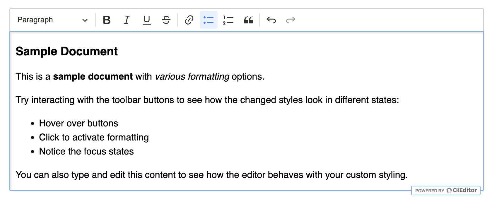
The default editor’s look:
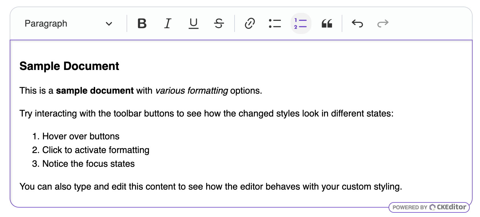
The editor’s look after customization:
Here are some essential CSS variables for customizing the editor:
| Variable | Description |
|---|---|
--ck-border-radius |
Border radius for rounded corners throughout the editor. |
--ck-spacing-unit |
Base spacing unit that controls all spacing in the UI. |
--ck-font-size-base |
Base font size for the editor UI. |
--ck-font-face |
Font family used throughout the editor UI. |
--ck-color-focus-border |
Border color when elements are focused. |
--ck-color-toolbar-background |
Background color of the toolbar. |
--ck-color-base-border |
Primary border color used throughout the UI. |
--ck-color-button-on-background |
Background color for active/selected buttons. |
--ck-color-button-on-color |
Text color for active/selected buttons. |
--ck-color-button-default-hover-background |
Background color when hovering over buttons. |
You can also browse CSS files to find more available variables.
Knowing the variables, you can push the customization even further and create your own themes, as in this dark theme example.
To apply classes or styles directly to the editable area from the editor configuration, see the Styling the editable area section of the Root types guide.
Similarly to the customizable editor look, some features also provide an interface to change their styles via native CSS variables.
CKEditor 5 provides CSS variables to standardize font and line height styling across the content. These variables control the default appearance of text the content. You can override them in the following way:
:root {
    /* Override the default font family */
    --ck-content-font-family: "Roboto";

    /* Override the default font size */
    --ck-content-font-size: 16px;

    /* Override the default font color */
    --ck-content-font-color: hsl(225, 5%, 45.00%);

    /* Override the default line height */
    --ck-content-line-height: 2;
}
Individual features also provide CSS variables for their specific styling needs. For example, if you want to change the color of the mentions’ background and text, you can do the following override:
:root {
    --ck-content-color-mention-background: black;
    --ck-content-color-mention-text: white;
}
Find the available CSS variables in our ckeditor5 and ckeditor5-premium-features packages.
Your application is typically divided into two areas. Content creation, which hosts the editor and is a writing tool, and content publishing, which presents the written content.
It is important to use the content styles on the publishing side of your application. Otherwise, the content will look different in the editor and for your end users.
There are two ways to obtain the content styles:
- From the
npmpackages, in thedist/ckeditor5-content.cssandckeditor5-premium-features-content.csslocation. - From our CDN,
https://cdn.ckeditor.com/ckeditor5/
Below is an example with placeholder paths showing how to load the ckeditor5-content.css (and ckeditor5-premium-features-content.css, if needed) file on the publishing side.
<link rel="stylesheet" href="path/to/assets/ckeditor5-content.css">

<link rel="stylesheet" href="path/to/assets/ckeditor5-premium-features-content.css">

<link rel="stylesheet" href="path/to/assets/styles.css">
The final setup depends on how your application is structured. As mentioned earlier, you can use our CDN, or your JS bundler already creates and serves combined style sheets. Choose the solution that works best for your case.
Important!
If you take a closer look at the content styles, you may notice they are prefixed with the .ck-content class selector. This narrows their scope when used in CKEditor 5 so they do not affect the rest of the application. To use them in the front–end, you will have to add the ck-content CSS class to the container of your content. Otherwise, the styles will not be applied.
The ckeditor5 package distributes three style sheets:
ckeditor5.css– combined editor and content styles,ckeditor5-content.css– only content styles,ckeditor5-editor.css– only editor styles.
The same is true for the ckeditor5-premium-features package, but the filenames are different:
ckeditor5-premium-features.css– combined editor and content styles,ckeditor5-premium-features-content.css– only content styles,ckeditor5-premium-features-editor.css– only editor styles.
However, these style sheets include styles for all editor plugins. If you want to optimize the size of the style sheet, to only include styles for the plugins you use, you can follow the Optimizing build size guide.