Custom annotation theme
This is the simplest way to change the look of annotations. Using the power of CSS variables, it is really easy to override the default design of comments. You can undo this by adding an extra .css file.

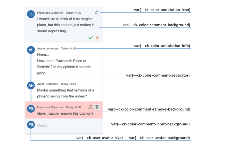
The image above shows you which variables are responsible for every component of the default annotation view.
With the inheritance of CSS variables, you can change the default :root values of the variables in the .ck-sidebar scope. You can override these properties with a .css file or place your customizations directly into the <head> section of your page, but in this case, you will need to use a more specific CSS selector than :root (for example, <body>).
Check out the color sheet for the full list of customizable colors. You can also browse other files with CSS Variables in CKEditor 5.
/* Change the default yellow color of the comment marker in the content to green. */
:root {
    --ck-color-comment-marker: hsl(127, 98%, 83%);
    --ck-color-comment-marker-active: hsl(127, 98%, 68%);
}

.ck-sidebar {
    --ck-color-comment-background: #ecf5f0;
    --ck-color-comment-separator: #64ca6d;
    --ck-color-comment-remove-background: #eccbcb;

    --ck-comment-content-font-family: Arial;
    --ck-comment-content-font-size: 13px;
    --ck-comment-content-font-color: #333;

    --ck-color-comment-count: #807e81;

    --ck-color-annotation-icon: #0f5c2f;
    --ck-color-annotation-info: #1eb35c;

    --ck-annotation-button-size: 0.85em;

    --ck-user-avatar-background: #239855;
}

/* You can even change the appearance of a single element. */
.ck-sidebar .ck-comment__wrapper:first-of-type {
    --ck-color-annotation-info: #8e9822;
    --ck-user-avatar-background: #8e9822;
}
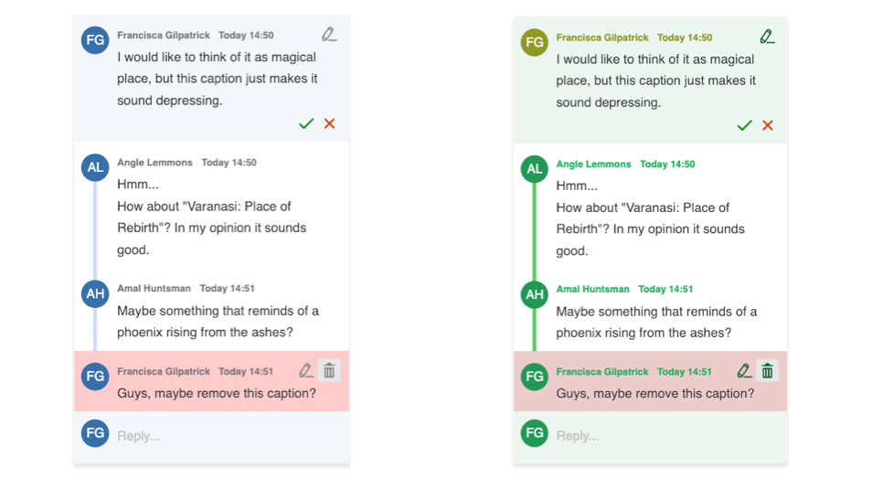
The examples above will generate the following designs for comments:
