


Creating a Simple CKEditor 4 Widget (Part 2)
The aim of this tutorial is to demonstrate how to extend an existing CKEditor 4 widget with a dialog window. This dialog window will be used to insert a new widget into the editor or modify an existing one and set some basic properties (width, alignment) for it.
#Prerequisites
Widgets are an innovative feature that is available since CKEditor 4.3. In order to proceed with this tutorial and create your own widget you need the following:
- CKEditor 4.3 and above.
- The Widget plugin along with its dependencies.
#Introduction
Instead of creating a new plugin, this time we are going to expand on the functionality of the Simple Box widget plugin created in the previous installment of the widget tutorial series.
We need to start where we previously left off. You can download the entire plugin folder including the icon, the fully commented source code, and a working sample. If you have any doubts about the installation process, see the instructions.
Should you have any questions about the content of the existing plugin and its configuration, refer to the Creating a Simple CKEditor 4 Widget (Part 1) tutorial.
#Widget Plugin Files
We continue our work on the file structure that we created for the Simple Box widget plugin in the previous installment of the tutorial.
CKEditor 4 dialog windows can be defined in separate files and then loaded on demand, which improves the overall editor performance. We will name the dialog window file simplebox.js and place it in a newly added dialogs directory, creating the following directory structure for the widget:
ckeditor root/plugins/simplebox/dialogs/simplebox.js
icons/simplebox.png
plugin.js
#Widget Source Code
With the following structure ready, it is time to open the plugin.js file in a text editor and to start modifying the source code of our sample widget.
#Widget Dialog Window
We will start from registering the widget dialog window by calling the standard CKEDITOR.dialog.add method inside the init method of the widget plugin definition.
CKEDITOR.plugins.add( 'simplebox', {
    init: function( editor ) {
        // Existing code...

        CKEDITOR.dialog.add( 'simplebox', this.path + 'dialogs/simplebox.js' );
    }
} );
This code registers the simplebox dialog window name, telling the editor to load the dialog window definition from the dialogs/simplebox.js file from the plugin installation directory (this.path).
Additionally, to create the automatic binding between the widget and the dialog window (just like we did for the widget button in part 1 of the tutorial), we need to define the dialog property of the widget definition inside the editor.widgets.add method. This will ensure that the simplebox dialog window will be opened when creating a new Simple Box widget or editing an existing one.
editor.widgets.add( 'simplebox', {
    // Code defined before...

    dialog: 'simplebox'
} );
When you load the sample page (that we created in the previous installment of the tutorial) in the browser, you will see that after you click the Simple Box toolbar button nothing happens. The widget will not get inserted into the editor because we changed the widget definition, adding a dialog window to it, and Widget System API is built in a way that forces automatic opening of the widget dialog window if it exists. Since this dialog window has not been defined yet, the editor cannot open it, so we need to work on the simplebox.js file now.
#Widget Dialog Window Definition
Open the dialogs/simplebox.js file in a text editor now. For a start, we will repeat the CKEDITOR.dialog.add call, but this time we will return the dialog definition to the editor.
CKEDITOR.dialog.add( 'simplebox', function( editor ) {
    return {
        // Dialog window definition will be added here.
    };
} );
See the CKEDITOR.dialog.definition documentation for a full reference on defining editor dialog windows.
In our case we will give the dialog window a name (simplebox) and use the title, minWidth, and minHeight parameters to define its title and minimum dimensions, respectively.
CKEDITOR.dialog.add( 'simplebox', function( editor ) {
    return {
        title: 'Edit Simple Box',
        minWidth: 200,
        minHeight: 100
    };
} );
#Dialog Window Contents
The dialog window should also contain some content, but in our case one page (tab) with id of info will be enough. This is added through the contents parameter of the dialog window definition. Note that by default CKEditor 4 also adds the standard “OK” and “Cancel” buttons.
CKEDITOR.dialog.add( 'simplebox', function( editor ) {
    return {
        title: 'Edit Simple Box',
        minWidth: 200,
        minHeight: 100,
        contents: [
            {
                id: 'info',
                elements: [
                    // Dialog window UI elements.
                ]
            }
        ]
    };
} );
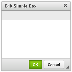
The result of this change can be seen immediately. Open the sample page in the browser and click the Simple Box toolbar button in order to open the newly created (and so far empty) “Edit Simple Box” dialog window.
#Dialog Window UI Elements
User interface elements added to a dialog window tab are defined in the elements parameter, which is an array of CKEDITOR.dialog.definition.uiElement objects.
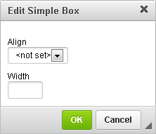
Our dialog window will contain two UI elements that will let you define two widget properties: width and alignment.
Since it might be useful to control the widget alignment in the document, we will use a selection field with three predefined options: left, right and center alignment (and an additional “not set” option). These are well-known editor alignment options, so we can use the common language strings for their labels which will simplify the internationalization of the widget.
Another UI element will be a text field where you will be able to define the width of the widget.
Since the width field will be using the width style property, you can use all CSS-allowed measurement units here: px, %, in, cm, mm, em, ex, pt, or pc.
elements: [
    {
        id: 'align',
        type: 'select',
        label: 'Align',
        items: [
            [ editor.lang.common.notSet, '' ],
            [ editor.lang.common.alignLeft, 'left' ],
            [ editor.lang.common.alignRight, 'right' ],
            [ editor.lang.common.alignCenter, 'center' ]
        ]
    },
    {
        id: 'width',
        type: 'text',
        label: 'Width',
        width: '50px'
    }
]
The reloaded sample page will now show you the complete widget dialog window.
You can now fill in the dialog window fields. When you click the “OK” button, the widget will be added to the document.
#Setting Widget Data
You might notice, however, that the values that you defined in the dialog window are not really applied to the widget. And when you double click the widget, both dialog window fields will be back at their default values.
This is because our widget definition still misses the logic that would pass the data between the widget and the dialog window that creates and edits it. We will need to add this logic both in the dialog window definition and in the widget definition.
#Dialog Window
Let us start with the dialog window. We will need to define the setup and commit functions for both fields. The setup function is invoked when opening the widget dialog window and populating the values in the dialog window fields with data already present in the widget. It uses the setValue method to set the value of the field to the value present in widget data.
The commit function is called when setting or changing the data in the widget, when a dialog window is being closed and the changes are confirmed by using the “OK” button. It uses the widget.setData() method to set the widget data to the value given in a dialog window field.
Note that the dialog window and the widget definition must use the same data properties (in this case, width and align with the exact same values, i.e. left, right, and center)!
elements: [
    {
        id: 'align',
        type: 'select',
        label: 'Align',
        items: [
            [ editor.lang.common.notSet, '' ],
            [ editor.lang.common.alignLeft, 'left' ],
            [ editor.lang.common.alignRight, 'right' ],
            [ editor.lang.common.alignCenter, 'center' ]
        ],
        setup: function( widget ) {
            this.setValue( widget.data.align );
        },
        commit: function( widget ) {
            widget.setData( 'align', this.getValue() );
        }
    },
    {
        id: 'width',
        type: 'text',
        label: 'Width',
        width: '50px',
        setup: function( widget ) {
            this.setValue( widget.data.width );
        },
        commit: function( widget ) {
            widget.setData( 'width', this.getValue() );
        }
    }
]
You might notice that the Dialog Window API states that setup and commit functions need to be complemented by setupContent and commitContent dialog window methods. However, you do not need to add these manually to your code as the Widget API does that for you.
The dialog window definition is now complete, so let us go back to the plugin.js file. Even though the values are not used by the widget after you insert it, when you double click it, the dialog window will show that the values were indeed saved.
#Widget Styling
As explained in the first part of the tutorial, widget styling needs to be tackled according to your usage scenario (classic vs inline editor).
To simplify the tutorial, let us assume you are using the classic editor. The new widget properties (width and alignment) will be using the width CSS style property and custom alignment classes. You need to add these classes to your default contents.css file.
.simplebox.align-right {
    float: right;
}
.simplebox.align-left {
    float: left;
}
.simplebox.align-center {
    margin-left: auto;
    margin-right: auto;
}
#Widget Plugin File
To prevent the editor’s content filtering system from removing the new widget properties we must also adjust the allowedContent definition:
editor.widgets.add( 'simplebox', {
    allowedContent:
        'div(!simplebox,align-left,align-right,align-center){width};' +
        'div(!simplebox-content); h2(!simplebox-title)',
} );
When a widget is being initialized we need to read its data (align and width) from DOM and set this data by using the widget.setData() method. This is done inside the init property of the widget definition in the editor.widgets.add method that may contain any code that needs to be executed when DOM is available.
In this case we will get the value of the width CSS property from the widget element and if it exists, assign it to the width data property of the widget by using the setData() method. We will then check if the align-left, align-right or align-center classes exist for the widget element and if this is the case, assign appropriate left, right or center values to the align data property of the widget.
editor.widgets.add( 'simplebox', {
    // Code defined before...

    init: function() {
        var width = this.element.getStyle( 'width' );
        if ( width )
            this.setData( 'width', width );
        if ( this.element.hasClass( 'align-left' ) )
            this.setData( 'align', 'left' );
        if ( this.element.hasClass( 'align-right' ) )
            this.setData( 'align', 'right' );
        if ( this.element.hasClass( 'align-center' ) )
            this.setData( 'align', 'center' );
    }
} );
This allows us to read the properties that are already in DOM and set them for an existing widget. We must now make sure we are also able to add a new widget or modify an existing one by setting its data and updating its view in the editor. We can do this in the dedicated data property of the widget definition inside the editor.widgets.add method.
The function we are going to define in the data property of the widget definition will be executed every time the widget data is changed. Widget data will be changed by using the widget.setData() method, which we previously added to commit functions of the dialog window fields.
First we will check whether the width widget data property was set. If it does not exist, we remove the width CSS style from the widget main element in the DOM (div.simplebox) by using the removeStyle() method. If the width data property was set, we assign its value to the width CSS style property of the widget main element by using the setStyle() method.
As for alignment classes, the simplest approach will be to remove them from the main widget element by using the removeClass() method and set an appropriate one read from the widget align data property.
editor.widgets.add( 'simplebox', {
    // Code defined before…
    data: function() {

        if ( this.data.width == '' )
            this.element.removeStyle( 'width' );
        else
            this.element.setStyle( 'width', this.data.width );

        this.element.removeClass( 'align-left' );
        this.element.removeClass( 'align-right' );
        this.element.removeClass( 'align-center' );
        if ( this.data.align )
            this.element.addClass( 'align-' + this.data.align );
    }
} );
This completes the changes that are needed for the updated widget to work.
#Full Source Code
The full contents of the simplebox/plugin.js file is as follows:
CKEDITOR.plugins.add( 'simplebox', {
    requires: 'widget',

    icons: 'simplebox',

    init: function( editor ) {
        CKEDITOR.dialog.add( 'simplebox', this.path + 'dialogs/simplebox.js' );

        editor.widgets.add( 'simplebox', {

            button: 'Create a simple box',

            template:
                '<div class="simplebox">' +
                    '<h2 class="simplebox-title">Title</h2>' +
                    '<div class="simplebox-content"><p>Content...</p></div>' +
                '</div>',

            editables: {
                title: {
                    selector: '.simplebox-title',
                    allowedContent: 'br strong em'
                },
                content: {
                    selector: '.simplebox-content',
                    allowedContent: 'p br ul ol li strong em'
                }
            },

            allowedContent:
                'div(!simplebox,align-left,align-right,align-center){width};' +
                'div(!simplebox-content); h2(!simplebox-title)',

            requiredContent: 'div(simplebox)',

            dialog: 'simplebox',

            upcast: function( element ) {
                return element.name == 'div' && element.hasClass( 'simplebox' );
            },

            init: function() {
                var width = this.element.getStyle( 'width' );
                if ( width )
                    this.setData( 'width', width );
                if ( this.element.hasClass( 'align-left' ) )
                    this.setData( 'align', 'left' );
                if ( this.element.hasClass( 'align-right' ) )
                    this.setData( 'align', 'right' );
                if ( this.element.hasClass( 'align-center' ) )
                    this.setData( 'align', 'center' );
            },

            data: function() {

                if ( this.data.width == '' )
                    this.element.removeStyle( 'width' );
                else
                    this.element.setStyle( 'width', this.data.width );

                this.element.removeClass( 'align-left' );
                this.element.removeClass( 'align-right' );
                this.element.removeClass( 'align-center' );
                if ( this.data.align )
                    this.element.addClass( 'align-' + this.data.align );
            }
        } );
    }
} );
This is the complete source code of the simplebox/dialogs/simplebox.js dialog window file:
CKEDITOR.dialog.add( 'simplebox', function( editor ) {
    return {
        title: 'Edit Simple Box',
        minWidth: 200,
        minHeight: 100,
        contents: [
            {
                id: 'info',
                elements: [
                    {
                        id: 'align',
                        type: 'select',
                        label: 'Align',
                        items: [
                            [ editor.lang.common.notSet, '' ],
                            [ editor.lang.common.alignLeft, 'left' ],
                            [ editor.lang.common.alignRight, 'right' ],
                            [ editor.lang.common.alignCenter, 'center' ]
                        ],
                        setup: function( widget ) {
                            this.setValue( widget.data.align );
                        },
                        commit: function( widget ) {
                            widget.setData( 'align', this.getValue() );
                        }
                    },
                    {
                        id: 'width',
                        type: 'text',
                        label: 'Width',
                        width: '50px',
                        setup: function( widget ) {
                            this.setValue( widget.data.width );
                        },
                        commit: function( widget ) {
                            widget.setData( 'width', this.getValue() );
                        }
                    }
                ]
            }
        ]
    };
} );
The following are all styles needed by the widget that should be added to your contents.css file:
.simplebox {
    padding: 8px;
    margin: 10px;
    background: #eee;
    border-radius: 8px;
    border: 1px solid #ddd;
    box-shadow: 0 1px 1px #fff inset, 0 -1px 0px #ccc inset;
}
.simplebox-title, .simplebox-content {
    box-shadow: 0 1px 1px #ddd inset;
    border: 1px solid #cccccc;
    border-radius: 5px;
    background: #fff;
}
.simplebox-title {
    margin: 0 0 8px;
    padding: 5px 8px;
}
.simplebox-content {
    padding: 0 8px;
}
.simplebox.align-right {
    float: right;
}
.simplebox.align-left {
    float: left;
}
.simplebox.align-center {
    margin-left: auto;
    margin-right: auto;
}
You can also download the entire plugin folder including the icon, the fully commented source code, and a working sample. If you have any doubts about the installation process, see the instructions.
#Working Example
You can reload the sample page now. When you click the Simple Box toolbar button, the widget dialog window will be displayed. After you fill the fields and click “OK”, a widget instance using the defined width and alignment values will be inserted into the document.
If you double click an existing widget instance, the dialog window will open again and current width and alignment values will be shown. After you modify them and click “OK”, the widget instance in the editing area will be updated.
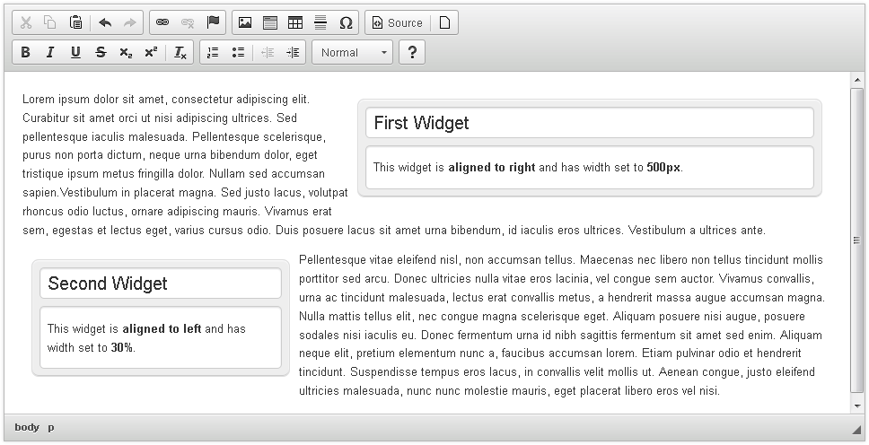
#Simple Box Widget Demo
See the working “SimpleBox (Creating a Custom Widget)” sample that shows the final version of the Simple Box widget integrated with an editor instance.