How WYSIWYG editors represent the future of content editing

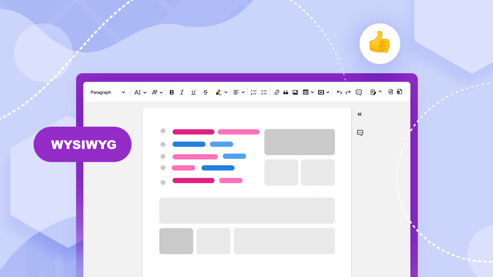
WYSIWYG stands for what you see is what you get. The term refers to content creation being done instantly and without relying on coding. It also tends to address a specific user interface (UI) and user experience (UX) tied to a seamless workflow. The WYSIWYG interface offers a method of visualizing the way the final content will look as it is being worked on and showcases changes made instantly.
If we analyze writing, for example, as a form of content creation, we can come to the conclusion that, more often than not, writing for the web consists of knowing basic HTML codes such as <b> for bold text or various formatting shenanigans. A system based on WYSIWYG principles will allow the writer to input text on the screen and various formatting options to appear exactly the way they write it without additional code or tools being used for the job. The output will look instantaneously the same as the final output ready to be published at any time.
Origins of the term “WYSIWYG”
The term’s origins are quite captivating and paved the way for modern operating systems and software that we take for granted today. The inception of WYSIWYG can be traced to a program, called Bravo, for the Alto computer created in 1974, and it would ultimately lead to the creation of Microsoft Word.
This was an interesting time in computing as even operating systems lacked a clear user interface or WYSIWYG elements that they do today in order to select files, find folders, or install software. You may recall DOS, an operating system reliant entirely on command line interfaces for such tasks being popular during the 1980s and into the early-to-mid 1990s.
The term was actually coined by Xerox Alto (first computing system designed with a mouse interface) designer Chuck Thacker’s wife after seeing an Alto computer run Bravo as she asked her husband, “you mean, what I see is what I get?”
Some say the idea behind WYSIWYG was the reason Apple survived as a company.
“The Mac survived because it was the first thorough attempt in a low-cost computer to accomplish WYSIWYG,” according to The Electric Light Company. “Sales soared when the Desktop Publishing Revolution came, and designers could see pages on their displays which were very close in appearance to those that would emerge from the printers.”
A WYSIWYG interface should be created in a way that allows for a seamless and smooth user experience (UX) for the end user. The layout will be created right on the display with clicks of a mouse and no memorization of layout commands or code will be needed to accomplish this task.
Examples of WYSIWYG software
WYSIWYG software comes in all sorts of variants depending on their goal and type of audience of content creators or developers it attracts. Many traditional desktop, and highly technical, apps are offering simplified and WYSIWYG variations in the form of mobile or iPad apps to get new users interested in the software.
Word processors of today are also done in a WYSIWYG methodology and these can range from standalone Microsoft Word to cloud-based Google Docs. An editor by CKSource called CKEditor 5 also works using a WYSIWYG interface and can be integrated into other web-based software (aka web apps), so different organizations can target their user base without requiring them to know formatting or code.
CKEditor 5 allows for collaborative editing, in real time. This means that you and coworkers can work simultaneously across multiple teams on projects; and you can do this all within your web-based application with the editor integrated. Features like Track Changes and Comments are all part of its package and the editor can be customized in a WYSIWYG fashion according to the needs of the company using it.
It can be argued that word processors were always done in a WYSIWYG fashion, but today they moved to the cloud and even online HTML editors tend to work using WYSIWYG visualizations.
Advantages of WYSIWYG interfaces
There are many advantages of software using WYSIWYG principles and reasons to work with WYSIWYG interfaces. Besides ease of use and a seamless experience for most non-technical users, it also speeds up the entire process of content creation.
There is less fiddling with sizes, dimensions, code, or preview of said content before seeing it live or the way it will look in the final (published) form. Adjustments in real time can be done and this is also a reason why it is faster to work with than when using non-WYSIWYG editors or software.
This also means companies have to train their teams less in terms of overall technical knowledge and coding to get up and running any software using a WYSIWYG interface and UX. This frees up time and resources on getting the work done rather than learning how to get it done in the long run.
Preview is also instant and the user can see what the final outcome will look like without having to compile anything, use preview programs, or publish HTML content before seeing what the results will look like. This, again, frees up time and relieves the hassle of traditional methods of creating content.
Why WYSIWYG is the future of software
If you look at the history of computing, most operating systems and software updated over long periods became more WYSIWYG in nature over time. As previously mentioned, operating systems used to rely on command lines and users had to memorize these command lines to access files and work around an operating system. Today, they are driven by either a mouse input or touch displays for instant accessibility around the OS.
Software, ranging from graphic design programs like Adobe Photoshop to website builders and text editors, also became less cumbersome to use and more instant and thus conforming to WYSIWYG methodologies and styles of interfaces.
Thus, we can gather that the evolution of software and computing aligns more alongside what the idea behind WYSIWYG is based on than more functionality and elitism of using software and creating content. The simpler and easier to understand the software is for new users, the easier it is to come back to after not using it for long periods of time; and the more users it attracts the easier the onboarding process will be for companies.
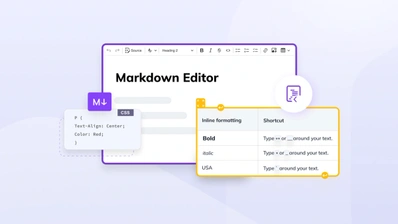
The future of content for the most part is in WYSIWYG and right now editing text is a great WYSIWYG example showing how content creation has progressed over time to the modern fashion we see today. CKEditor shows this in action to its full potential. The latest version of this editor, called CKEditor 5, allows for copy-and-paste to be done seamlessly, Markdown to be integrated with WYSIWYG principles, and images to be pasted without the use of cumbersome code. This is all done with dimensions or other aspects of positioning within the text being positioned with just a click of the mouse.
Collaboration is also a huge selling point of this WYSIWYG editor as it offers its users the ability to simultaneously work on content with others. Users logged into the customizable builds of CKEditor 5 can also leave comments within the content, track the changes of others working on it, either synchronously or asynchronously, and even revert changes using a Revision History feature.
The future of content is in WYSIWYG and if you want to see it fully in action today, check out CKEditor 5 and what it offers. Contact us to find out how our WYSIWYG experience can be integrated into your software for a seamless and UX-friendly text editing process.
See related articles:
- What are virtual classrooms? Virtual classroom software - CKEditor
- Knowledge management and capturing the ideas of your talent
- Content publishing during Covid-19
- 5 ways SaaS companies can benefit from collaborative editing with CKEditor 5
- Agile project management - history, benefits and advantages of use
- The shape of things to come: student information systems edition
- Knowledge management tools - the top 5 on the market according to CKEditor


