What is Image Management? A Comprehensive Guide
13min read
||Updated:Image management is a part of modern content—from product images and blog visuals to diagrams and marketing assets. But without a strategy, managing your images can get messy and time-consuming.
In this guide we’ll explore what image management is, why it matters to developers and their application users, and how the right tools-like CKEditor 5—can help you store, organize, style, and deliver images across your workflows. By the end of this article, you’ll have a clear understanding of how to overcome the associated challenges, best practices for image management, and how to use CKEditor to simplify image storage, streamline content workflows with images, and even edit images directly within your application’s rich text editor.
What is Image Management?
Image management is the process of managing, storing, retrieving, sharing, and optimizing images throughout their lifecycle. This includes uploading and editing images, adding metadata, managing access permissions, and making sure the right images are available to the right teams or platforms at the right time.
It’s key to maintaining brand consistency, collaboration, and workflow efficiency, especially as organizations grow and image libraries expand. Whether you’re managing hundreds of product images for e-commerce, storing marketing assets for cross-channel campaigns, or just adding images to a blog, effective image management avoids duplication, saves time searching for files, and ensures images are always ready to use. Plus, it ensure that brand approved images are at content creator’s fingertips, eliminating off brand photos and illustrations that don’t match the brand’s colors, typefaces, and look and feel.
Modern image management often relies on tools or systems—like Digital Asset Management (DAM) platforms—that have advanced features like metadata tagging, responsive image delivery, role-based permissions, and integration with content management systems. These solutions keep images secure, accessible, and on brand.
CKEditor 5 supports this approach by having image management built in to your editing experience—making it easier than ever to work with images and have control and consistency.
Benefits of Image Management
Effective image management gives you so much more than just organized files. As mentioned in the previous section, it’s key to brand consistency and productivity and supports efficiency for teams, whether they are working across departments or collaborating globally.
Here are the top benefits of image management:
-
Time Savings: Centralized, searchable image libraries eliminate time wasted searching through scattered folders or re-creating assets so teams can focus on higher-value work.
-
Cost Savings: By avoiding duplicates and streamlining image storage, organizations reduce redundancy, conserve server space, and cut unnecessary licensing or re-editing costs.
-
Improved Collaboration: Shared access to approved assets means marketing, design, and product teams can work together more effectively—especially in remote or cross-functional environments.
-
Consistent Branding: Image management enforces brand guidelines by ensuring only the latest, approved, and correctly formatted images are used in campaigns and across channels.
-
Workflow Automation: Automating tasks like image resizing, categorization, and tagging reduces manual work and speeds up content production and publishing workflows.
-
Organizational Clarity: With a structured repository and standardized naming or taxonomy, teams can quickly browse and retrieve the right assets for the right purpose.
-
Security and Access Control: Image management systems often include permission settings, watermarks, encryption, and backup systems to protect proprietary or sensitive content.
Whether you have a few hundred images or millions, good image management means your organization can move faster, stay consistent, and avoid costly mistakes.
Best Practices for Organizing and Managing Images
A well-organized image library is key to getting the most out of your visual content. Without a strategy, even the best tools can’t prevent clutter and confusion.
Here are some of the best practices to ensure your image management system remains efficient, scalable, and user-friendly:
-
Use Descriptive File Names: Avoid vague names like IMG_001.jpg. Instead, use meaningful, keyword-rich filenames that reflect the image’s purpose (e.g., product-launch-2025-banner.jpg). This helps both human navigation and search engines.
-
Apply Metadata and Tags: Add structured metadata like keywords, descriptions, author, usage rights, or creation dates. This makes it searchable and provides context for internal teams and external users.
-
Centralize Your Images: Store all images in one place—whether in a cloud-based DAM, in CKBox, on a CDN, or on another platform—so everyone has the same source of truth.
-
Standardize Formats and Sizes: Create guidelines for acceptable formats (e.g., PNG, JPEG, WebP) and resolution standards so images display consistently across platforms.
-
Use Controlled Vocabularies: For metadata tagging, create a consistent taxonomy—such as predefined keywords, categories, or project labels—to reduce tagging errors and asset retrieval.
-
Schedule Backups: Back up your entire image library regularly using secure automated methods. This protects against data loss from hardware failure, accidental deletion, or security breaches.
-
Review and Clean Up: Archive or remove outdated, duplicate, or irrelevant images on a set schedule to keep your library lean and relevant.
-
Train Your Teams: Make sure everyone uploading or accessing images knows file naming conventions, metadata rules, and folder structures. Consistency starts with shared knowledge.
-
Use Image Management Tools: Use dedicated platforms like CKBox, DAM software, or media libraries that support automated tagging, responsive delivery, role-based permissions, and integration with your content workflows.
Following these best practices doesn’t just make it easier to find and use your images—it also scales your team’s ability to collaborate, stay compliant, and deliver consistent visual experiences.
Image Management with CKEditor 5
Many organizations use external image management systems, but CKEditor 5 has built-in image management right inside the editing experience so you can keep your content visually consistent, accessible, and on brand.
Here’s how CKEditor 5 simplifies modern image management:
-
Integrated Image Workflows: Upload, insert, edit, and format images within the editor—no need to switch between tools or break your content creation flow.
-
Smart Styling and Layout Control: CKEditor 5 supports block and inline images, responsive resizing, custom styling, alignment, and captioning—so images look great across all content types and devices.
-
Accessibility Features: Built-in alt text management ensures all visuals meet accessibility standards, and captions add context for all readers.
-
Seamless Integration: Connects to your preferred platforms and storage backends—whether cloud based or on premises, and is compatible with a variety of frameworks, including React, Angular, Vue, and Vanilla JS.
-
Flexible Storage Options: Use CKBox for advanced image storage, metadata tagging, responsive delivery, and team-based access control. CKEditor also offers Image Optimizer, powered by Uploadcare, as a plugin. You can also connect your own storage via custom adapters.
Whether you’re managing blog visuals, documentation images, or branded marketing assets, CKEditor 5 helps you keep consistency, speed up publishing, and deliver better user experiences with every image.
Image Storage Options for CKEditor
When it comes to image storage for CKEditor, you’ve got four options, each with their own benefits and drawbacks.
-
CKBox is a modern, secure option for image management and storage that has a native integration with CKEditor 5. It’s also compatible with major JavaScript frameworks like React, Angular, and Vue. Plus it’s backend agnostic, using a REST API for integration, authentication, and management, and allows you to manage files and users centrally, via the administration panel. The Workspaces feature means CKBox can also be configured to provide separate storage solutions in a multi-user, multi-tenant, or multi-project situation.CKBox is available via SaaS, or as an on-premises installation.
The SaaS version of CKBox uses Amazon S3 for image storage and serves assets via secure CDN powered by AWS. In contrast, CKBox on-premises (available as a Docker image) allows you to choose where to store your images. You can use AWS, Azure, Google Cloud, your own data center, or any other storage solution – and choose from a range of data storage types. CKBox on-premises can integrate with your chosen CDN, but you will have to handle the setup process.
-
CKFinder: is our first iteration image upload and management platform, with a built-in image editor. It was released before CKBox. To learn more about the key differences between the two, read our comparison guide.
-
Simple Upload Adapter: The Simple Upload Adapter plugin allows you to upload images to your own server with minimal editor configuration. It gives you control over the server-side implementation— see our full guide for more information.
-
Your Own Custom Upload Adapter: If your project has unique requirements, then consider implementing your own custom upload adapter using our public APIs. You can learn more about building a custom upload adapter in our guide.
Once you’ve made your decision on image storage, you can finally get down to adding and managing images in your document.
Inserting Images into CKEditor
Adding images into your content is intuitive and easy. CKEditor supports a range of different ways to insert images:
-
Copy and Paste: You can copy an image, then paste it from the clipboard.
-
Insert via URL: Another option is to paste its URL into the editor directly (or into the “insert image via URL” feature).
-
Drag and Drop: You can drag an image file from your computer and drop it into the editor.
-
Insert Image: You can click the “insert image” button to bring up the file system dialog and select your image.
Or, you can select an image from the media management tool in your application.
Image Alignment
Images in CKEditor 5 can be treated as one of two different page elements:
Block Element: A block element is a separating instance; it always starts a new line and takes up the whole available width. Paragraphs, headings, block quotes, and tables are all common examples of block elements. Block images can only be inserted between other block elements. Generally, a block image is good for large or complex pictures, and for breaking up long sequences of text.
Inline Element: Inline elements are almost the exact opposite. They do not start on a new line, and they can have any width. Most text formatting, like bold and italics, inline code, and even links, are inline elements. Inline images are typically smaller than block images, they can be aligned to the right or left, with a paragraph beside them. Very small inline images can even act as icons. An inline image can be inserted inside a paragraph, mid-sentence, or inside a link.
CKEditor 5 supports both inline and block images, thanks to a pair of plugins: ImageInline and ImageBlock contained within a glue plugin, Image. These are included by default in all predefined editor builds. Unless configured differently, the editor treats all images as block images when first inserted.
Arranging images
When you insert an image, CKEditor 5 will automatically decide, based on the image’s context and placement, whether it should be a block or an inline element. Don’t worry though— you don’t have to take CKEditor’s recommendation. You can use the image contextual toolbar to change whether the image is a block or inline element and change its alignment on the page. Since block images take up the full width, there’s no way to change their alignment.
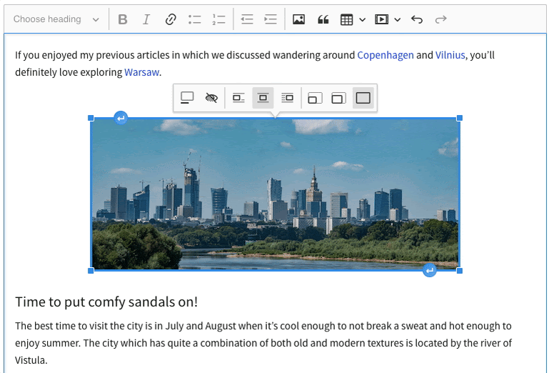
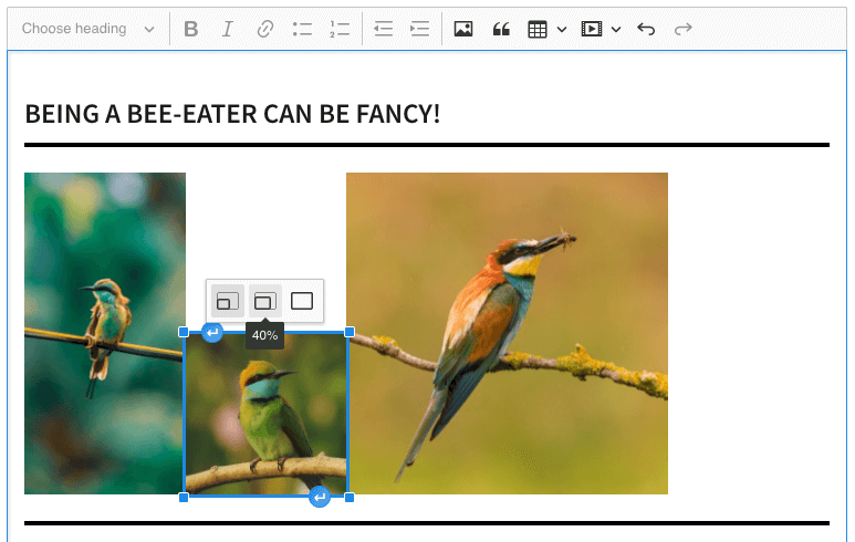
However, if you want to center, right-align, or left-align an image, it automatically becomes an inline image. Simply click the buttons on the toolbar to change the image alignment.
The image changes from block to inline as you click on the different alignment options.
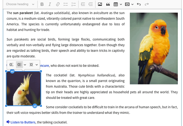
When you select an image in the editor, you’ll notice two ↵ insert paragraph handles at the top and bottom of the image. Clicking these buttons instantly adds a new paragraph above or below the image. And if you want to type text beside an image, simply select the image and press the left or right arrow keys to move the cursor, then start typing.
Different image styles
CKEditor 5 provides several basic image styles by default, but you’re free to define your own. There are two kinds of image styles: semantical and presentational.
-
Semantical styles are defined at a low level and are more about the role of the picture and its place within the content than anything else. The default semantical styles are block, inline, and side, as shown in the GIF above.
-
Presentational styles allow for control over the alignment, text wrapping around the images, margins, and other aspects of the image’s appearance that are governed by CSS. Default presentational styles include align left, align right, and center.
However, you can also customize the default styles or define your own. Many presentational styles rely on resizing the image, so it’s important to have the Image Resize plugin set up.
Key image management features
1. Resizing images
The Image Resize plugin allows you to easily and conveniently resize images right inside the editor window. This is additional functionality, enabling you to fully control the images so that they fit predefined dimensions— perfect when creating content for print.
The plugin supports several approaches to resizing images. To switch between predefined image sizes, you can use the resize dropdown or the resize image buttons, which appear in the contextual image toolbar.
You can define the preset image sizes during plugin installation.
And don’t worry about ending up with a skewed image. When an image is added into CKEditor, its width and height attributes are retained to ensure the aspect ratio is respected when the image is resized.
Alternatively, you can resize images using the resize handles. This gives the most control over the resizing process, allowing you to click and drag to scale the image to any size.
2. Serving responsive images
Using responsive images means serving images of an appropriate resolution and file size for the device that’s accessing your content. So a desktop with a 4K monitor gets a larger image than a small smartphone screen. This means the mobile user saves bandwidth, and page load times are faster.
Of all the image management solutions mentioned in this article, CKBox is the only one that automatically makes your images responsive.
When you upload an image to CKBox, it creates WebP formatted versions of the image at the original and lower resolutions. Then, whenever the image is loaded by a browser, CKBox serves the image most appropriate for that device.
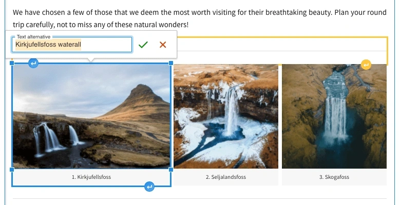
3. Setting alternative text
Accessibility is a key priority for CKEditor, and one of the best ways to make the web more accessible is using proper alternative text on all your images. Also known as alt text, it’s a written description of the image’s content that’s read aloud by screen-reading software, so that those with visual impairments can understand the image and its role on the page.
In some jurisdictions, having properly written alternative text is a legal requirement.
Not only does alternative text make your images more accessible to people, it also makes them more accessible to search engines, which use alt text to index images on the web. You can add alternative text to your image from the image toolbar.
If you’re using CKBox for image management, handling alternative text is even easier. When you upload an image to CKBox, just fill out the description field— your description text will be automatically applied as alt text every time you insert the image into CKEditor.
4. Image captions
The contextual image toolbar also has a caption button. Unlike alternative text, which should ideally concentrate on describing what the picture shows, captions serve a supporting role.
A caption can be used to give an image a title, provide an explanation of what is shown in the picture, or something else entirely. Captions can be especially helpful for readers scanning the document for specific information.
You can turn the caption on and off for each image from the toolbar. To edit an existing caption, simply click the text in the caption box. Both caption and alternative text functionality are available by default in all predefined CKEditor 5 builds.
5. Image links
There’s one more image management feature in CKEditor 5. Using the Image Linking plugin, you can add hyperlinks to images. This is a great way to use images as a call to action (CTA), use icons as anchor links in a long document, or use a thumbnail of an image to link to the full-resolution version.
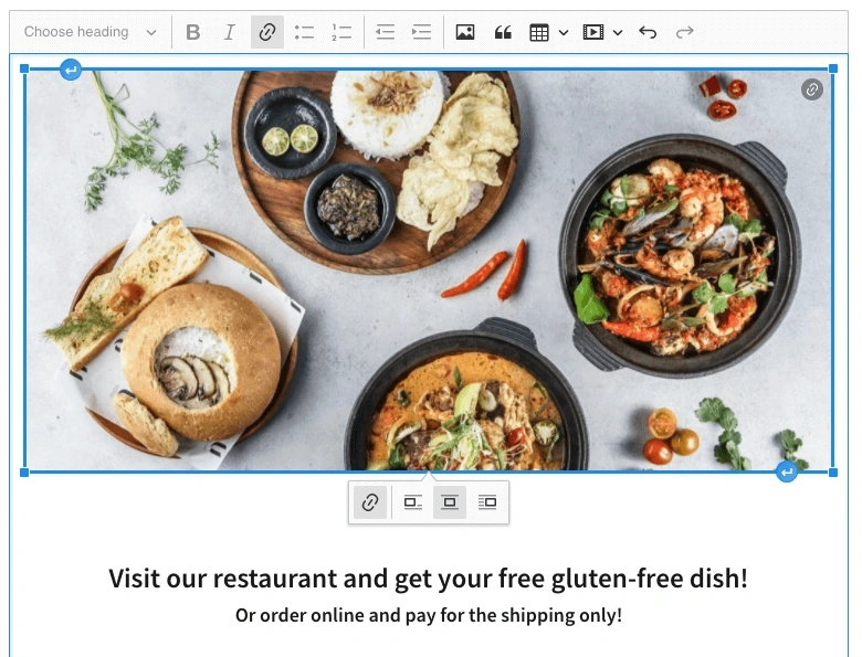
Use the contextual image management toolbar to add, edit, and remove the link attached to an image. To see whether an image has an attached link, look for the link icon in the top right corner of the image.
Learn more about image management in CKEditor
Whatever kind of content you’re creating, the image subsystem of CKEditor 5 is a versatile, highly developed set of features offering terrific flexibility and usability in a wide variety of contexts.
The most important decision for you to make about image management, however, is your image storage location. Once you’ve decided where your images will be stored, working with them in CKEditor is simple.
The predefined CKEditor builds include many of the essential plugins that will get you started working with images, and you can use the builder to get up and running quickly with a free trial. If you’d like to learn more about how CKEditor and CKBox can work in the enterprise, contact us.
* CKBox and CKFinder are both Premium features. To use Premium features, you need to purchase a CKEditor 5 Commercial License. You can also try an online demo of CKBox, and an online demo of CKFinder.
Tags: