
The Prototype Trap: Shipping AI-written Code Before It’s Ready
Fast AI prototypes are slipping into production. Learn why vibe coding creates risk—and how leaders can stop the prototype trap.
WEBINAR:
Beyond Disjointed Text Boxes
Orchestrating Every Piece of Content and Its Metadata with CKEditor AI
Enhanced CKEditor AI with new on-premises deployment, MCP support, and the ability to refine its customization options. The release also improves list indentation behavior.
Read more
The Prototype Trap: Shipping AI-written Code Before It’s Ready
Fast AI prototypes are slipping into production. Learn why vibe coding creates risk—and how leaders can stop the prototype trap.
LLM Model Fallback Is a Product Strategy
When Anthropic’s Fable 5 went offline with no warning, products on a single LLM broke. Why model fallback and provider abstraction is product strategy.
The Missing Governance Layer in AI Document Editing
Frontier AI models corrupt around 25% of content in long edits. See how an enterprise AI governance layer makes every AI change reviewable.
CKEditor Expands Public Sector Access Through Carahsoft Partnership
CKEditor and Carahsoft’s partnership helps public sector teams access secure, accessible rich text editing built for modern content workflows, collaboration, and AI-enabled applications.
CKEditor 5 v48.2.0 Release Highlights: AI Chat Improvements, Media Embed, and More
CKEditor 5 v48.2.0 brings General HTML Support for CKEditor AI, AI Chat improvements, media embed resizing and alignment, and skip-level list support.
AI Is Already on Your Roadmap. Now How Do You Govern It?
AI is on your roadmap, but ownership, governance, security, and maintenance are often unplanned. Here’s what IT leaders need to account for.
CKBox Version 2.12 and 2.13: Refreshed UI, File Versioning and more
Discover CKBox 2.12 and 2.13 with a refreshed UI, file versioning, asset overwrite, and PDF thumbnails for faster, more reliable asset management.
How We Built MCP Support in CKEditor AI
Learn how CKEditor AI brought MCP into a real SaaS environment, turning external tools and customer data into secure, scalable agent capabilities.
How Adaptive Context Works in CKEditor AI
See how CKEditor AI uses adaptive context to send the LLM only what each request needs - cutting token cost and latency on large documents.
CKEditor Is Now HIPAA-aligned for Healthcare Workflows
CKEditor is now HIPAA-aligned, adding healthcare-grade controls on top of SOC 2 Type II. See what’s in scope, who benefits, and how it cuts vendor risk.
Are Your AI Tools Quietly Draining Your Productivity?
Fragmented AI tools are costing enterprise teams more than they realise. Learn how tool sprawl creates governance risk, inconsistent outputs, and poor AI ROI.
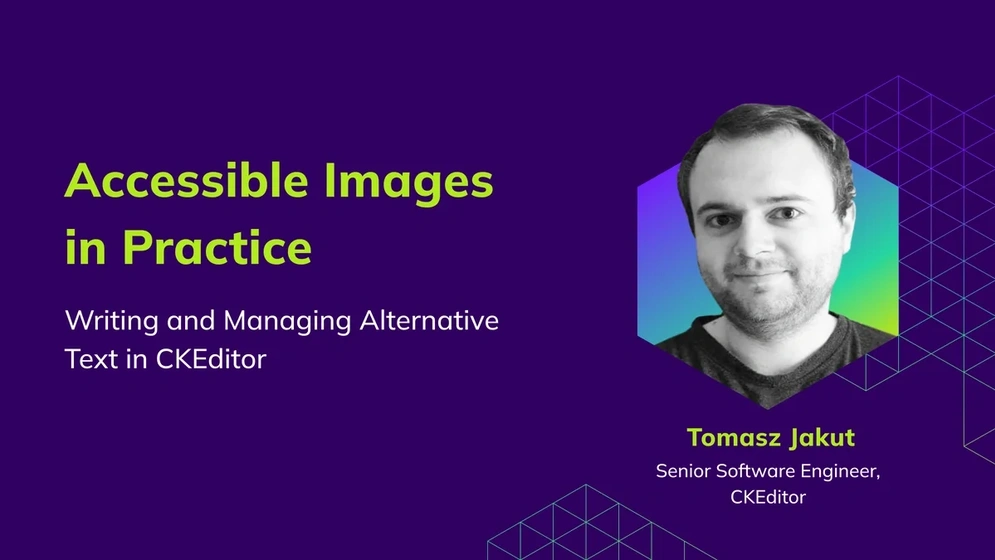
Accessible Images in Practice: Writing, Generating, and Managing Alternative Text in CKEditor
Learn how to write effective alternative text for images — and let CKEditor AI generate it for you. Covers WCAG guidelines, context-based best practices, and how to handle decorative, complex, and linked images.
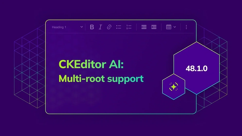
CKEditor 5 v48.1.0 Release Highlights: CKEditor AI Chat Improvements and AI in Multi-root Setups
The release brings AI Chat improvements and experimental AI support for multi-root and multiple editor setups, along with several fixes and improvements.
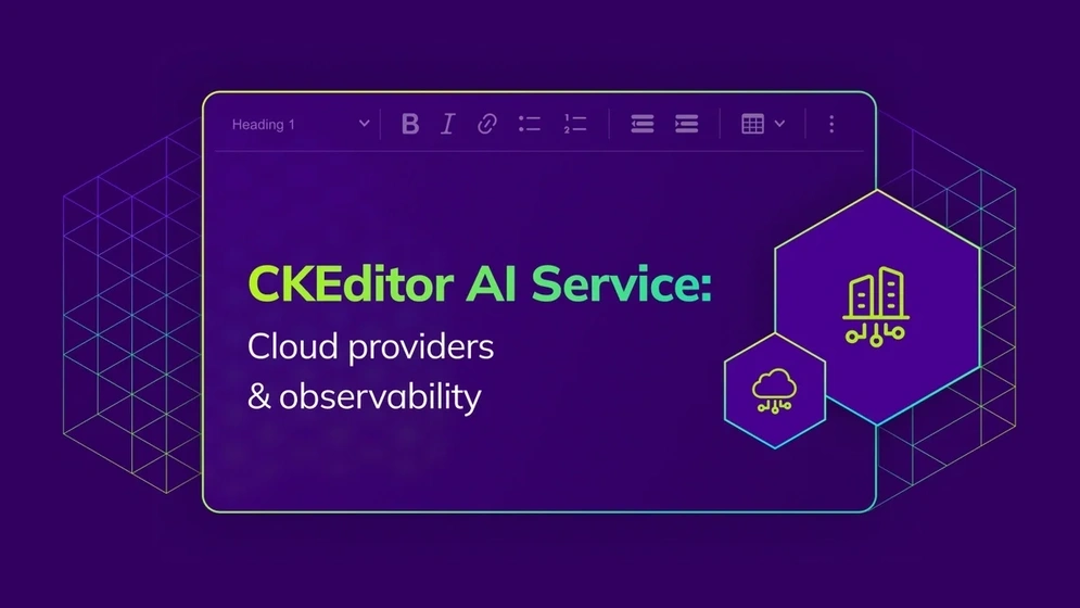
CKEditor AI Service: Cloud Provider Support, Observability, and More
Native support for Azure OpenAI, Amazon Bedrock, and Vertex AI, OpenTelemetry observability, LLM circuit breaker, expanded file limits, and more in the latest CKEditor AI Service highlights
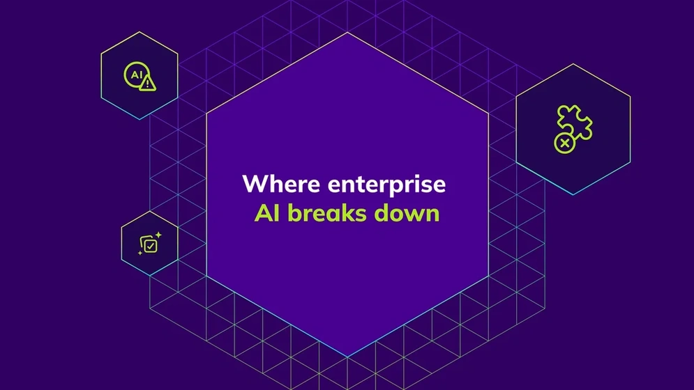
Why Enterprise AI Pilots Fail, and What the Winners Do Instead
Enterprise AI pilots fail not because of the model, but because AI never fits real workflows. See the patterns behind implementations that scale.
What Is CKEditor AI? A Guide for Product Teams
CKEditor AI brings AI-assisted writing directly into your rich text editor. Discover how it works, what pain points it solves, and why teams are adopting it.
CKEditor 5 v47.7.0 LTS Release Highlights: Entering the Maintenance Phase
This release marks the start of the maintenance phase for the LTS Edition. Learn what this means for LTS customers and what to expect going forward.
How to Choose a Rich Text Editor for Compliant App Development
Your RTE choice shapes how much compliance work your team owns. Learn what to look for when building for healthcare, finance, or government.
CKEditor 5 v48.0.0 Release Highlights: Installation Methods Transition Completed
Installation methods transition is now complete, table capabilities significantly expanded, CKEditor AI improved, Export to PDF defaults to v2, and more.
WYSIWYG vs Markdown: Differences, Pros, Cons, and Which to Choose
Compare WYSIWYG and Markdown editors across collaboration, storage, and UX. Learn which fits your team and how to pick the right embeddable editor.
What’s new in CKEditor Drupal modules: CKEditor AI and more
Discover what’s new in CKEditor modules for Drupal, including CKEditor AI with AI Chat, AI Review, AI Translate, and AI Quick Actions and stability fixes.

Rich Text Editors in Regulated Industries: A Business Leader’s Guide
Learn how CKEditor ensures text editor compliance across healthcare, finance, and education by meeting key industry regulations with secure features.
What to Expect During the Free Trial Period of CKEditor
Use your CKEditor 14-day trial to test AI, collaboration, and export. Learn what’s included, how to get a license key, and what changes after it ends.
No entries