CKEditor 5 v49.0.0 Release Highlights & New Features
10min read
|CKEditor 5 v49.0.0 is a major release that expands how the editor integrates and refreshes how it looks. Focused on enabling CKEditor in compliance-heavy enterprise systems, it brings together several capabilities. You can now run CKEditor 5 inside a shadow root, which opens a clean path into web components, micro-frontends, and design systems. The default theme has a refreshed look built on a new system of design tokens for greater customizability and maintainability.
V49.0.0 goes further than most releases. On top of these integration and styling changes, it also brings the CKEditor AI interface together into one cohesive experience with a redesigned AI Review, adds support for applications that enforce Trusted Types for a stricter security posture, and simplifies error handling now that the Watchdog is gone.
Before you update: v49.0.0 includes several major and minor breaking changes across different features. See the changelog for the full list.
Shadow DOM support NEW
What is shadow DOM?
Many modern web apps are built from self-contained components that use shadow DOM to keep their styles and structure isolated from the rest of the page. Design systems and micro-frontends are built this way, including the enterprise platforms built on them, like Salesforce, ServiceNow, and SAP.
What businesses get from using shadow DOM:
-
Predictable UI. Global CSS from the host app, a theme, or a third-party script can’t break the component’s layout. Its styles also can’t leak out and break the host page.
-
Safe drop-in reuse. One component works the same way across apps, teams, and frameworks (React, Angular, Vue, plain HTML) without CSS conflicts. That cuts integration and QA time.
-
Independent teams. Teams in micro-frontend setups can ship components without coordinating class names or style rules. You get fewer regressions and faster releases.
-
Cheaper maintenance. Upgrading or restyling one component doesn’t cause side effects elsewhere in the app.
-
Controlled customization. Component authors decide what consumers can change through CSS custom properties, `::part`, and slots. Brand theming stays possible while the internals stay stable.
Still, it’s a tough environment for rich text editors, which depend on browser APIs that assume a single, shared page. Salesforce is a clear example - its Lightning experience is built from Lightning Web Components, and each one renders inside a shadow root. Until now, the only way to put CKEditor 5 on a Lightning page was a detour: wrap the editor in a Visualforce page and embed it through an iframe.
Shadow DOM support in CKEditor 5
Shadow DOM support has been one of our community’s long-standing requests, and with v49.0.0 it’s here! 🎉 CKEditor 5 can now run inside a shadow root out of the box, with no custom workarounds. Selection, focus, scrolling, drag and drop, and the floating UI all work there, and so do premium features like comments, track changes, real-time collaboration, and CKEditor AI.
Shadow DOM isolates styles in both directions, so the host page’s CSS can’t bleed in and restyle the editor, and the editor can’t leak out and affect the page. A help desk widget embedded across many customer sites, for example, keeps a consistent editor look regardless of the host page’s CSS, and can’t break those sites either. Loading the editor’s styles into the shadow root is part of the setup which you can learn more about in the Shadow DOM integration guide.
// CKEditor 5 is modular: you import the editor type and only the features you need.
import { ClassicEditor, Essentials, Paragraph, Bold, Italic } from 'ckeditor5';

// Import the editor's CSS as a plain string, not as a regular page stylesheet.
// (`?inline` is Vite syntax; other bundlers have their own equivalents.)
import editorStyles from 'ckeditor5/ckeditor5.css?inline';

// Page styles can't reach inside a shadow root, so the editor's CSS has to be
// loaded into it directly. A constructed stylesheet does exactly that.
const styleSheet = new CSSStyleSheet();
styleSheet.replaceSync( editorStyles );

// Create the shadow root on a host element, and an element inside it
// for the editor to attach to.
const host = document.querySelector( '#editor-host' );
const shadowRoot = host.attachShadow( { mode: 'open' } );
const editorElement = shadowRoot.appendChild( document.createElement( 'div' ) );

// Apply the editor's styles inside the shadow root.
shadowRoot.adoptedStyleSheets = [ styleSheet ];

// Create the editor inside the shadow root. The configuration object tells it
// where to attach and which features (plugins) and toolbar buttons to use.
ClassicEditor.create( {
	attachTo: editorElement,
	licenseKey: '<YOUR_LICENSE_KEY>',
	plugins: [ Essentials, Paragraph, Bold, Italic ],
	toolbar: [ 'undo', 'redo', '|', 'bold', 'italic' ]
} );
The shadow-aware helpers behind this support are now a public API, so plugin authors can make their own features work in a shadow root too. The Shadow DOM support deep dive shows how.
A new config.ui.overlayContainer option lets you choose where balloons, dialogs, and tooltips render. It also helps outside shadow DOM, for example, when the editor sits inside a container that cuts off anything extending past its edges.
// Balloons, dialogs, and tooltips render outside the editing area. Give them
// their own shadow root at the end of the page, where no parent element can
// cut them off.
const overlayHost = document.body.appendChild( document.createElement( 'div' ) );
const overlayContainer = overlayHost.attachShadow( { mode: 'open' } );

// This is a separate shadow root, so it needs the editor's styles too.
overlayContainer.adoptedStyleSheets = [ styleSheet ];

ClassicEditor.create( {
	attachTo: editorElement,
	// Tell the editor where to render its floating UI.
	ui: {
		overlayContainer
	},
	// ... license key, plugins, and toolbar as before.
} );
A refreshed default theme
The editor has a new, completely refreshed default look in v49.0.0. The refresh runs across the entire interface, from toolbar and dialogs to every single feature UI, so your editor will get the new look everywhere automatically.
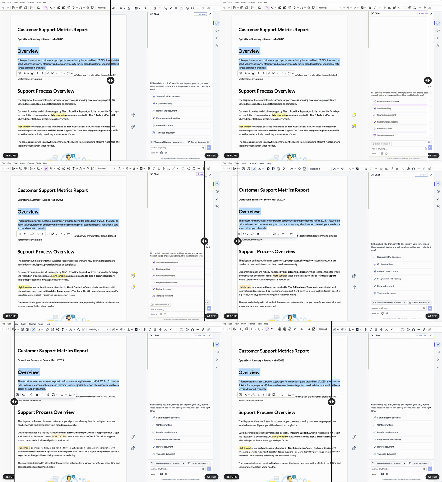
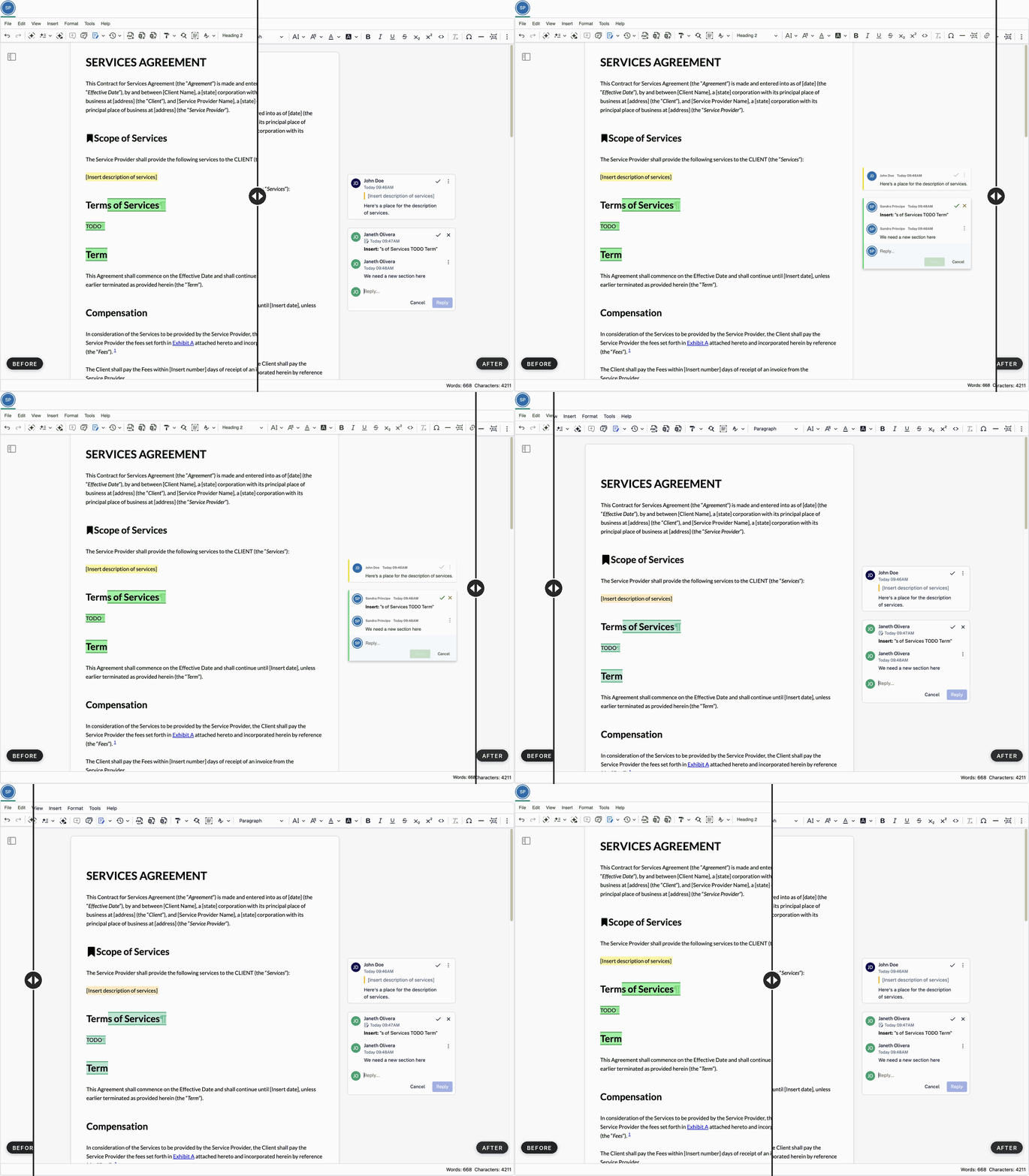
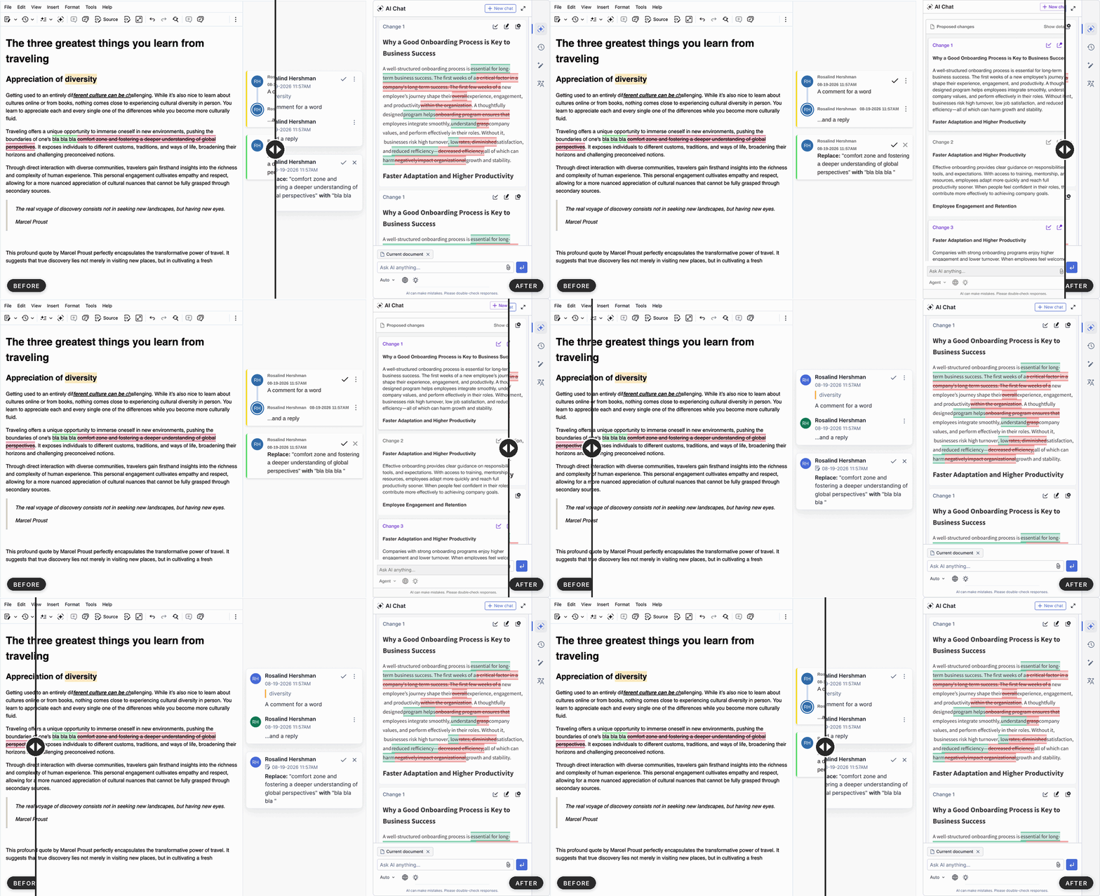

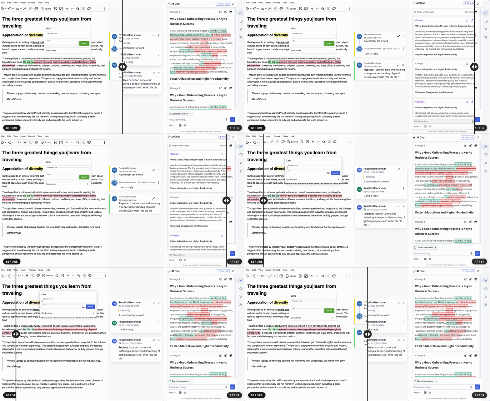
The refresh also updates the content styles with updates to colors of: block quotes, code blocks, horizontal lines and comment/suggestion markers. So published documents and content will automatically look slightly different. If you wish, you can still keep the previous look by loading the legacy theme preset after the editor styles, and use the content styles rollback snippets for published content.
Under that the refreshed look is a reworked foundation. The theme is now built on a reorganized system of design tokens, the editor’s own customization points. By overriding tokens, you can customize the editor’s look more easily than ever before.
Design tokens for theme customizationNEW
The design tokens are CSS variables, organized into three layers:
-
Foundation tokens are the primitives, the base scale, colors, and geometry everything else builds on.
-
Semantic tokens are design-intent roles shared across components, so one change can restyle a whole class of controls at once.
-
Component tokens target a single component, for adjustments that stay local.
Benefits of using the new design tokens
Each value is defined once and flows up through the layers, so a single change reaches every place that uses it – in the core UI, open-source features, and premium features such as AI and collaboration alike. The structure also maps to variables in design tools such as Figma. That makes it practical to bring an existing design system into the editor, or to build a completely new variant, like a dark or high-contrast palette, by redefining the semantic roles.
Customizations are also easier to maintain. Semantic tokens describe intent, such as the hover color of interactive elements, so overrides keep applying as components are added or redesigned. Token names are independent of their default values, so the default look can change in future releases without breaking your overrides. Custom plugins can use the same tokens to stay consistent with the rest of the editor.
Token names follow a convention, so you can easily predict them from the component and property, for example --ck-button-border-radius. You can learn more in the theme token naming and theme customization guides.
Already customized the editor’s appearance? Your changes will not be affected by this update, since your existing variable overrides carry over. For the details, see the Migrating to the refreshed theme guide for exact changes and the backward-compatibility mechanisms.
CKEditor AI: Unified design and AI Review with tracked suggestions
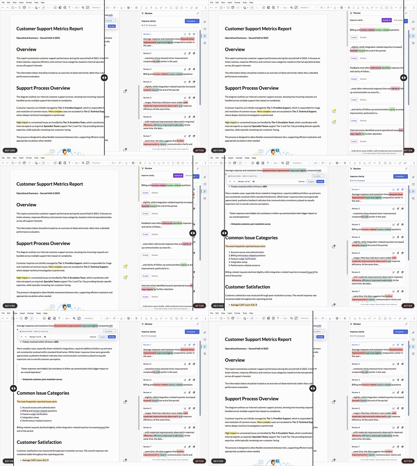
AI Review, AI Quick Actions, and Proposed Changes in AI Chat now share the same cards and controls, for one cohesive AI experience. The whole AI interface, including AI Translate, also uses the refreshed theme and follows the same token overrides as the rest of the editor.
AI Review has a new design and a Suggest action. Previously, proposed AI Review changes could only be applied directly to the content. Now, similar to AI Chat, they can also be added as Track Changes suggestions, so they can be accepted or rejected like any other suggestion. As you work through the proposed changes, a navigation panel moves with you from one change to the next, right in the content, and a progress bar shows how many you’ve reviewed.
Already customized the CKEditor AI’s interface? Unlike the core theme, the AI components do not fall back to legacy variable names, so please update your overrides to the new names. The AI package section of the migration guide lists the name mappings.
Trusted Types supportNEW
Applications with strict security often enforce Trusted Types, a browser feature that helps prevent cross-site scripting by blocking raw HTML strings from reaching the page. They turn it on through their Content Security Policy, with the require-trusted-types-for 'script' directive. Until now, this blocked the editor too: the browser rejected the HTML it inserts, so it could not run in these applications at all.
As of v49, CKEditor 5 works in these applications. Every place the editor inserts HTML, including premium features, now routes through a Trusted Types policy named ckeditor5.
For organizations that require Trusted Types, this removes a blocker to adopting the editor. It runs under the enforced policy as is, with no need to weaken the policy or add exceptions for the editor. The policies it needs have fixed names – ckeditor5, plus a few documented ones that depend on how you load the editor and which features you use – so the allowlist in your Content Security Policy stays short and explicit. Where third-party code cannot route its HTML through a policy, such as the color picker or the Uploadcare dialog, the editor turns that part off and logs a warning instead of failing, and each such case is listed in the documentation.
Trusted Types support builds on the editor’s existing Content Security Policy compatibility. The CSP guide lists every directive the editor needs, explains how each one affects specific features, and documents the strictest configuration the editor runs with, so you can tighten your policy to match your requirements.
The policy does not sanitize content, so validating the data you load into the editor remains your responsibility. You can see the Trusted Types section of the CSP guide and the trustedHtml() API docs for more information.
Update CKEditor 5 with your AI coding agent NEW
Major releases like this one come with breaking changes, and updating means working through every update guide between your version and the new one. The new official ckeditor-update skill does that for you. Tell your AI coding agent “Update CKEditor 5 to the latest version” or name the exact version you want. Your agent will apply the changes to your code and then check that the editor still works as before.
The skill uses the open Agent Skills format, so it works in Claude Code, Cursor, Codex, GitHub Copilot, and other agents that support it. Install the CKEditor 5 skills with one command:
npx skills add ckeditor/skillsSee the Using CKEditor 5 with AI coding agents guide for setup options and other related agentic features.
Error handling without the Watchdog
Error handling is simpler in v49. If an editor crashes, it now stays in place with its content and undo history intact, so users keep their work. To make that possible, we removed the @ckeditor/ckeditor5-watchdog package and the automatic restart it performed.
For notifications, the new onEditorError() function reports any error that escapes an editor, along with the editor or context it came from. It only observes, so nothing is restarted and the error still reaches the console. If you are using ContextWatchdog to share a context between editors, you will need to create the Context yourself and pass it in the configuration you use when creating each editor.
For more details:
-
The Error handling guide covers registering a handler.
-
The Migrating from the Watchdog guide walks through the upgrade for plain JavaScript, React, Vue, and Angular.
-
The v49 update guide lists the breaking changes.
Before you update: v49.0.0 includes several major and minor breaking changes across different features. See the changelog for the full list.
Quick links for CKEditor v49.0.0
Learn more about previous CKEditor 5 versions
-
CKEditor 5 v48.5.1 and LTS v47.7.4 Release Highlights: Security Fixes
-
CKEditor 5 v48.4.0 Release Highlights: AI Context Library and Image Understanding
-
CKEditor 5 v48.3.0 Release Highlights: Programmatic API for CKEditor AI
-
CKEditor 5 v48.2.0 Release Highlights: AI Chat Improvements, Media Embed, and More
-
CKEditor 5 v48.1.0 Release Highlights: CKEditor AI Chat Improvements and AI in Multi-root Setups
-
CKEditor 5 v48.0.0 Release Highlights: Installation Methods Transition Completed
-
CKEditor 5 v47.6.0 Release Highlights: CKEditor AI On-Premises and Improved AI Customization
-
CKEditor 5 v47.5.0 Release Highlights: AI Translate, Export to PDF v2 and more
-
CKEditor 5 v47.2.0 Release Highlights: Introducing CKEditor AI and Footnotes
Tags: