5 Tips on How to Improve Accessibility When Creating Your Web Content in a WYSIWYG Editor
Reaching out through Web Accessibility
The first thing you usually want to achieve when creating online content is to reach the maximum possible audience. Most ways of increasing your reach are usually connected to digital marketing campaigns and online advertising, however you have to be sure that your content was created accessible from the get-go.
The issue of Web Accessibility (often referred to as “a11y”) is gaining momentum, since it is not only a question of complying with government regulations and web standards, but there are clear financial benefits for the makers of web services whose websites and online products are fully accessible.
In layman’s terms - Web Accessibility is all about making sure that your content is created in such a way, that it has the potential to be received by the maximum amount of viewers, despite their disabilities or the technical platforms they use.
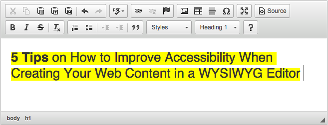
Here are just a few easy steps to make sure that the content you create in a WYSIWYG editor is accessible. Our editor of choice will be CKEditor, but these steps are easily replicable in any other tool.
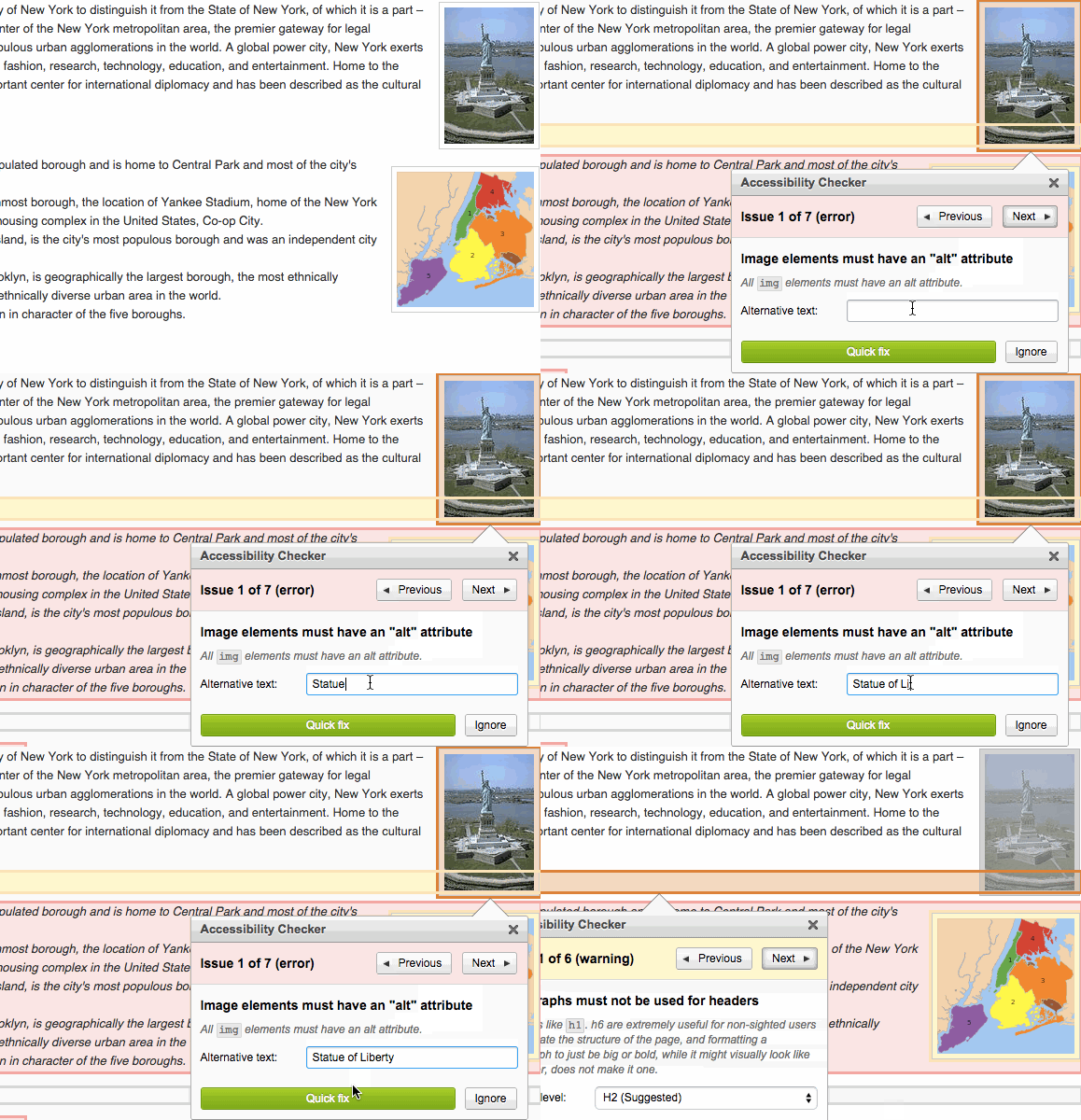
Apply proper alt tags for images
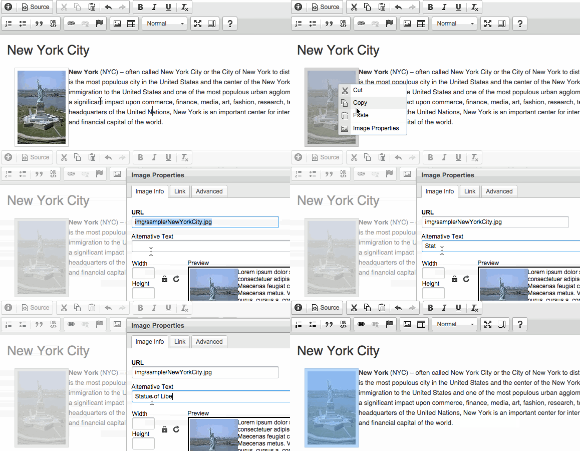
Most images require the alt attribute. It specifies an alternate text for an image, if the image cannot be displayed (because of slow connection, if the user uses a screen reader etc.) The ideal alt tag should be a clear, brief, contextual and SEO conscious description of what is portrayed in the visual, so forget about simply copying the name of the image file (i.e. 3ce00b07d39a1aeb2dd2.png) and inserting it as your alt tag.
How to do it:
- Right click on the image
- Click on “Image Properties”
- Insert proper value in “Alternative text” section
Apply semantic headings
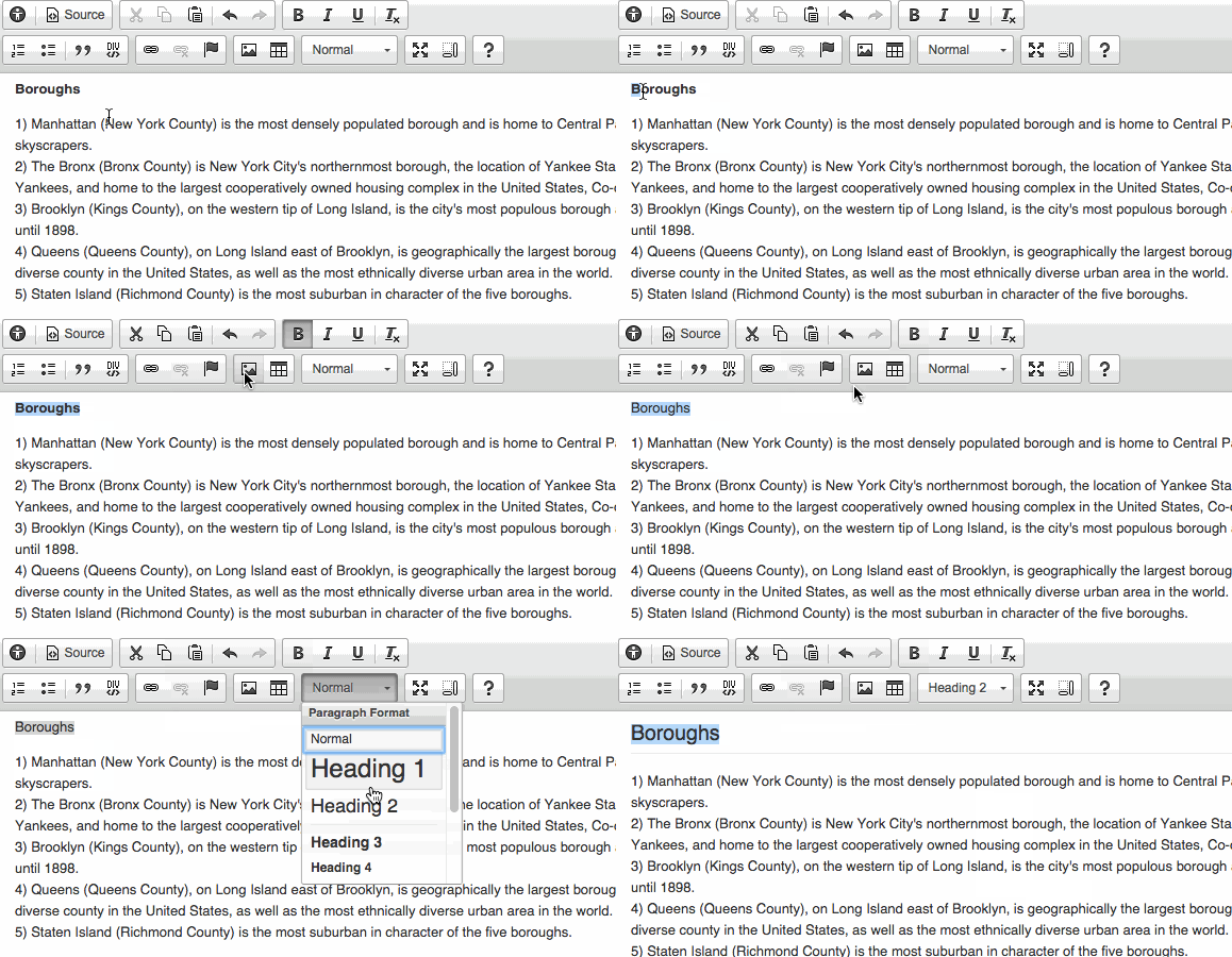
In HTML, semantic elements are the ones which clearly describe their meaning to both the browser and the developer. The problem of non-semantic headings appears when the author of the content tries to create headings using strictly visual HTML techniques such as bold text, increased font size etc. Applying semantic headings is really useful for both users and creators of the content. Users benefit from the clear structure of the content, while the author benefits from headings being search engine friendly.
How to do it:
- Select the text you want to turn into one of your headings
- Remove the wrong formatting (bold element, increased font size, CSS class etc.)
- Select the heading of your choice from the format dropdown menu (remember about the consequent use of headings - H1 > H2 > H3 and so on)
Apply semantic lists
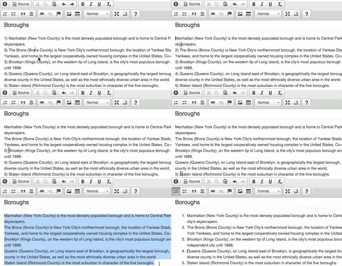
HTML has also its semantic tag for unordered and ordered lists, so creating lists using just plain text is a no-no. When using semantic lists you will be able to easily nest lists within lists, which means that loooooooong lists with many sublevels will no longer be a nightmare.
How to do it:
- Select the text you want to turn into a part of a list
- Remove the wrong formatting (plain text enumeration beginning with characters like “1.” “a)” “•” etc.)
- Use the “Insert Numbered List” or “Insert Bulleted List” tool to create your list
Apply semantic table headings
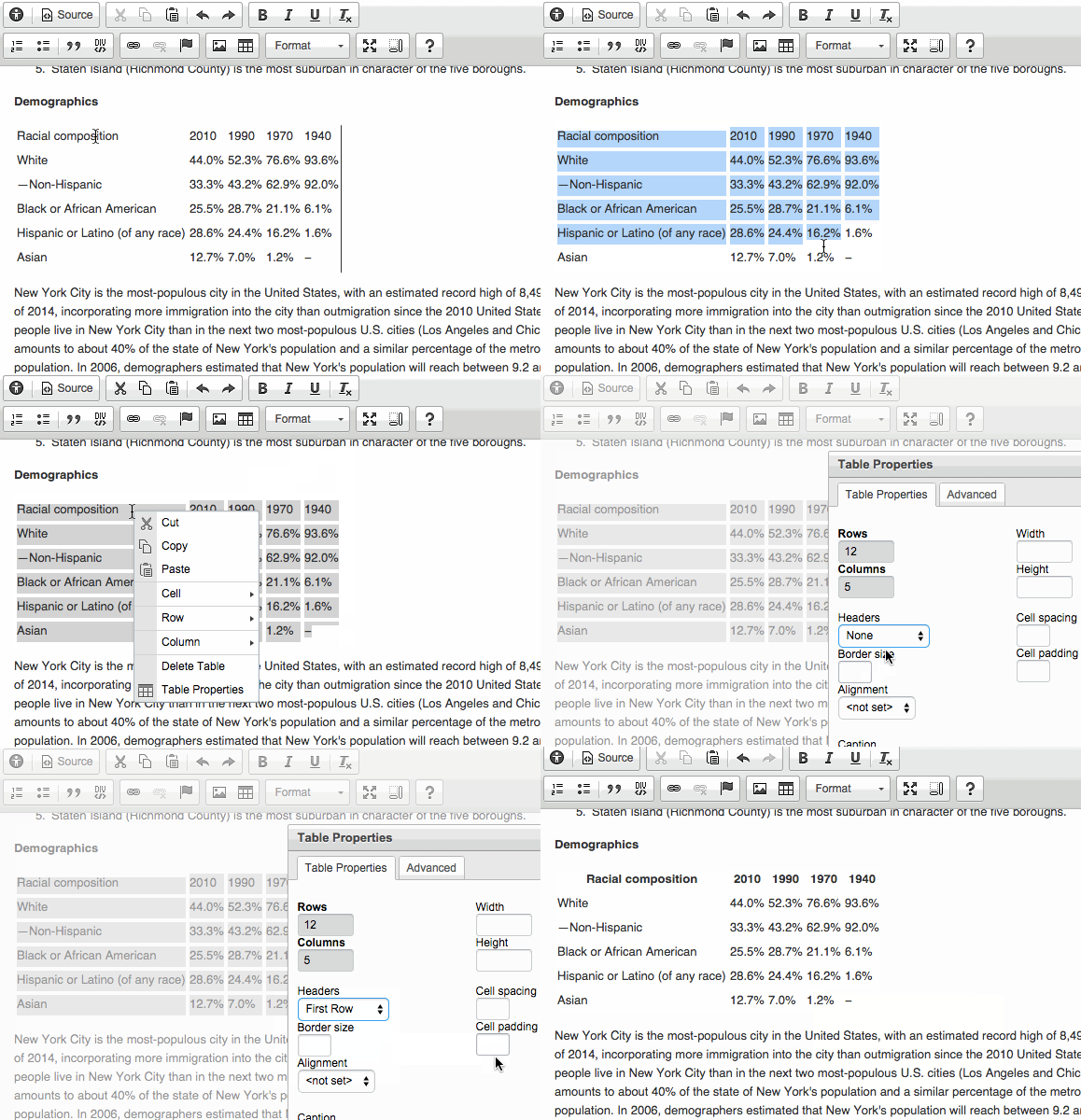
Without properly formatted table headings (especially when displaying large amounts of data) users with vision impairment will have a hard time understanding what the table is about. Screen readers will be simply missing the context when reading the table out loud. Using bold text or increased font size as headings will not do the trick.
How to do it:
- Right click on the table
- Select “Table properties”
- In “Headers” dropdown select the relevant row/column that will serve as the heading
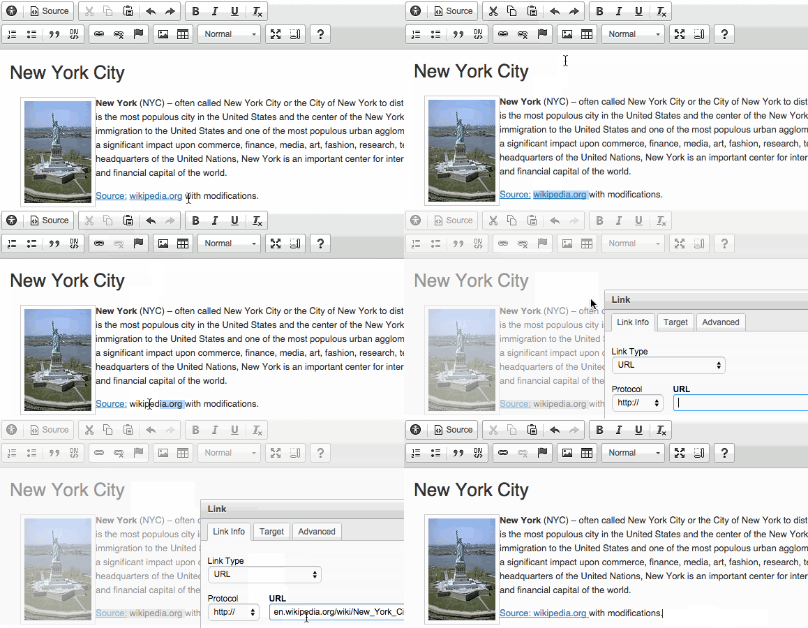
Remove subsequent links with the same URL from your content
Users with disabilities are often listing out all the links on the page they are currently visiting just to see where they can go next. Imagine ending up with a large list of subsequent links that lead to the same URL. It creates confusion and makes life harder to all “keyboard-only” users (those with disabilities as well as those who use old mobile phones to surf the web).
How to do it:
- Decide which bit of text will point to the URL of your choice
- Remove all other subsequent links leading to the same URL from your content
Accessibility Checker
If you create content with a WYSYWIG editor on a regular basis you know that these issues are sometimes hard to spot at a first glance. However these simple examples of best practice can really improve the accessibility of your online content.
In order to save your time and make sure that you implement proper accessibility standards on your website, we have created the Accessibility Checker - the first tool that enables you to check your content for accessibility issues and fix them before you go live.
It is built upon three key elements:
- User interface optimized for quick problem solving
- Flexibility allowing you to use the accessibility checking engine of your choice
- Quick Fix feature allowing you to eliminate common problems fully automatically
For more info on Web Accessibility and the latest a11y standards go to W3C Web Accessibility Initiative website.
You can read more on the topic of Web Accessibility in our blog posts:
- The Technology We Use Shouldn't Limit Us from Finding a Connection
- Commercial Benefits of Accessibility
- Accessibility, usability and SEO go hand in hand
- If You're not Thinking About Accessibility - a Talk with Marcy Sutton
- A web that excludes only people with disabilities
- Accessibility, availability and Progressive Enhancement
- Accessibility Checker Goes Open Source
- CKEditor + WAI-ARIA = Usable Accessibility
- Web accessibility testing - DIY!
- Button - why is simple not that simple?
