Button - why is simple not that simple?
Some things are regarded as simple. A button is a great example of it: a small rectangular thingy that can be clicked. I mean — that’s it, that’s the button, there isn’t anything complex about it… or is there?
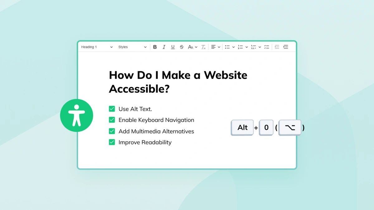
Making a button is easy but making an accessible button is a totally different beast. There are certain matters that the button maker must consider during their work. And all of them are written in WCAG. This ominous stuff is not any kind of dark magic spell but a name of a web standard that describes how to create accessible experiences. The full name sounds much more human-friendly: Web Content Accessibility Guidelines. The current version of these guidelines is WCAG 2.1.
WCAG is divided into four main accessibility principles (POUR — Perceivable, Operable, Understandable, Robust). The principles are divided into guidelines (e.g. “Keyboard Accessible” or “Text Alternatives”) which further branch into success criteria. Each success criterion describes one feature that should be accessible, like the ability to navigate via keyboard to every interactive element on the page. Additionally, success criteria are divided into three levels — A, AA, and AAA. The A level means the basic accessibility, AA — better accessibility and AAA — “the best” accessibility (defined in the standard!).
“But that sounds really complicated!” — I hear you screaming. And yes, WCAG can be intimidating at first but fortunately, there are additional resources that help with grasping this standard. The first one is a quick reference that sums up the whole standard into a more readable list of all success criteria with techniques that can be used to meet them. There is also the Understanding WCAG 2.1 resource, describing every success criterion in detail, and Techniques for WCAG 2.1, containing a list of techniques that could help you make your website more accessible. And thanks to them, WCAG is not (that) scary anymore!
Let’s look into our spell book specification then, to see how an accessible button should look and behave! I have prepared a totally inaccessible div-based button that needs some accessible love.
Overall appearance of a button
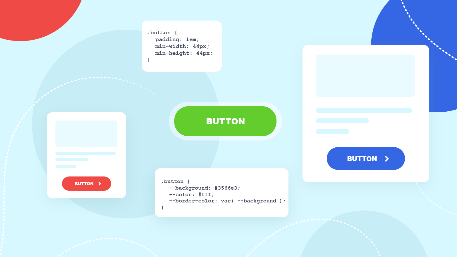
We all know what the button looks like. But WCAG contains some more guidelines about it. The first one is 2.5.5 Target Size — the button should be at least 44 pixels wide and 44 pixels high so that more users could click or tap it. Some users could have motor impairments that would not allow them to make precise mouse movements. Other users could experience seizures that would also prevent them from aiming right at the button. Having said that, I also remember well enough all these tiny buttons that were too small for my thumb — and I bet that you remember some of them, too!
Making a button big enough could be done in several ways, for example setting its min-width and min-height to 44px or by setting its padding (e.g. 1rem). I personally tend to use both of these approaches. Setting the padding makes the button nicer while min-widthand min-height make sure that for a button with little text, the dimensions are still meeting the WCAG’s success criterion:
.button {
	padding: 1em;
	min-width: 44px;
	min-height: 44px;
}
The button now has correct dimensions — let’s then jump to colors! They are described in the 1.4.3 Contrast (Minimum), 1.4.6 Contrast (Enhanced) and 1.4.11 Non-text Contrast documents. According to these guidelines, the contrast ratio between the button’s text color and the button’s background should have the value of 4.5:1 (for AA level) or 7:1 (for AAA level). As I’m not that good at choosing the right colors, I borrowed them from the W3C’s design system (I hope they don’t mind). This way the background of the button becomes #005797 (for those of us who still can’t visualise such colors in our heads: it’s a dark blue shade) and the text color — #fff (white). I also set the border color of the button to the same as its background (so the border is not visible):
.button {
	--background: #005797;
	--color: #fff;
	--border-color: var( --background );
}
We’re done with the contrast inside the button. But the whole button should also have a contrast ratio of at least 3:1 against its neighboring colors (so basically — between the button and the content that surrounds it). Fortunately, it’s already done! Our dark blue has a contrast ratio of 7.47 against its surrounding content (in our case — the page’s white background).
But how to check whether the contrast ratio is enough? There are several tools for this. My favorite ones are whocanuse and contrast ratio. The former shows how the combination of colors is seen by various people with visual impairments, color vision deficiencies, or simply by someone that is looking at their phone’s screen during a very sunny day. The latter is a much simpler tool that just calculates the contrast ratio between given colors. The contrast ratio is also checked by nearly every automatic accessibility checker, like aXe, WAVE or Lighthouse. And if these sound too fancy for you, you can always use a formula to calculate the contrast ratio yourself.
Identification
After making the button look like a button we need to make the button be seen as one by the assistive technology. This requirement is described in the 1.3.1 Info and Relationships and 1.3.6 Identify Purpose documents.
A browser is like a forest — it contains a lot of trees. One of them is an accessibility tree. It contains information about how each HTML element on the page should be presented to the assistive technology, for example, a screen reader. Most HTML elements have their default semantics, so <h1> is presented to the assistive technology as a heading, level 1, <a> as a link, and so on.
Sometimes, however, semantics needs to be added (in more complex cases that don’t have their dedicated HTML elements, like data grids) or changed (like a <div> that pretends to be a button — hey, that’s our case!). That can be done by adding an ARIA attribute — [role].
ARIA is another web standard and stands for Accessible Rich Internet Applications. While WCAG provides general guidelines for creating accessible experiences, ARIA is a much more technical standard that describes how to inform assistive technology about the roles and states of elements on the page. It’s intended to use when HTML does not provide means to describe more complex kinds of widgets. However, it can also be used in cases where someone broke accessibility — intentionally or not. It’s a powerful tool and that’s why it should not be used lightly. The first rule of ARIA is: you do not talk about ARIA, you do not use ARIA if something can be done via HTML.
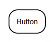
But let’s assume for now that there is no other way to make our button a button than to use ARIA. There is a button role that can make any HTML element be seen as a button by the assistive technology. Let’s add it to our button:
<div class="button" role="button">Button</div>Voilà! The button is now a button.
Keyboard interaction
Every button should be operable using only the keyboard. It’s stated in the WCAG in 2.1.1 Keyboard and 2.1.3 Keyboard (No Exception) that all functionality should be available this way. In case of the button, it should respond to both Space and Enter keys. ARIA Practices is a really good place with examples of how various widgets can be implemented in an accessible way.
But to be able to use the button via the keyboard, the button must be focusable. Without being focusable it’s impossible to interact with the button using a keyboard. Fortunately, there is a way to make anything focusable: the tabindex attribute! Adding it to the button will make it focusable:
<div class="button" role="button" tabindex="0">Button</div>Yet, even after focusing the button, pressing Enter or Space does nothing… You need to add keyboard interaction in JavaScript for a div-based button:
button.addEventListener( 'keydown', ( { key } ) => {
	if ( key === 'Enter' || key === ' ' ) {
		handleClick();
	}
} );
Thanks to the keydown event and recognizing the pressed key using the event.key property, it’s possible to fire a click handler also on “clicking” by a keyboard.
But there’s still a problem with the keyboard interaction…
Focus and other states
It’s really hard to tell if the button is focused due to the fact that it does not change its appearance. And WCAG requires it in the 2.4.7 Focus Visible success criterion for AA level. At the same time we can’t forget about 1.4.11 Non-text contrast — a button in any state should have the contrast ratio of at least 3:1 against its surrounding content. Also 1.4.3 Contrast (Minimum) and 1.4.6 Contrast (Enhanced) are important — the content in the button should be readable in any button’s state.
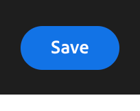
There are many techniques for making an accessible focus indicator and Sara Soueidan describes most of them in detail. In the case of our button, let’s use the same technique that W3C uses in their button: the background of the button is changed. As an experienced color thief, I again borrowed the W3C’s focus styles and now the button in focus state has #f9dc4a (a shade of yellow) for the background and #000 (black) for the text color. Also, the button’s border is set to the text color (black). Additionally, the original button’s outline is hidden as the alternative styling is provided (remember, never remove the outline without making an alternative for it!):
.button:focus {
	outline: none;
	--background: #f9dc4a;
	--color: #000;
	--border-color: var( --color );
}
Thanks to changing the text color to black, there is still enough contrast ratio between the button’s text and background… But the contrast ratio between the button’s background and its surrounding content (white background) is not that good anymore! Have we failed?
Fortunately no. The trick here is the presence of the border that is black. And the contrast ratio between that border and the page’s white background is high enough. Sara explains it in detail in her article.
There is also one more thing to consider: WCAG 2.2 is coming. And it contains two more success criteria for focus indicators — 2.4.11 Focus Appearance (Minimum) for AA level and 2.4.12 Focus Appearance (Enhanced) for AAA level. And once again, Sara describes them in detail in her article (you really should read it!). I just want to point to one thing — these two criteria require the contrast ratio between the unfocused and focused states to be at least 3:1 (for AA level) or 4.5:1 (for AAA level). The trick with the background change allows us to meet this requirement.
WCAG does not mention any requirements for other states, like :hover or :active, but adding them would definitely make the user experience better. I decided to add some subtle color change:
.button:hover {
	--background: #024488;
}
.button:active {
	--background: #d7cb39;
}
And now our button is accessible!
Windows High Contrast Mode
Or at least our button is accessibilish because there is at least one scenario in which it can fall short: Windows High Contrast Mode. In this mode much of the styling is removed by the browser and the colors are set to some predefined values that ensure a high contrast ratio. And our div-based button looks much more like plain text than a button.
This issue is even more apparent in React Native docs which presents a buttons withoutthat do not add any styling for border:
If there was a way to make a completely accessible button…
Use the Platform, Luke!
Well, there is! You can use the <button> element to create… a button. You see, the button element is called a button for a reason: it’s intended to be used for creating buttons. And by using a button element to create a button you can be sure that your button is an accessible button! Using a native HTML solution gives us keyboard interaction and focus management for free, ensures that an element is correctly described in the accessibility tree and makes the button look like a button in high contrast mode.
So why would anyone want to base that clicky thingy on a <div> element? One of the main reasons was the inability to style a button element in more complex ways. There were also some bugs in browsers, like the lack of support for flexbox inside button elements. Fortunately, these bugs are now fixed and styling is super easy thanks to all: unset.
But there are still some little pitfalls waiting along the way. First of them is the fact that focusing button elements work everywhere… except Safari — at least by default. Due to some design decisions, navigating using a keyboard on macOS does not focus buttons by default. You need to enable it. However, I’d say it’s not our fault but the fault of the operating system and its conventions. Yet, it could be troublesome in some cases.
Another pitfall is connected with the fact that many buttons contain only an icon, without a text label. And it means that sometimes the user would encounter a button with such an icon:

If you don’t know what that icon means, it’s supposed to be a universal icon for changing the language of the page. Apparently, it’s so universal that nobody knows about it… There are also icons that changed their meaning due to their usage. A good example can be a globe icon which was used some time ago as an icon for changing the localization of the site. Then Facebook started using it as an icon for notifications. And due to Facebook’s popularity, the globe icon changed its meaning for many users — it’s now connected with notifications.
The next pitfall is connected with a cursor for a link. Many think it should be a pointer while others think it should be the default one. Adam Silver makes some compelling arguments for the default one: a pointer was meant for links and operating systems do not add a pointer for native buttons. But at the same time, Bootstrap uses a pointer for buttons and due to its popularity users could be already used to it. So it’s best to test with your users to check if they understand (or even expect!) a pointer for buttons.
And there is that whole issue with touch devices and optimizing buttons primarily for touch, not for the mouse. It requires some additional thinking, for example, how to prevent accidental taps on buttons when the user is scrolling the page. Rick Hanlon gave a really good talk about it.
Buttons are hard
Buttons are hard and I have an anecdotal proof for it! Adobe prepared a series of articles about creating a button:
- Building a Button Part 1: Press Events,
- Building a Button Part 2: Hover Interactions,
- Building a Button Part 3: Keyboard Focus Behavior.
And the end result is… a button, just a button.
So don’t be ashamed if your buttons aren’t perfect yet. They’re simple as a user control but very hard to implement.
They also aren’t the only simple things that aren’t that simple. However, it’s a story for another time.
You can read more on the topic of Web Accessibility in our blog posts:
- The Technology We Use Shouldn't Limit Us from Finding a Connection
- Commercial Benefits of Accessibility
- Accessibility, usability and SEO go hand in hand
- If You're not Thinking About Accessibility - a Talk with Marcy Sutton
- A web that excludes only people with disabilities
- Accessibility, availability and Progressive Enhancement
- Accessibility Checker Goes Open Source
- CKEditor + WAI-ARIA = Usable Accessibility
- Web accessibility testing - DIY!