Web accessibility testing - DIY!

Every website should pass through an accessibility audit to check if it is really inclusive for every user willing to use your product. However, very often you do not have the time or funds to go for a complete, professional audit. Sometimes it is enough to check the basics and increase the accessibility on your own. This checklist will help you perform a basic web accessibility audit to ensure that some common accessibility issues present on your site will be wiped out with a reasonable effort.
Web accessibility checklist
- Automated web accessibility testing
- Web-based testing
- CLI or in-browser testing
- Code validation
- Check the contrast and use of color
- Check the language of the page
- Check the landmarks
- Check the headings outline
- Check the image alternative texts and multimedia captions
- Check the form element labels
- Check the keyboard navigation
- Skip links are present
- Interactive elements are accessible
- The focusing order is correct
- The indicator of the current focus position is visible
- Check if your design is responsive
- Performance testing
- Perform a basic test using a screen reader
- Test with real users
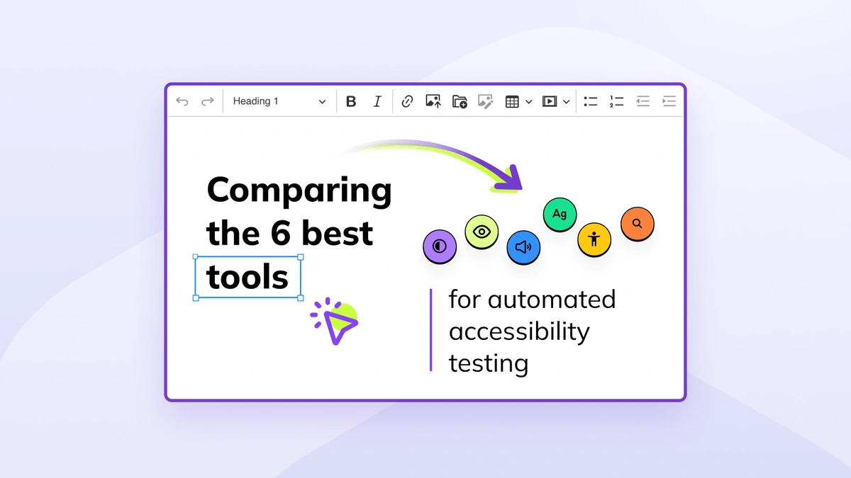
Automated web accessibility testing
Some of the web accessibility issues (like not enough contrast) can be detected by using automated checkers. These tools are really good as the first step in performing an accessibility audit of your site. However, they can detect at most 30-50% of all accessibility issues and from time to time they can be wrong. Sometimes it is also good to use several of such tools, as each one can point to different issues.
There are basically three types of such tools: web-based ones, running in a command line interface (CLI) and running as an extension of the browser or the browser developer tools.
Code validation
One of the WCAG success criteria is syntactical correctness of documents written in a markup language. In the case of web pages, it means that your HTML should be well-formed. In other words, WCAG requires that every HTML tag is correctly opened, closed and nested. Contrary to a popular misconception, it does not prevent the use of Custom Elements as long as they are conforming to syntax rules of HTML.
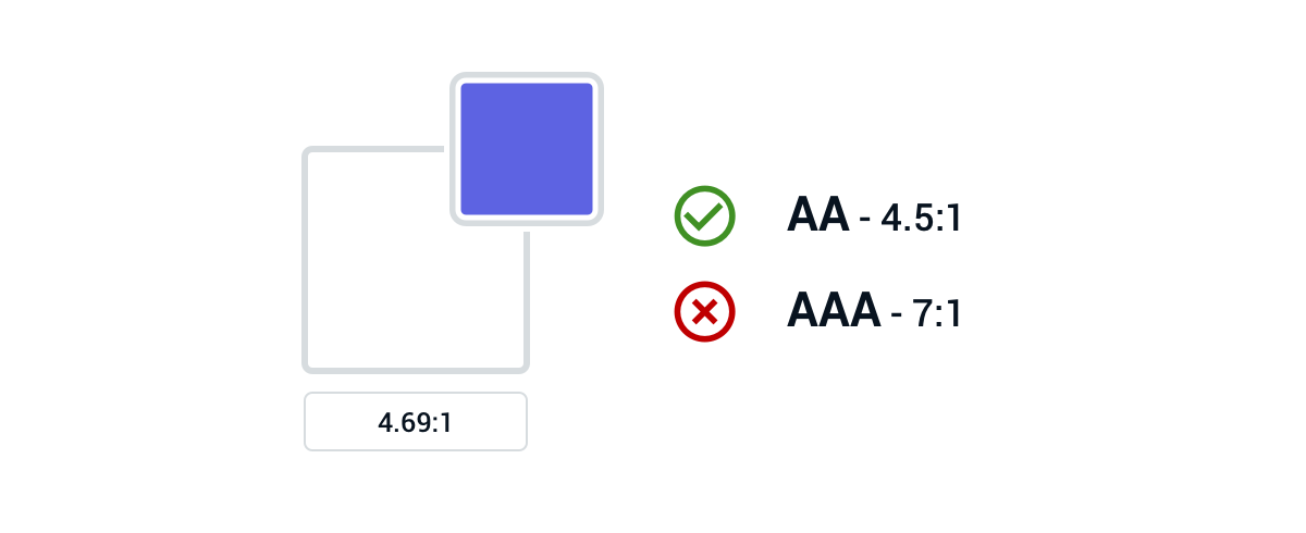
Check the contrast and use of color
As already mentioned, issues connected with contrast can be detected by automated testing. However, it is always good to do some manual testing in this regard. Automated web accessibility testing often has trouble with checking contrast for elements that have an image background (as it is not a single color) and does not check interactive states of elements (for example, if the focus outline has enough contrast).
Contrast is also not the only issue connected with colors that can be present on a website. Some people suffer from color blindness, therefore conveying important information only through color is not enough. This is why some conventions, like underline for links, are really helpful for distinguishing between different elements.
There are several tools that can help you with this aspect of web accessibility testing, for instance, ChromeLens. It simulates how people with different kinds of vision impairments (including low vision and color blindness) see your website.
Check the language of the page
Every website should specify the language that its content was written in. It can be done by adding the lang attribute to the <html> element:
<html lang="en">This information is used by assistive technology in several ways, for example, it tells automated translators which language should be used as the source one. Screen readers also use this information to correctly read out the content.
Check the landmarks
HTML5 and ARIA introduced the concept of website landmarks. They replace non-semantic <div> elements that were used to build the page structure before them. Thanks to them you can now divide your pages into logical regions corresponding to ARIA roles, like:
banner– Introductory content, most often the<header>of the page.contentinfo– Some meta information about the page (author, copyright, etc.), most often the<footer>of the page.main– The main content of the page.nav– Navigation region.
A sample page structure can look like this:
<nav>
  Topbar menu
</nav>
<header>
  <h1>Page title on a hero image</h1>
</header>
<main>
  The main content
</main>
<footer>
  Copyright © 2019 CKSource
</footer>
The page structure uses standard HTML elements to create appropriate landmarks, as every HTML element has an implicit ARIA role.
These regions are used by assistive technology to help the users easily navigate through the page, for example by providing convenient keystrokes for jumping between website landmarks.
Check the headings outline
Web pages are often called documents — and not without a reason. On the most basic, content level they are inspired by newspapers and just like printed articles, they are divided using headings. In fact, the whole concept of sectioning content in HTML is based on enforcing the meaning of headings with additional tags. What is even more important, research shows that headings are the preferred navigation method by screen reader users.
Personally, I use the Headings First Principle to divide the content of the page. I start with the main heading of the page, containing its title, and then add appropriate subtitles:
<h1>Languages of my life</h1>

  <h2>JavaScript</h2>

  <h2>HTML</h2>

  <h2>CSS</h2>
If some section needs an additional subsection, I repeat the whole process with an appropriate heading level:
<h1>Languages of my life</h1>

  <h2>JavaScript</h2>

    <h3>History</h3>

    <h3>Current usage</h3>

  <h2>HTML</h2>

  <h2>CSS</h2>
After dividing the page using headings, I add an appropriate sectioning element for every heading:
<main>
  <h1>Languages of my life</h1>

  <article>
    <h2>JavaScript</h2>

    <section>
      <h3>History</h3>
    </section>

    <section>
      <h3>Current usage</h3>
    </section>
  </article>

  <article>
    <h2>HTML</h2>
  </article>

  <article>
    <h2>CSS</h2>
  </article>
</main>
This way I can easily divide the whole page into appropriately named sections.
When dividing the page using headings, it is important to remember that the HTML5 outline algorithm does not work and therefore heading levels must be used in conjunction with sectioning elements.
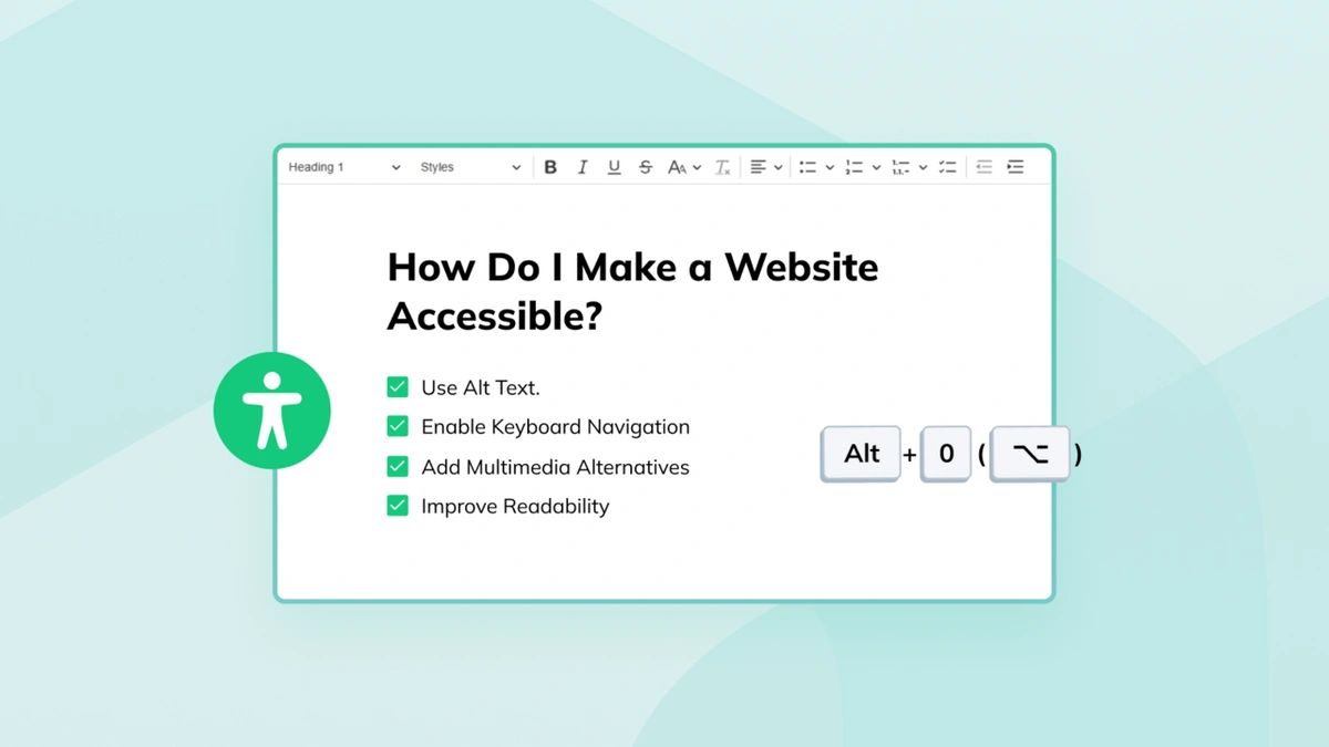
Check the image alternative texts and multimedia captions
This is probably the most basic web accessibility feature and the one that is easiest to implement. Yet this issue is nearly as popular as not having enough contrast.

Many of image alternative texts provided by alt attributes are optimized not for users, but for SEO. Additionally, in many cases, this attribute is employed as a means to display an alternative in the case when the image was not loaded (for example due to network issues). However, this is not its only (or main) use. Alternative texts are used by assistive technology to present the image content to the users that cannot see it.
Fortunately, this kind of issue is easy to detect with automated testing and the HTML specification has many examples of proper alt attributes. The rule of thumb is to choose the correct alternative text based on the context in which the image is presented.
An article about trends in using JavaScript tools could serve as an example here. An image with a chart could be embedded in the middle of the article to show the trends:
<article>
  <h1>Trends in using JavaScript tools</h1>

  <img src="chart.svg" alt="Chart">
</article>
“Chart” is a bad alternative text for this image. It does not convey the information that is presented on the chart. A much better option would be to describe the actual numbers:
<article>
  <h1>Trends in using JavaScript tools</h1>

  <img src="chart.svg" alt="Chart: In January 47% of developers were using some JavaScript tools. In March this number grew to 48%.">
</article>
Providing captions for multimedia, especially if you host them on a third-party service, is more troublesome. Many of such services (e.g. YouTube) have a useful option to add closed captions to your video. In the case of audio files, always include transcription.
Check the form element labels
Every form element should have a readable label. The only exceptions are buttons and hidden fields.
Labels are so important because they are used by assistive technology to present the purpose of the focused field to the user. Without it, the users will not be able to understand what they are supposed to type into the field.
Additionally, visible labels are helpful for other users, as browsers tend to autofill forms. This hides the labels provided inside the field and leaves the user to wonder whether the form was autofilled correctly. A label is always much more understandable than an icon that aims to represent the same information.
In the case of checkboxes and radio buttons, it is also good to provide information about the purpose of the whole group, not only individual options. It can be done using the <fieldset> and <legend> elements:
<fieldset>
  <legend>My favorite foods</legend>

  <label>
    <input type="checkbox" name="foods" value="pizza"> Pizza
  </label>

  <label>
    <input type="checkbox" name="foods" value="burger"> Burger
  </label>

  <label>
      <input type="checkbox" name="foods" value="pasta"> Pasta
  </label>
</fieldset>Check the keyboard navigation
The ability to navigate the site using the keyboard is one of the most basic web accessibility features. It consists of several subfeatures.
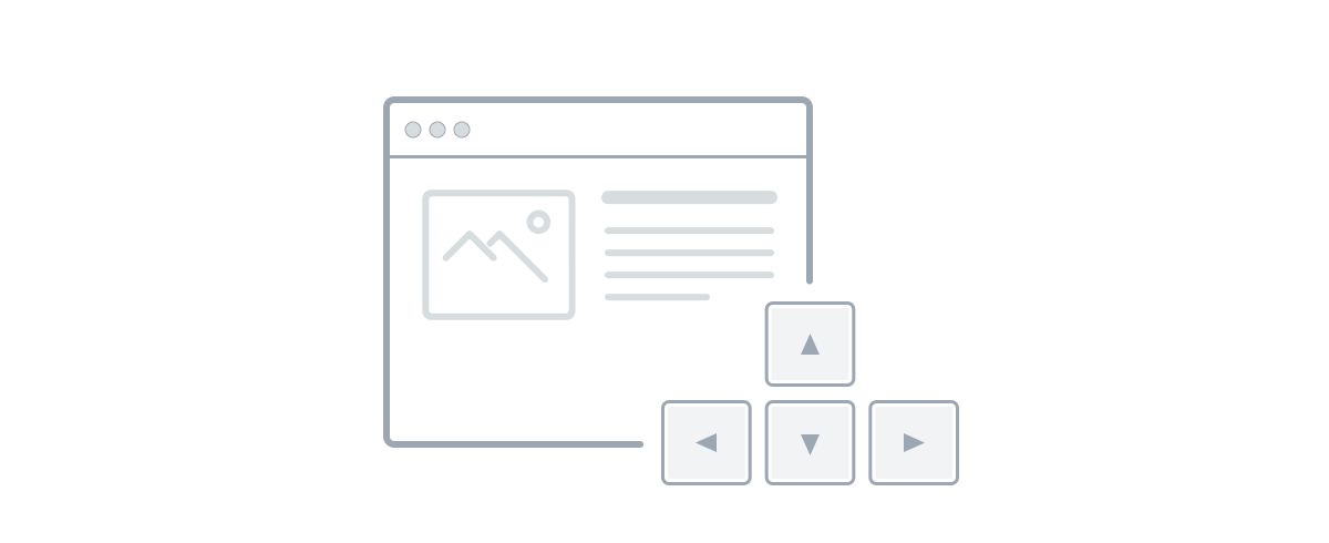
Keyboard navigation is important because there are several groups of people that cannot use the mouse or other precise pointing devices. This is the case for people with disabled arms or hands, people with motoric deficiencies or simply people with temporary disabilities (like a broken arm) as well as people that do not want to use the mouse (like power users using keystrokes to control their computers).
Skip links are present
The structure of the page often begins with an enormous header area that contains lots of links (often hidden in dropdown menus). Users of screen readers can easily skip the whole region by navigating to another landmark or heading, but users that use the keyboard — due to their inability to use the mouse or just because they prefer keystrokes — are out of luck. Therefore it is nice to include skip links at the beginning of the page to allow the user to easily skip the whole page header and get directly to the main content.
Interactive elements are accessible
Every link, button or another interactive element should be accessible with the keyboard. It means that every interactive element should be focusable. It can be achieved by using only <a> and <button> tags to create such elements. The rule of thumb is simple: if it triggers navigation, it is a link. If it triggers an action on the page, it is a button.
The order of focusing is correct
Elements are focusable in the order in which they appear in the DOM. It means that the visual order of elements should be consistent with the DOM order. Otherwise, the user can feel confused and lose the current focus position.
It can be really cumbersome to keep these two focus orders in sync in more complicated layouts, but this is the reality that we need to adjust to — at least for now.
The indicator of the current focus position is visible
When navigating using the Tab key, the current focus position is indicated by appropriate :focus styles. It is really important to check if focused elements have a visible focus indicator. It does not need to be an outline — it can be an underline, a pointing arrow that shows up or even some kind of a subtle animation.
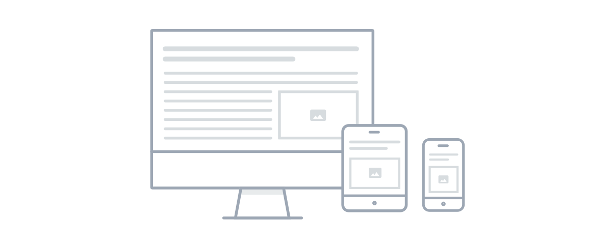
Check if your design is responsive
Mobile devices are becoming more and more popular nowadays. They are nearly as popular as desktop ones (in many regions already more popular). Creating a non-responsive site is equal to excluding certain groups of people.
In the case of the WCAG standard, the most basic measurement of responsiveness is the ability to zoom the content to at least 200% without losing the ability to read it. To conform to the standard, you cannot disable zooming via the <meta name="viewport"> tag.
WCAG 2.1 introduced some advice for interactive elements to be at least 44 pixels wide and 44 pixels tall. Such size should allow users without a precise pointer (like those using a touch screen) to tap the elements they really want to interact with, not the elements in their neighbourhood.
Performance testing
Contrary to the popular belief, performance is, in fact, an accessibility concern. Creating a non-performant site excludes certain groups of people. It affects not only people with poor connection but also people that have to pay for the Internet access. In other words: performance is a factor that can easily exclude some users from accessing your site. Checking the website performance should be included in your web accessibility testing routine.
The most basic, automated performance test can be done using LightHouse, built into Chrome developer tools. It checks not only the performance of network operations (download time and resource sizes), but also the time needed by JavaScript to be properly parsed and executed. Google provides many guidelines that can improve the performance of your website and many of them are linked in LightHouse results. A more traditional tool, WebPageTest, focuses mostly on the network aspect of the website performance.
Perform a basic test using a screen reader
A recommended web accessibility testing method is to use some kind of assistive technology to access your page. Probably the most common one is a screen reader.
There are several screen readers on the market, e.g. VoiceOver (iOS/macOS), NVDA (Windows), JAWS (Windows), Orca (Linux) and Talkback (Android). They all adhere to the same standard, yet there are still noticeable differences between them. However, even testing in one of these tools can give you a hint if your site is accessible to the screen reader user.
Screen readers offer helpful keystrokes that allow for navigating through the page. Knowing the most basic of them (for example, for jumping between the landmarks or headings) can further help you test if your website structure is correct.
Test with real users
Last but not least: test with real users! Every big feature or a new product should be tested with users because after all — they will be the ones using it, not you. It is always refreshing to see a new perspective and confront your assumptions with the usage by real people.
Organizing a professional web accessibility testing session with real users is definitely out of scope in a DIY accessibility audit, yet just asking your less tech-savvy friends for help can get you a lot of insights.
Just do it!
Of course, this checklist cannot replace a full-fledged audit executed by a professional web accessibility expert. It also cannot replace much broader tests with real users. However, it can help you extend your knowledge about inclusive design and web accessibility as well as point some common issues to you while showing the possible solutions.
Just remember: even the smallest changes matter! And what is worth to keep in mind, compliance with web accessibility standards is not only right, but it can also increase your website traffic, potential audience, and business opportunities.
If you enjoyed the article, you would be happy to hear that we will be publishing two more articles about accessibility within the next few days. You can follow us on Twitter to not miss them.
You can read more on the topic of Web Accessibility in our blog posts:
- The Technology We Use Shouldn't Limit Us from Finding a Connection
- Accessibility, usability and SEO go hand in hand
- If You're not Thinking About Accessibility - a Talk with Marcy Sutton
- A web that excludes only people with disabilities
- Accessibility, availability and Progressive Enhancement
- Accessibility Checker Goes Open Source
- CKEditor + WAI-ARIA = Usable Accessibility
- Button - why is simple not that simple?