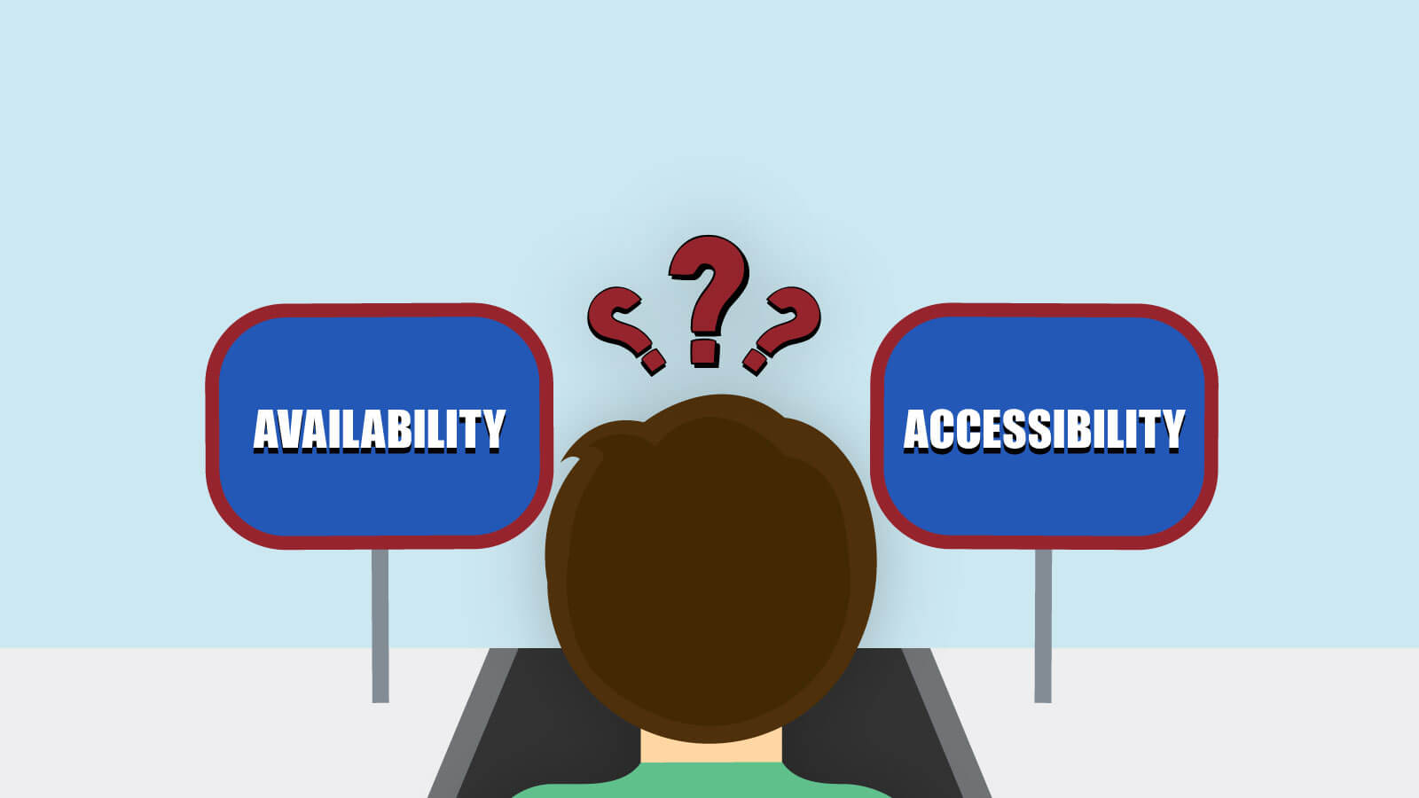
Accessibility, Availability and Progressive Enhancement
I like English because it often provides more words than Polish (my native language) to describe certain things or phenomena. “Accessibility” and “availability” can be good examples of this. In Polish, there is one word with an ambiguous meaning: “dostępność”. If something is “dostępne”, it is either accessible or available. In English, there is a clear distinction between these two meanings. And don’t even get me started about the Polish counterpart for “resilience”!
Why am I talking about language stuff? Well, because being a native Polish speaker made me treat accessibility and availability as the same thing — or rather two sides of the same coin. However, they can be separated or different meanings in another language, like English in the example above. Let’s dig into it!
Availability – the first step
Web developers have a lot of things to consider even before starting to develop a site or web app. Both front-end and back-end development should be considered for a fully optimized website. It must not just have basic functionality in order to be attractive, but also it must be available for anyone to view it who clicks on it through any one of various web browsers available (this includes both modern browsers and legacy browsers people still use in bulk).
That is a rather obvious statement if you want to attract visitors, clicks or clients. However, what does “an available website” mean? In the most basic form, it could be interpreted as being created in a way that allows it to be viewed in a wide variety of browsers and devices. Going further down that path you can even risk saying “to be viewed in every browser on every device”, but that is probably not going to happen anytime soon or be easy to implement…
There are literally thousands of mobile phone models on the market right now and these numbers increase daily. It is impossible to test any website on every one of them and to ensure that it is, indeed, fully available, for every device.
And this is just phones! What about other devices? Tablets, notebooks, PCs with 4k displays, smart TVs, smartwatches, video game consoles, kiosks… I bet that some of you even have a fridge that can run web apps! Not to mention older devices like PlayStation Portable. There are so many of these that I probably cannot even imagine properly, yet they exist and to some extent people can use them to browse the Web.

So are we doomed and the “availability” of a web page or a web application is just a fever dream of the marketing team? Fortunately not. Some techniques allow for creating projects that work nearly everywhere (nearly as you can never be 100% sure). The key is simplicity and progressively enhance something already existing to match modern users and their needs.
The simpler the site is, the more available it should be. And by simple I do not mean deprived of features. I mean simple in how it is constructed. This is key to good web design and web development has advanced to a point where simplicity is key. This thus leads to a greater user experience as users do not have to weed through a lot of information useless to them to get to the important stuff.
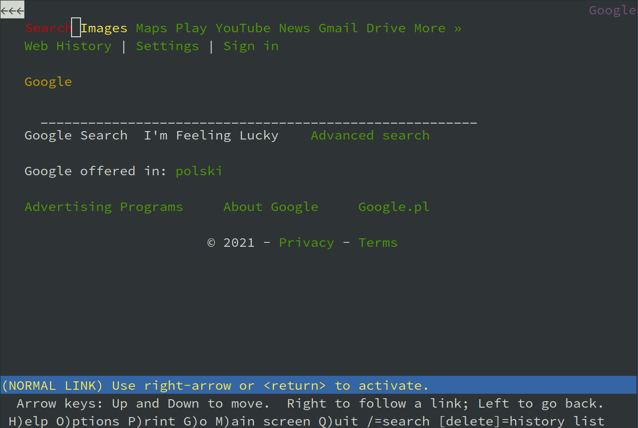
If it is simple, it can work even on your microwave oven. If it is not, it can break in many more ways than you could probably think of. Of course, I do not mean to say that your web app using WebAssembly needs to run on my microwave oven or it should not use JavaScript (although it probably should not overuse it). But most of the Web is still concerned with delivering the content, not the experience — and for content, the simplest solutions are still the most bulletproof and efficient ones. Next time you want to use that new hippy JS framework to generate a blog post, look at how well Google is rendered on Lynx and ask yourself if a simpler solution will not be a better fit.
Of course, it seems so simple when looking at it from a distance. While some website designers browse on their macs and shiny new iPhones, using the wifi they paid for in their coffee bill, in reality, in the first half of 2021 Google Chrome holds a stable 65% of the market share, Safari follows with 19% with Microsoft Edge and Mozilla Firefox close behind these two with 3.5% each. The more obscure browsers still hold a stance at 15% of the market share. Formidable customer force, after all.
The mobiles sport a different share. Even though Chrome is almost untouched here with 63%, Safari goes up garnering almost 25%. The third force is Samsung with its built-in browser taking about 6%. Others are basically omittable at this point, but software like Opera or Puffin does exist and there are users that keep on using it, either due to their personal preference or due to unavoidable circumstances.
This also very much depends on the users’ operating system. Android is the king here with a 40% share and Windows follows with about 32%. Different versions of iOS sport over 16%. And this is where the devil hides. Windows 10 takes up 78% but the good, old, trustworthy Windows 7 still holds over 16% of the market! How about Android? Well, version 11 has been on the rise since last year and recently amounted to 12% while version 10 declined slightly to 40% after a sharp surge in 2020. And Pie is still at the level of 18% despite the constant decline in the number of users.
This is a catastrophic mess and there is no way to possibly satisfy an end-user base as diverse when you make assumptions, even the smallest ones, like the common belief that the third decade of the 21 century magically makes everyone an owner of a very fast internet connection. While this may be true for many users, some of us still involuntarily take the nostalgia trip down the analog modem speed lane and that is more often than we could expect. Realising this simple fact and considering it at the design stage is crucial, too.
Accessibility – the main focus
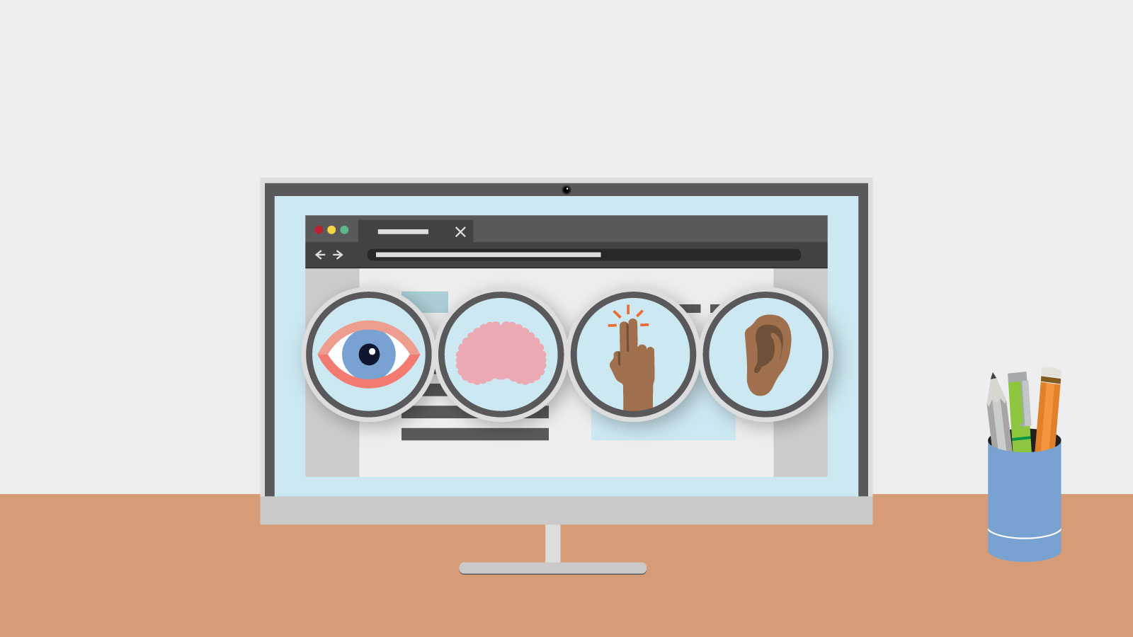
Once your website is available, you can now make it accessible. And by accessible I mean catered to the needs of everyone. Accessibility is not only for people with disabilities. It is for everyone, Even You™. There are a lot of situations when you will not be able to operate a site the way you usually do, for example, a super sunny day would make the screen of your smartphone nearly unreadable and a broken arm could be a good reason to ditch using a mouse for quite some time. If you are not going to make your website accessible for others, then, well, do it for yourself!
And if you are not selfish enough, there is always the entire business side of it. According to WHO statistics, there are at least 2.2 billion people with some kind of vision impairment. Official US statistics show that over 12% of the whole population has some kind of disability. This is a really large base of potential customers that you miss simply by not making your website accessible. And we are talking about disabilities alone, not including the situational inabilities to fully operate the user’s device!
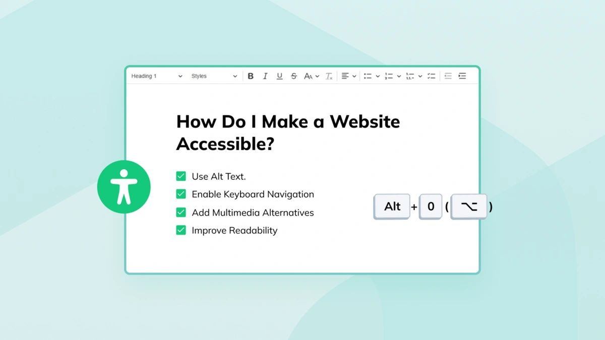
We have already posted some guides on making your site accessible as well as the commercial benefits of accessibility. We also have special tips on both checking your website and improving it. I want to emphasize that everything should be accessible. Designing websites with an accessibility-first approach can be beneficial. And it is not that different from the widely used mobile-first approach. They can even complement each other, as the accessibility-first approach is focused on the end-user of the site while the mobile-first approach — on the end-user’s device. Combining these two methods means thinking about the user and their environment as one, interconnected world.
Progressive Enhancement – the how
And finally Progressive Enhancement — the big elephant in the room. But after you get to know it, you will realize that it isn’t scary at all. What is more — it is a really friendly and gentle giant that is eager to help you!

Progressive Enhancement is often referenced as the way to create accessible experiences. These two are in such a close relationship that some people treat them as one. Progressive enhancement and graceful implementation of design is what good web development is about.
The main premise of Progressive Enhancement is creating a layered experience. It allows for delivering the best experience available for the given device. It is opposing the idea of the same site in every browser approach. If browser A supports some shiny new Web API, it will get a version of the site that uses it. If browser B is Lynx, it will get the HTML-only version. And that’s basically it…
The most basic form of Progressive Enhancement is based on having three layers: HTML, CSS, and JS. The HTML one is the most basic one, which will be delivered to every browser. Today, however, such an understanding of Progressive Enhancement is often too simplistic and suitable only for critical services (the ones that need to work in nearly every possible situation, like access to email).
The more modern approach to a progressive enhancement strategy (which is still at least 10 years old) further divides the three basic layers into even more layers. For example, older browsers will get only basic JavaScript functionality, newer ones will get some more advanced features, and the latest ones — all the good stuff. In some web applications, the layers will not even start on the HTML level anymore as they do not make any sense without the JavaScript code (e.g. graphic editors). In such cases, layers can be connected with certain features (like enabling hardware acceleration in browsers with WebGPU support).
Thinking in the terms of layers makes creating both available and accessible sites a lot easier. If you are creating a website and put the whole content into semantic HTML, and then add some CSS and JS on top of that, you make sure that the site will be available in a wide range of browsers (even Lynx) and that it will be accessible by default (as semantic HTML is mostly accessible… unless you break it).
In fact, you only need to deliver the content to the user — this is what they are looking for! This is why it is up to the designer himself or herself rather than specific web technologies they use to make a site stand out. Functionality of a website and its content should be prioritized.
Availability and accessibility – the best friends
Your site cannot be accessible if it is not available. And if it is available, it will not be usable to the users unless it is accessible. These two terms are strictly interconnected and I would risk saying that they are describing the same thing. While availability is more technical and connected to the user’s browser, operating system and device, accessibility is all about the users themselves. It is a case similar to one of mobile-first and accessibility-first approaches.
So maybe the Polish language is not that wrong after all. Because for me personally “dostępność” will always be about both availability and accessibility.
This blog post is part of the Global Accessibility Awareness Day that we all celebrate May 20 of this year. The purpose of GAAD is to draw attention to accessibility problems and help designers and webmasters create better, more inclusive and user-oriented online environments. This approach will benefit both the users and content creators, as well as the business that stands behind online enterprises, by making their services and products more easily available for a larger group of consumers.
You can read more on the topic of Web Accessibility in our blog posts:
- The Technology We Use Shouldn't Limit Us from Finding a Connection
- Commercial Benefits of Accessibility
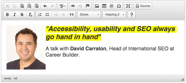
- Accessibility, usability and SEO go hand in hand
- If You're not Thinking About Accessibility - a Talk with Marcy Sutton
- A web that excludes only people with disabilities
- Accessibility Checker Goes Open Source
- CKEditor + WAI-ARIA = Usable Accessibility
- Web accessibility testing - DIY!
- Button - why is simple not that simple?