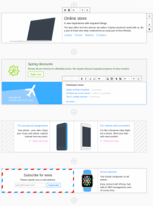
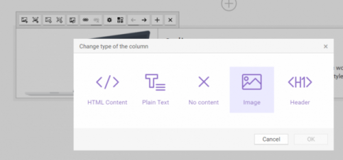
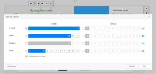
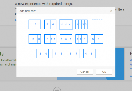
Create responsive content in CKEditor like a pro thanks to this powerful content editor based on the native Bootstrap Grid-system. Manage all standard Bootstrap elements like containers, columns and rows in a simple visual way to create any responsive layout of the web page in minutes, completely without code editing.
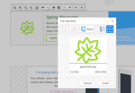
To make sure the responsive content looks correctly on different devices, use the “on the fly” preview. And thanks to the File Uploader plugin tightly integrated into Bootstrap Editor you can add images to the page in one click.
Bootstrap 3 Editor is absolutely compatible with Foundation and can work in the Foundation-compatibility mode.
If you use Bootstrap 4, we recommend using Bootstrap 4 Editor instead.
Online builder
The recommended way to install all CKEditor add-ons is to create a custom build by using Online builder. To do that, click the Add to my editor button on the plugin page. When you are done, click the Build my editor button on the right side of the page to go to Online builder.
Note: This add-on is already selected to be a part of your current build.
Add-on installation instructions
If you want to add the plugin manually, you will need to:
- Extract the downloaded plugin
.zip into the plugins folder of your CKEditor installation. Example:
http://example.com/ckeditor/plugins/bootstrap-3-editor
- Enable the plugin by using the
extraPlugins configuration setting. Example:
config.extraPlugins = 'bootstrap-3-editor';
- Download and configure all its dependencies, too.
Add-on dependencies
No additional dependencies.
Note: The plugin may have additional requirements. Check the add-on page and documentation for more details.

