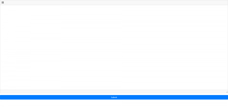
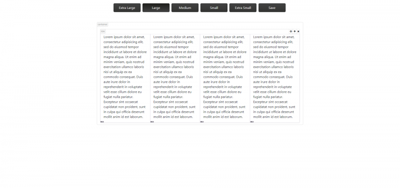
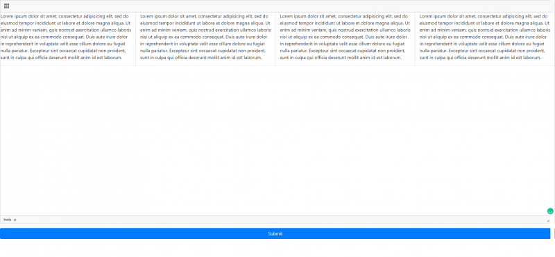
Bootstrap includes a responsive, mobile-first fluid grid system that appropriately scales up to 12 columns as the device or viewport size increases.
- Manage your grid’s layout for Large Desktop, Desktop, Tablet, and Moble
- Resizable Feature
- Compatible with Bootstrap 4
NOTE: You can send your suggestions, comments, concerns, or inquiries through mj.plugins.info@gmail.com or by filling up the contact form of my website. I'm having trouble using Disqus lol.
Online builder
The recommended way to install all CKEditor add-ons is to create a custom build by using Online builder. To do that, click the Add to my editor button on the plugin page. When you are done, click the Build my editor button on the right side of the page to go to Online builder.
Note: This add-on is already selected to be a part of your current build.
Add-on installation instructions
If you want to add the plugin manually, you will need to:
- Extract the downloaded plugin
.zip into the plugins folder of your CKEditor installation. Example:
http://example.com/ckeditor/plugins/bootstrapGridBuilder
- Enable the plugin by using the
extraPlugins configuration setting. Example:
config.extraPlugins = 'bootstrapGridBuilder';
- Download and configure all its dependencies, too.
Add-on dependencies
No additional dependencies.
Note: The plugin may have additional requirements. Check the add-on page and documentation for more details.