
 Document outline
The document outline feature displays the list of sections (headings) of the document next to the editor. The outline updates automatically as the user works on the document. It offers quick navigation to a specific section upon clicking.
This premium feature is a part of the Productivity Pack available only for customers with a commercial license. Contact us for more details.
You can also sign up for the CKEditor Premium Features 30-day free trial to test the feature.
# Demo
When the feature is enabled and configured, the outline can be displayed next to the document as presented below. The placement of the outline is configurable and depends on the HTML structure of the integration. The demo below showcases one of the recommended integrations but more are possible. See the demo code to learn more.
APPENDIX C
Sample Request for Proposal Language for QBE Contract Goals for Invest-Build
(Department of Purchasing Invest-Build Project from 2019)
QUALIFIED BUSINESS ENTERPRISE (2-1-19) SP P32
Description
The purpose of this Special Provision is to carry out the Department of Purchasing's policy of ensuring nondiscrimination in the award and administration of contracts financed in whole or in part with Federal funds. This provision is guided by 54 CFR Part 3.
Definitions
Forms and Websites Referenced In this Provision
QBE Goal
The following QBE goal for participation by Qualified Business Enterprises is established for this contract:
Qualified Business Enterprises 11%
- If the QBE goal is more than zero, the invest-build team shall exercise all necessary and reasonable steps to ensure that QBES participate in at least the percentage of the contract as set forth above as the QBE goal.
- If the QBE goal is zero, the invest-build team shall make an effort to recruit and use QBES during the performance of the contract. Any QBE participation obtained shall be reported to the Department.
This goal is to be met through the utilization of construction contractors and/or right-of-way acquisition firms. The utilization of QBE firms performing design, other preconstruction services, or construction engineering and inspection is not included in this goal.
Directory of Firms (Directory)
Real-time information is available about firms doing business with the department and firms that are certified through UCP in the Directory of Firms. Only firms identified in the directory as QBE certified shall be used to meet the QBE goal. The directory can be found at the following link: https://partner.capitalbc.com/VendorDirectory/default.html.
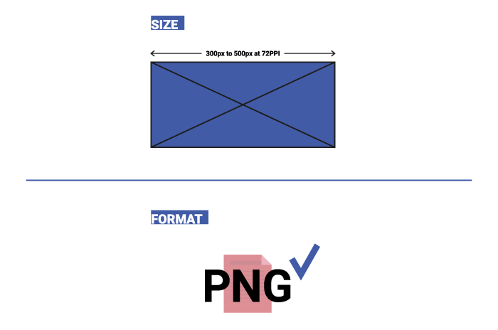
For the listing to be validated, the logo of the firm must be submitted to the directory. You can submit your logos 300 pixels to 500 pixels at 72PPI to QBE@capitalbc.com in PNG format.
The listing of an individual firm in the directory shall not be construed as an endorsement of the firm's capability to perform certain work.
Listing of QBE Subcontractors
At the time of bid, proposers shall submit all QBE participation that they anticipate to use during the life of the contract. Only those identified to meet the QBE goal will be considered committed, even though the listing shall include both committed QBE subcontractors and additional QBE subcontractors. Additional QBE subcontractor participation submitted at the time of bid will be used toward the department's overall race-neutral goal. Only those firms with current QBE certification at the time of the Price Proposal opening will be acceptable for listing in the proposer's submittal of QBE participation. The invest-build team shall indicate the following required information:
- If the QBE goal is more than zero,
- Proposers, at the time the Price Proposal is submitted, shall submit a listing of QBE participation, including the names and addresses on the Listing of QBE Subcontractors contained elsewhere in the contract documents, for the Price Proposal to be considered responsive. Proposers shall indicate the total dollar value of the QBE participation for the contract.
- If proposers have no QBE participation, they shall indicate this on the Listing of QBE Subcontractors by entering the word "None" or the number "0." This form shall be completed in its entirety.
- The Proposer shall be responsible for ensuring that the QBE is certified at the time of bid by checking the Directory of Firms. If the firm is not certified at the time of the opening of the Price Proposals, this QBE's participation will not count toward achieving the QBE goal.
- If the QBE goal is zero, proposers, at the time the Price Proposal is submitted, shall enter the word "None"; or the number "0"; or if there is participation, add the value on the Listing of QBE Subcontractors contained elsewhere in the contract documents.
Blank forms will not be deemed to represent zero participation. Price Proposals submitted that do not have QBE participation indicated on the appropriate form will not be read publicly during the opening of the Price Proposals. The Department will not consider these Price Proposals for award and the proposal will be rejected.
QBE Prime Contractor
When a certified QBE firm proposes a contract that contains a QBE goal, the QBE firm is responsible for meeting the goal or making good faith efforts to meet the goal, just like any other proposer. In most cases, a QBE proposer on a contract will meet the QBE goal by virtue of the work it performs on the contract with its own forces. However, all the work that is performed by the QBE proposer and any other QBE subcontractors will count toward the QBE goal. The QBE proposer shall list itself along with any QBE subcontractors, if any, to receive credit toward the QBE goal.
For example, if the QBE goal is 45% and the QBE proposer will only perform 40% of the contract work, the prime will list itself at 40%, and the additional 5% shall be obtained through additional QBE participation with QBE subcontractors or documented through a good faith effort.
QBE prime contractors shall also follow Sections A and B listed under Listing of QBE Subcontractor just as a non-QBE proposer would.
Written Documentation - Letter of Intent
The proposer shall submit written documentation for each QBE that will be used to meet the QBE goal of the contract, indicating the proposer's commitment to use the QBE in the contract. This documentation shall be submitted on the department's form titled Letter of Intent.
The documentation shall be received in the office of the Contractor Utilization Engineer or at QBE@capitalbc.com no later than noon (12:00) of the sixth calendar day following the opening of Price Proposals unless the sixth day falls on an official state holiday. In that situation, it is due in the office of the Contractor Utilization Engineer no later than noon (12:00) on the next official state business day.
If the proposer fails to submit the Letter of Intent from each committed QBE to be used toward the QBE goal, or if the form is incomplete (i.e., both signatures are not present), the QBE participation will not count toward meeting the QBE goal. If the lack of this participation drops the commitment below the QBE goal, the invest-build team shall submit evidence of good faith efforts, completed in its entirety, to the Contractor Utilization Engineer or QBE@capitalbc.com no later than noon (12:00) on the eighth calendar day following the opening of the Price Proposals, unless the eighth day falls on an official state holiday. In that situation, it is due in the office of the Contractor Utilization Engineer no later than noon (12:00) on the next official state business day.
Submission of Good Faith Effort
If the Proposer fails to meet or exceed the QBE goal, the proposer with the apparent adjusted low price shall submit to the department documentation of adequate good faith efforts made to reach the QBE goal.
A hard copy and an electronic copy of this information shall be received in the office of the Contractor Utilization Engineer or at QBE@capitalbc.com no later than noon (12:00) of the sixth calendar day following the opening of the Price Proposals unless the sixth day falls on an official state holiday. In that situation, it is due in the office of the Contractor Utilization Engineer on the next official state business day. If the invest-build team cannot send the information electronically, then one complete set and nine copies of this information shall be received under the same time constraints.
Note: Where the information submitted includes repetitious solicitation letters, it will be acceptable to submit a representative letter along with a distribution list of the firms that were solicited. Documentation of QBE quotations shall be a part of the good faith effort submission. This documentation may include written subcontractor quotations, telephone log notations of verbal quotations, or other types of quotation documentation.
Consideration of Good Faith Effort for Projects with QBE Goals More Than Zero
Adequate good faith efforts mean that the proposer took all necessary and reasonable steps to achieve the goal which, by their scope, intensity, and appropriateness, could reasonably be expected to obtain sufficient QBE participation. Adequate good faith efforts also mean that the proposer actively and aggressively sought QBE participation. Mere proforma efforts are not considered good faith efforts.
The Department will consider the quality, quantity, and intensity of the different kinds of efforts a proposer has made. Listed below are examples of the types of actions a proposer will take in making a good faith effort to meet the goal. They are not intended to be exclusive or exhaustive, nor is the list intended to be a mandatory checklist.
- Soliciting through all reasonable and available means (e.g., attendance at pre-bid meetings, advertising, and/or written notices through the use of the Directory of Firms) the interest of all certified QBES who have the capability to perform the work of the contract. The proposer must solicit this interest no less than 10 days prior to the opening of the Price Proposals to allow the QBES to respond to the solicitation. Solicitation shall provide the opportunity to QBES within the division and surrounding divisions where the project is located. The proposer must determine with certainty if the QBES are interested by taking appropriate steps to follow up initial solicitations.
- Selecting portions of the work to be performed by QBES to increase the likelihood that the QBE goals will be achieved. This includes, where appropriate, breaking out contract work items into economically feasible units to facilitate QBE participation, even when the prime contractor might otherwise prefer to perform these work items with its own forces.
- Providing interested QBES with adequate information about the plans, specifications, and requirements of the contract in a timely manner to assist them in responding to a solicitation.
- Negotiating in good faith with interested QBES. It is the proposer's responsibility to make a portion of the work available to QBE subcontractors and suppliers and to select those portions of the work or material needs consistent with the available QBE subcontractors and suppliers, so as to facilitate QBE participation. Evidence of such negotiation includes the names, addresses, and telephone numbers of QBES that were considered; a description of the information provided regarding the plans and specifications for the work selected for subcontracting; and evidence as to why additional agreements could not be reached for QBES to perform the work.
- A proposer using good business judgment would consider a number of factors in negotiating with subcontractors, including QBE subcontractors, and would take a firm's price and capabilities as well as contract goals into consideration. However, the fact that there may be some additional costs involved in finding and using QBES is not in itself sufficient reason for a proposer's failure to meet the contract QBE goal, as long as such costs are reasonable. Also, the ability or desire of a prime contractor to perform the work of a contract with its own organization does not relieve the proposer of the responsibility to make good faith efforts. Proposing invest-build teams are not, however, required to accept higher quotes from QBES if the price difference is excessive or unreasonable.
- Not rejecting QBES as being unqualified without sound reasons based on a thorough investigation of their capabilities. The proposer's standing within its industry; membership in specific groups, organizations, or associations; and political or social affiliations (for example, union vs. non-union employee status) are not legitimate causes for the rejection or non-solicitation of bids in the proposer's efforts to meet the project goal.
- Making efforts to assist interested QBES in obtaining a recipient or proposer. bonding, lines of credit, or insurance as required by the
- Making efforts to assist interested QBES in obtaining necessary equipment, supplies, materials, or related assistance or services.
- Effectively using the services of available minority/women community organizations; minority/women contractors' groups; Federal, State, and local minority/women business assistance offices; and other organizations as allowed on a case-by-case basis to assist in the recruitment and placement of QBES. Contact within 7 days from the opening of the Price Proposals the Business Development Manager in the Business Opportunity and Work Force Development Unit to give notification of the proposer's inability to get QBE quotes.
- Any other evidence that the proposer submits which shows that the proposer has made reasonable good faith efforts to meet the QBE goal.
In addition, the Department may take into account the following:
- Whether the proposer's documentation reflects a clear and realistic plan for achieving the QBE goal.
- The proposer's past performance in meeting the QBE goals.
- The performance of other proposers in meeting the QBE goal. For example, when the proposer with the apparent adjusted low price fails to meet the QBE goal, but others meet it, you may reasonably raise the question of whether, with additional reasonable efforts, the proposer with the apparent adjusted low price could have met the goal. If the proposer with the apparent adjusted low price fails to meet the QBE goal but meets or exceeds the average QBE participation obtained by other proposers, the department may view this, in conjunction with other factors, as evidence of the proposer with the apparent adjusted low price having made a good faith effort.
If the Department does not award the contract to the proposer with the apparent adjusted low price, the Department reserves the right to award the contract to the proposer with the next adjusted lowest adjusted price that can satisfy to the Department that the QBE goal can be met or that an adequate good faith effort has been made to meet the QBE goal.
Non-Good Faith Appeal
The Contractor Utilization Engineer will notify the invest-build team verbally and in writing of non-good faith. An invest-build team may appeal a determination of non-good faith made by the Goal Compliance Committee. If an investment-build team wishes to appeal the determination made by the Committee, they shall provide written notification to the Contractual Services Engineer or at QBE@capitalbc.com. The appeal shall be made within 2 business days of notification of the determination of non-good faith.
Counting QBE Participation Toward Meeting QBE Goal
Participation
The total dollar value of the participation by a committed QBE will be counted toward the contract goal requirement. The total dollar value of participation by a committed QBE will be based upon the value of work actually performed by the QBE and the actual payments to QBE firms by the invest-build team.
Joint Checks
Prior notification of joint check use shall be required when counting QBE participation for services or purchases that involves the use of a joint check. The notification shall be through submission of the Joint Check Notification Form and the use of joint checks shall be in accordance with the Department's Joint Check Procedures.
Subcontracts
A QBE may enter into subcontracts. Work that a QBE subcontracts to another QBE firm may be counted toward the contract goal requirement. Work that a QBE subcontracts to a requirement. If a QBE contractor or subcontractor subcontracts a significantly greater portion of the work of the contract non-QBE firm does not count toward the contract goal tract than would be expected on the basis of standard industry practices, it shall be presumed that the QBE is not performing a commercially useful function. The QBE may present evidence to rebut this presumption to the department.
Joint Venture
When a QBE performs as a participant in a joint venture, the invest-build team may count toward its contract goal requirement a portion of the total value of participation with the QBE in the joint venture, that portion of the total dollar value being a distinct, clearly defined portion of work that the QBE performs with its forces.
Suppliers
An invest-build team may count toward its QBE requirement 60% of its expenditures for materials and supplies required to complete the contract and obtained from a QBE regular dealer and 100% of such expenditures from a QBE manufacturer.
Manufacturers and Regular Dealers
An invest-build team may count toward its contract goal requirement only expenditures to DBES that perform a commercially useful function in the work of a contract.
- The fees or commissions charged by a QBE firm for providing a bona fide service, such as providing bonds or insurance specifically required for the performance of a CapitalBC-assisted contract, provided the fees or commissions are determined to be reasonable and not excessive compared with fees and commissions customarily allowed for similar services.
- With respect to materials or supplies purchased from a QBE that is neither a manufacturer nor a regular dealer, count the entire amount of fees or commissions charged for assistance in the procurement of the materials and supplies, or fees or transportation charges for the delivery of materials or supplies required (but not the cost of the materials and supplies themselves), provided the fees are determined to be reasonable and not excessive compared with fees customarily allowed for similar services.
Commercially Useful Function
QBE Utilization
The invest-build team may count toward its contract goal requirement only expenditures to QBES that perform a commercially useful function in the work of a contract. A QBE performs a commercially useful function when it is responsible for the execution of the work of the contract and is carrying out its responsibilities by actually performing, managing, and supervising the work involved. To perform a commercially useful function, the QBE shall also be responsible with respect to materials and supplies used on the contract, for negotiating price, determining quality and quantity, ordering the material and installing (where applicable), and paying for the material itself. To determine whether a QBE is performing a commercially useful function, the department will evaluate the amount of work subcontracted, industry practices, whether the amount the firm is to be paid under the contract is commensurate with the work it is actually performing and the QBE credit claimed for its performance of the work, and any other relevant factors.
QBE Partner Utilizations
The following factors will be used to determine if a QBE partner firm is performing a commercially useful function.
- The QBE shall be responsible for the management and supervision of the entire partner operation for which it is responsible on a particular contract, and there shall not be a contrived arrangement for the purpose of meeting QBE goals.
- The QBE may subcontract the work to another QBE firm, including an owner-operator who is certified as a QBE. The QBE who subcontracts work to another QBE receives credit for the total value of the services the subcontracted QBE provides on the contract.
- The QBE may also subcontract the work to a non-QBE firm, including an owner-operator. The QBE who subcontracts the work to a non-QBE is entitled to credit for the total value of services provided by the non-QBE subcontractor not to exceed the contract. Additional participation by non-QBE subcontractors receives credit only for the fee or commission it receives as a result of the subcontract arrangement. The value of services performed under subcontract agreements between the QBE and the invest-build team will not count toward the QBE contract requirement.
- A QBE may lease equipment from an established equipment leasing business open to the general public. The lease must indicate that the QBE has exclusive use of and control over the equipment. This requirement does not preclude the leased equipment from working for others during the term of the lease with the consent of the QBE, so long as the lease gives the QBE absolute priority for use of the leased equipment. This type of lease may count toward the QBE's credit as long as the operator of the equipment is under the QBE's payroll.
- Subcontracted/leased equipment shall display clearly the name of the QBE that they are subcontracted/leased to and their own company name if it is not identified on the equipment itself.
A QBE Replacement
When an invest-build team has relied on a commitment to a QBE firm (or an approved substitute QBE firm) to meet all or part of a contract goal requirement, the invest-build team shall not terminate the QBE for convenience. This includes, but is not limited to, instances in which the invest-build team seeks to perform the work of the terminated subcontractor with another QBE subcontractor, a non-QBE subcontractor, or with the contractor's own forces or those of an affiliate. A QBE may only be terminated after receiving the Engineer's written approval based upon a finding of good cause for the termination.
All requests for the replacement of a committed QBE firm shall be submitted to the Engineer for approval on Form RF-1 (QBE Replacement Request). If the invest-build team fails to follow this procedure, the prime contractor or other affiliated companies within the invest-build team may be disqualified from further bidding for a period of up to 6 months.
The invest-build team shall comply with the following for the replacement of a committed QBE:
Performance-Related Replacement
When a committed QBE is terminated for good cause as stated above, an additional QBE that was submitted at the time of the bid may be used to fulfill the QBE commitment. A good faith effort will only be required for removing a committed QBE if there were no additional QBEs submitted at the time of bid to cover the same amount of work as the QBE that was terminated.
If a replacement QBE is not found that can perform at least the same amount of work as the terminated QBE, the design-build team shall submit a good faith effort documenting the steps taken. Such documentation shall include, but not be limited to, the following:
- Copies of written notification to QBES that their interest is solicited in contracting the work defaulted by the previous QBE or in subcontracting other items of work in the contract.
- Efforts to negotiate with QBES for specific sub-bids, including, at a minimum:
- The names, addresses, and telephone numbers of QBES who were contacted.
- A description of the information provided to QBES regarding the plans and specifications for portions of the work to be performed.
- A list of reasons why QBE quotes were not accepted.
- Efforts made to assist the QBES contacted, if needed, in obtaining bonding or insurance required by the design-build team.
Decertification Replacement
- When a committed QBE is decertified by the department after the SAF (Subcontract Approval Form) has been received by the department, the department will not require the invest-build team to solicit replacement QBE participation equal to the remaining work to be performed by the decertified firm. The participation equal to the remaining work performed by the decertified firm will count toward the contract goal requirement.
- When a committed QBE is decertified prior to the department receiving the SAF (Subcontract Approval Form) for the named QBE firm, the invest-build team shall take all necessary and reasonable steps to replace the QBE subcontractor with another QBE subcontractor to perform at least the same amount of work to meet the QBE goal requirement, If a QBE firm is not found to do the same amount of work, a good faith effort must be submitted to CapitalBC (see A herein for required documentation).
This demo presents a limited set of features. Visit the feature-rich editor example to see more in action.
# Demo code
For the best user experience the document outline feature requires some effort from integrators. Because it renders independently from the rest of the editor user interface (toolbar, edited content), its placement, dimensions, and behavior (like toggling) depend on the layout and functionality of the web page.
The presented demo is a custom UI built on top of the DecoupledEditor (similar to the document editor). The editor in this demo loads:
- A set of common editor plugins (
Essentials,Bold,Heading, etc.). - The
DocumentOutlineplugin. - A custom
DocumentOutlineTogglerplugin created for this particular demo to allow toggling the visibility of the outline (learn more in the step-by-step tutorial).
You can find the entire integration code below. To run it, see how to build the editor from source.
View the editor configuration script
import { DecoupledEditor } from '@ckeditor/ckeditor5-editor-decoupled';
import { Alignment } from '@ckeditor/ckeditor5-alignment';
import { Autoformat } from '@ckeditor/ckeditor5-autoformat';
import { Bold, Code, Italic, Strikethrough, Subscript, Superscript, Underline } from '@ckeditor/ckeditor5-basic-styles';
import { BlockQuote } from '@ckeditor/ckeditor5-block-quote';
import { CloudServices } from '@ckeditor/ckeditor5-cloud-services';
import { CodeBlock } from '@ckeditor/ckeditor5-code-block';
import { DocumentOutline } from '@ckeditor/ckeditor5-document-outline';
import { EasyImage } from '@ckeditor/ckeditor5-easy-image';
import { Essentials } from '@ckeditor/ckeditor5-essentials';
import { FontBackgroundColor, FontColor, FontFamily, FontSize } from '@ckeditor/ckeditor5-font';
import { Heading } from '@ckeditor/ckeditor5-heading';
import { HorizontalLine } from '@ckeditor/ckeditor5-horizontal-line';
import { Image, ImageCaption, ImageResize, ImageStyle, ImageToolbar, ImageUpload } from '@ckeditor/ckeditor5-image';
import { Indent, IndentBlock } from '@ckeditor/ckeditor5-indent';
import { Link } from '@ckeditor/ckeditor5-link';
import { List, ListProperties } from '@ckeditor/ckeditor5-list';
import { MediaEmbed } from '@ckeditor/ckeditor5-media-embed';
import { PageBreak } from '@ckeditor/ckeditor5-page-break';
import { Paragraph } from '@ckeditor/ckeditor5-paragraph';
import { RemoveFormat } from '@ckeditor/ckeditor5-remove-format';
import { SelectAll } from '@ckeditor/ckeditor5-select-all';
import { SpecialCharacters, SpecialCharactersEssentials } from '@ckeditor/ckeditor5-special-characters';
import { Table, TableCellProperties, TableProperties, TableToolbar } from '@ckeditor/ckeditor5-table';
import { ButtonView } from '@ckeditor/ckeditor5-ui';

const DOCUMENT_OUTLINE_ICON = '<svg viewBox="0 0 20 20" xmlns="http://www.w3.org/2000/svg"><path d="M5 9.5a.5.5 0 0 0 .5-.5v-.5A.5.5 0 0 0 5 8H3.5a.5.5 0 0 0-.5.5V9a.5.5 0 0 0 .5.5H5Z"/><path d="M5.5 12a.5.5 0 0 1-.5.5H3.5A.5.5 0 0 1 3 12v-.5a.5.5 0 0 1 .5-.5H5a.5.5 0 0 1 .5.5v.5Z"/><path d="M5 6.5a.5.5 0 0 0 .5-.5v-.5A.5.5 0 0 0 5 5H3.5a.5.5 0 0 0-.5.5V6a.5.5 0 0 0 .5.5H5Z"/><path clip-rule="evenodd" d="M2 19a2 2 0 0 1-2-2V3a2 2 0 0 1 2-2h16a2 2 0 0 1 2 2v14a2 2 0 0 1-2 2H2Zm6-1.5h10a.5.5 0 0 0 .5-.5V3a.5.5 0 0 0-.5-.5H8v15Zm-1.5-15H2a.5.5 0 0 0-.5.5v14a.5.5 0 0 0 .5.5h4.5v-15Z"/></svg>';
const COLLAPSE_OUTLINE_ICON = '<svg viewBox="0 0 20 20" xmlns="http://www.w3.org/2000/svg"><path d="M11.463 5.187a.888.888 0 1 1 1.254 1.255L9.16 10l3.557 3.557a.888.888 0 1 1-1.254 1.255L7.26 10.61a.888.888 0 0 1 .16-1.382l4.043-4.042z"/></svg>';

// A custom simplified plugin to allow toggling the visibility of the outline.
function DocumentOutlineToggler( editor ) {
    const button = new ButtonView( editor.locale );
    const documentOutlineContainer = editor.config.get( 'documentOutline.container' );
    const demoContainer = documentOutlineContainer.closest( '.demo-container' );

    button.set( {
        label: 'Toggle document outline',
        class: 'ck-document-outline-toggle',
        tooltip: 'Hide document outline',
        tooltipPosition: 'se',
        icon: COLLAPSE_OUTLINE_ICON
    } );

    button.on( 'execute', () => {
        // Toggle a CSS class on the demo container to manage the visibility of the outline.
        demoContainer.classList.toggle( 'collapsed' );

        // Change the look of the button to reflect the state of the outline.
        if ( demoContainer.classList.contains( 'collapsed' ) ) {
            button.icon = DOCUMENT_OUTLINE_ICON;
            button.tooltip = 'Show document outline';
        } else {
            button.icon = COLLAPSE_OUTLINE_ICON;
            button.tooltip = 'Hide document outline';
        }

        // Keep the focus in the editor whenever the button is clicked.
        editor.editing.view.focus();
    } );

    button.render();

    // Append the button next to the outline in its container.
    documentOutlineContainer.appendChild( button.element );
}

// Start the editor.
DecoupledEditor.create( document.querySelector( '.editor-content' ), {
    plugins: [
        Alignment,
        Autoformat,
        BlockQuote,
        Bold,
        CloudServices,
        Code,
        CodeBlock,
        DocumentOutline,
        DocumentOutlineToggler,
        EasyImage,
        Essentials,
        FontBackgroundColor,
        FontColor,
        FontFamily,
        FontSize,
        Heading,
        HorizontalLine,
        Image,
        ImageCaption,
        ImageResize,
        ImageStyle,
        ImageToolbar,
        ImageUpload,
        Indent,
        IndentBlock,
        Italic,
        Link,
        List,
        ListProperties,
        MediaEmbed,
        PageBreak,
        Paragraph,
        RemoveFormat,
        SelectAll,
        SpecialCharacters,
        SpecialCharactersEssentials,
        Strikethrough,
        Subscript,
        Superscript,
        Table,
        TableCellProperties,
        TableProperties,
        TableToolbar,
        Underline
    ],
    toolbar: [
        'undo',
        'redo',
        '|',
        'heading',
        '|',
        'fontFamily',
        'fontSize',
        'fontColor',
        'fontBackgroundColor',
        '|',
        'bold',
        'italic',
        'underline',
        'removeFormat',
        '-',
        'link',
        'uploadImage',
        'insertTable',
        'blockquote',
        'codeBlock',
        'mediaEmbed',
        '|',
        'alignment',
        '|',
        'numberedList',
        'bulletedList',
        'indent',
        'outdent'
    ],
    shouldNotGroupWhenFull: true,
    image: {
        toolbar: [ 'imageStyle:inline', 'imageStyle:wrapText', 'imageStyle:breakText', '|', 'imageTextAlternative' ]
    },
    table: {
        contentToolbar: [ 'tableColumn', 'tableRow', 'mergeTableCells', 'tableProperties', 'tableCellProperties' ],
        tableToolbar: [ 'bold', 'italic' ]
    },
    documentOutline: {
        container: document.querySelector( '.document-outline-container' )
    },
    cloudServices: {
        // This demo includes the Easy Image feature. Provide correct configuration values to use it.
        tokenUrl: 'https://example.com/cs-token-endpoint',
        uploadUrl: 'https://your-organization-id.cke-cs.com/easyimage/upload/'
        // Read more about Easy Image - https://ckeditor.com/docs/ckeditor5/latest/features/images/image-upload/easy-image.html.
        // For other image upload methods see the guide - https://ckeditor.com/docs/ckeditor5/latest/features/images/image-upload/image-upload.html.
    }
} ).then( editor => {
    document.querySelector( '.toolbar-container' ).appendChild( editor.ui.view.toolbar.element );

    window.editor = editor;
} ).catch( err => {
    console.error( err.stack );
} );
View the page layout and styles
<div class="demo-container">
    <div class="toolbar-container"></div>
    <div class="document-outline-container"></div>
    <div class="editor-content-wrapper">
        <div class="editor-content">
            <p>Initial content of the editor</p>
        </div>
    </div>
</div>

<style>
    /* ----------------------- Demo layout styles ------------------------------ */

    .demo-container {
        display: grid;
        grid-template-columns: minmax(250px,.5fr) 1.5fr;
        grid-template-rows: auto 1fr;
        gap: 0px 0px;
        grid-template-areas:
            "Toolbar Toolbar"
            "Sidebar Content";
        background: var(--ck-color-base-foreground);
        border: 1px solid var(--ck-color-base-border);
        margin: 1.5em 0;

        /* The max height of the editor content wrapper before it becomes scrollable. */
        --demo-content-height: 800px;
    }

    .demo-container .toolbar-container {
        grid-area: Toolbar;
        box-shadow: 0 2px 3px hsla(0, 0%, 0%, 0.078);

        /* Makes the shadow display over the editor content. */
        position: relative;
    }

    /* Adjust borders of the toolbar to fit well into the layout. Avoid duplicated borders. */
    .demo-container .toolbar-container > .ck.ck-toolbar {
        border-bottom-right-radius: 0;
        border-bottom-left-radius: 0;
        border-top: 0;
        border-left: 0;
        border-right: 0;
    }

    .demo-container .editor-content-wrapper {
        grid-area: Content;
        max-height: var(--demo-content-height);
        overflow-y: auto;

        /* Center the editor content in this grid area. */
        display: flex;
        justify-content: center;
        align-items: flex-start;
    }

    .demo-container .document-outline-container {
        grid-area: Sidebar;
        max-height: var(--demo-content-height);
        overflow-y: auto;
        display: flex;
        flex-direction: column;
        padding: var(--ck-spacing-large) 0 0;

        /* Customize the default font size of the outline */
        --ck-document-outline-base-font-size: 1em;
    }

    /* ------------ DocumentOutlineToggler plugin styles ------------------- */

    /* Styles of the topmost demo container when the outline gets collapsed. */
    .demo-container.collapsed {
        grid-template-columns: 50px 1fr;
    }

    /* Styles of the outline when it gets collapsed. */
    .demo-container.collapsed .document-outline-container .ck-document-outline {
        width: 0px;
        margin: 0;
        padding: 0;
        overflow: hidden;
        height: 0;
    }

    /* Styles of the outline collapse button. */
    .demo-container .document-outline-container .ck-document-outline-toggle {
        align-self: flex-start;
        opacity: .5;
        margin-left: var(--ck-spacing-large);
        border-radius: 100%;
    }

    .demo-container .document-outline-container .ck-document-outline-toggle:hover {
        opacity: 1;
    }

    /* ----------------------- Content styles ------------------------------ */

    /* Styles of the editor content container to make it look like a sheet of paper. */
    .ck.ck-content {
        max-width: calc( 210mm + 2px );
        min-height: calc( 210mm + 2px );
        height: auto;
        padding: 20mm 12mm;
        box-sizing: border-box;
        background: hsl( 0, 0%, 100% );
        box-shadow: 0 2px 8px hsla( 0, 0%, 0%, .08 );
        margin: calc( 2 * var(--ck-spacing-large) );
        overflow: hidden;
        flex: 1 1 auto;
    }

    .ck.ck-content,
    .ck.ck-content.ck-focused {
        border: 1px solid hsl( 0, 0%, 88% );
        box-shadow: 0 2px 8px hsla( 0, 0%, 0%, .08 );
    }

    /* Vertical rhythm of the blocks in the editor content below. */
    .ck.ck-content h2 {
        font-size: 2.06em;
        line-height: 1.58em;
        padding-top: 0.455em;
        margin-bottom: 0.333em;
    }

    .ck.ck-content h3 {
        font-size: 1.75em;
        line-height: 1.86em;
        padding-top: 0.571em;
        margin-bottom: 0.357em;
    }

    .ck.ck-content h4 {
        font-size: 1.44em;
        line-height: 1.13em;
        padding-top: 0.217em;
        margin-bottom: 0.913em;
    }

    .ck.ck-content h5 {
        font-size: 1.19em;
        line-height: 1.37em;
        padding-top: 0.368em;
        margin-bottom: 1.00em;
    }

    .ck.ck-content p {
        font-size: 1.00em;
        line-height: 1.63em;
        padding-top: 0.500em;
        margin-bottom: 1.13em;
    }
</style>
# Installation
This feature is enabled by default in the superbuild only.
To add the document outline feature to your editor, install the @ckeditor/ckeditor5-document-outline package:
npm install --save @ckeditor/ckeditor5-document-outline
Then add the DocumentOutline plugin to your plugin list and configure it:
import { DocumentOutline } from '@ckeditor/ckeditor5-document-outline';

DecoupledEditor
    .create( document.querySelector( '#editor' ), {
        plugins: [ DocumentOutline, /* ... */ ],

        // Provide activation key (see explanation below)
        licenseKey: 'your-license-key',

        documentOutline: {
            container: document.querySelector( '.document-outline-container' ),
        }
    } )
    .then( /* ... */ )
    .catch( /* ... */ );
Read more about installing plugins.
# Activating the feature
To use this premium feature, you need to activate it with proper credentials. Refer to the License key and activation guide for details.
# Configuration
For more technical details, check the plugin configuration reference.
# Configuring the container
The container element is essential for the document outline to render. You should pass the reference to the container element in the config.documentOutline.container configuration option.
documentOutline: {
    // Make sure the .document-outline-container element exists when the editor is being created.
    container: document.querySelector( '.document-outline-container' )
}
# Customizing the look
The look of the document outline can be customized using CSS classes and custom properties. In the demo below, the following customizations were applied:
- The indentation of outline items was reduced (custom properties:
--ck-document-outline-indent-level-[2-3]). - The active item color was changed (
--ck-document-outline-item-active-colorcustom property). - The font size and line height were reduced for a more compact look (
.ck-document-outline__itemCSS class). - Different bullets were added for each level for better readability (
.ck-document-outline__item_level-[2-3]CSS classes).
View the document outline customization code
.customization-demo {
    --ck-document-outline-indent-level-2: 1.1em;
    --ck-document-outline-indent-level-3: 2.2em;
    --ck-document-outline-item-active-color: hsl(340deg 82% 52%);
}

.customization-demo .ck-document-outline__item {
    line-height: 1.1em;
}

.customization-demo .ck-document-outline__item::before {
    margin: 0 .2em 0 0;
}

.customization-demo .ck-document-outline__item.ck-document-outline__item_level-2::before,
.customization-demo .ck-document-outline__item.ck-document-outline__item_level-5::before {
    content: "•";
}

.customization-demo .ck-document-outline__item.ck-document-outline__item_level-3 {
    font-size: .9em;
}

.customization-demo .ck-document-outline__item.ck-document-outline__item_level-3::before,
.customization-demo .ck-document-outline__item.ck-document-outline__item_level-6::before {
    content: "‣";
}

.customization-demo .ck-document-outline__item.ck-document-outline__item_level-4,
.customization-demo .ck-document-outline__item.ck-document-outline__item_level-5,
.customization-demo .ck-document-outline__item.ck-document-outline__item_level-6 {
    font-size: .8em;
}

.customization-demo .ck-document-outline__item.ck-document-outline__item_level-4::before {
    content: "⁃";
}
APPENDIX C
Sample Request for Proposal Language for QBE Contract Goals for Invest-Build
(Department of Purchasing Invest-Build Project from 2019)
QUALIFIED BUSINESS ENTERPRISE (2-1-19) SP P32
Description
The purpose of this Special Provision is to carry out the Department of Purchasing's policy of ensuring nondiscrimination in the award and administration of contracts financed in whole or in part with Federal funds. This provision is guided by 54 CFR Part 3.
Definitions
Forms and Websites Referenced In this Provision
QBE Goal
The following QBE goal for participation by Qualified Business Enterprises is established for this contract:
Qualified Business Enterprises 11%
- If the QBE goal is more than zero, the invest-build team shall exercise all necessary and reasonable steps to ensure that QBES participate in at least the percentage of the contract as set forth above as the QBE goal.
- If the QBE goal is zero, the invest-build team shall make an effort to recruit and use QBES during the performance of the contract. Any QBE participation obtained shall be reported to the Department.
This goal is to be met through the utilization of construction contractors and/or right-of-way acquisition firms. The utilization of QBE firms performing design, other preconstruction services, or construction engineering and inspection is not included in this goal.
Directory of Firms (Directory)
Real-time information is available about firms doing business with the department and firms that are certified through UCP in the Directory of Firms. Only firms identified in the directory as QBE certified shall be used to meet the QBE goal. The directory can be found at the following link: https://partner.capitalbc.com/VendorDirectory/default.html.
For the listing to be validated, the logo of the firm must be submitted to the directory. You can submit your logos 300 pixels to 500 pixels at 72PPI to QBE@capitalbc.com in PNG format.
The listing of an individual firm in the directory shall not be construed as an endorsement of the firm's capability to perform certain work.
Listing of QBE Subcontractors
At the time of bid, proposers shall submit all QBE participation that they anticipate to use during the life of the contract. Only those identified to meet the QBE goal will be considered committed, even though the listing shall include both committed QBE subcontractors and additional QBE subcontractors. Additional QBE subcontractor participation submitted at the time of bid will be used toward the department's overall race-neutral goal. Only those firms with current QBE certification at the time of the Price Proposal opening will be acceptable for listing in the proposer's submittal of QBE participation. The invest-build team shall indicate the following required information:
- If the QBE goal is more than zero,
- Proposers, at the time the Price Proposal is submitted, shall submit a listing of QBE participation, including the names and addresses on the Listing of QBE Subcontractors contained elsewhere in the contract documents, for the Price Proposal to be considered responsive. Proposers shall indicate the total dollar value of the QBE participation for the contract.
- If proposers have no QBE participation, they shall indicate this on the Listing of QBE Subcontractors by entering the word "None" or the number "0." This form shall be completed in its entirety.
- The Proposer shall be responsible for ensuring that the QBE is certified at the time of bid by checking the Directory of Firms. If the firm is not certified at the time of the opening of the Price Proposals, this QBE's participation will not count toward achieving the QBE goal.
- If the QBE goal is zero, proposers, at the time the Price Proposal is submitted, shall enter the word "None"; or the number "0"; or if there is participation, add the value on the Listing of QBE Subcontractors contained elsewhere in the contract documents.
Blank forms will not be deemed to represent zero participation. Price Proposals submitted that do not have QBE participation indicated on the appropriate form will not be read publicly during the opening of the Price Proposals. The Department will not consider these Price Proposals for award and the proposal will be rejected.
QBE Prime Contractor
When a certified QBE firm proposes a contract that contains a QBE goal, the QBE firm is responsible for meeting the goal or making good faith efforts to meet the goal, just like any other proposer. In most cases, a QBE proposer on a contract will meet the QBE goal by virtue of the work it performs on the contract with its own forces. However, all the work that is performed by the QBE proposer and any other QBE subcontractors will count toward the QBE goal. The QBE proposer shall list itself along with any QBE subcontractors, if any, to receive credit toward the QBE goal.
For example, if the QBE goal is 45% and the QBE proposer will only perform 40% of the contract work, the prime will list itself at 40%, and the additional 5% shall be obtained through additional QBE participation with QBE subcontractors or documented through a good faith effort.
QBE prime contractors shall also follow Sections A and B listed under Listing of QBE Subcontractor just as a non-QBE proposer would.
Written Documentation - Letter of Intent
The proposer shall submit written documentation for each QBE that will be used to meet the QBE goal of the contract, indicating the proposer's commitment to use the QBE in the contract. This documentation shall be submitted on the department's form titled Letter of Intent.
The documentation shall be received in the office of the Contractor Utilization Engineer or at QBE@capitalbc.com no later than noon (12:00) of the sixth calendar day following the opening of Price Proposals unless the sixth day falls on an official state holiday. In that situation, it is due in the office of the Contractor Utilization Engineer no later than noon (12:00) on the next official state business day.
If the proposer fails to submit the Letter of Intent from each committed QBE to be used toward the QBE goal, or if the form is incomplete (i.e., both signatures are not present), the QBE participation will not count toward meeting the QBE goal. If the lack of this participation drops the commitment below the QBE goal, the invest-build team shall submit evidence of good faith efforts, completed in its entirety, to the Contractor Utilization Engineer or QBE@capitalbc.com no later than noon (12:00) on the eighth calendar day following the opening of the Price Proposals, unless the eighth day falls on an official state holiday. In that situation, it is due in the office of the Contractor Utilization Engineer no later than noon (12:00) on the next official state business day.
Submission of Good Faith Effort
If the Proposer fails to meet or exceed the QBE goal, the proposer with the apparent adjusted low price shall submit to the department documentation of adequate good faith efforts made to reach the QBE goal.
A hard copy and an electronic copy of this information shall be received in the office of the Contractor Utilization Engineer or at QBE@capitalbc.com no later than noon (12:00) of the sixth calendar day following the opening of the Price Proposals unless the sixth day falls on an official state holiday. In that situation, it is due in the office of the Contractor Utilization Engineer on the next official state business day. If the invest-build team cannot send the information electronically, then one complete set and nine copies of this information shall be received under the same time constraints.
Note: Where the information submitted includes repetitious solicitation letters, it will be acceptable to submit a representative letter along with a distribution list of the firms that were solicited. Documentation of QBE quotations shall be a part of the good faith effort submission. This documentation may include written subcontractor quotations, telephone log notations of verbal quotations, or other types of quotation documentation.
Consideration of Good Faith Effort for Projects with QBE Goals More Than Zero
Adequate good faith efforts mean that the proposer took all necessary and reasonable steps to achieve the goal which, by their scope, intensity, and appropriateness, could reasonably be expected to obtain sufficient QBE participation. Adequate good faith efforts also mean that the proposer actively and aggressively sought QBE participation. Mere proforma efforts are not considered good faith efforts.
The Department will consider the quality, quantity, and intensity of the different kinds of efforts a proposer has made. Listed below are examples of the types of actions a proposer will take in making a good faith effort to meet the goal. They are not intended to be exclusive or exhaustive, nor is the list intended to be a mandatory checklist.
- Soliciting through all reasonable and available means (e.g., attendance at pre-bid meetings, advertising, and/or written notices through the use of the Directory of Firms) the interest of all certified QBES who have the capability to perform the work of the contract. The proposer must solicit this interest no less than 10 days prior to the opening of the Price Proposals to allow the QBES to respond to the solicitation. Solicitation shall provide the opportunity to QBES within the division and surrounding divisions where the project is located. The proposer must determine with certainty if the QBES are interested by taking appropriate steps to follow up initial solicitations.
- Selecting portions of the work to be performed by QBES to increase the likelihood that the QBE goals will be achieved. This includes, where appropriate, breaking out contract work items into economically feasible units to facilitate QBE participation, even when the prime contractor might otherwise prefer to perform these work items with its own forces.
- Providing interested QBES with adequate information about the plans, specifications, and requirements of the contract in a timely manner to assist them in responding to a solicitation.
- Negotiating in good faith with interested QBES. It is the proposer's responsibility to make a portion of the work available to QBE subcontractors and suppliers and to select those portions of the work or material needs consistent with the available QBE subcontractors and suppliers, so as to facilitate QBE participation. Evidence of such negotiation includes the names, addresses, and telephone numbers of QBES that were considered; a description of the information provided regarding the plans and specifications for the work selected for subcontracting; and evidence as to why additional agreements could not be reached for QBES to perform the work.
- A proposer using good business judgment would consider a number of factors in negotiating with subcontractors, including QBE subcontractors, and would take a firm's price and capabilities as well as contract goals into consideration. However, the fact that there may be some additional costs involved in finding and using QBES is not in itself sufficient reason for a proposer's failure to meet the contract QBE goal, as long as such costs are reasonable. Also, the ability or desire of a prime contractor to perform the work of a contract with its own organization does not relieve the proposer of the responsibility to make good faith efforts. Proposing invest-build teams are not, however, required to accept higher quotes from QBES if the price difference is excessive or unreasonable.
- Not rejecting QBES as being unqualified without sound reasons based on a thorough investigation of their capabilities. The proposer's standing within its industry; membership in specific groups, organizations, or associations; and political or social affiliations (for example, union vs. non-union employee status) are not legitimate causes for the rejection or non-solicitation of bids in the proposer's efforts to meet the project goal.
- Making efforts to assist interested QBES in obtaining a recipient or proposer. bonding, lines of credit, or insurance as required by the
- Making efforts to assist interested QBES in obtaining necessary equipment, supplies, materials, or related assistance or services.
- Effectively using the services of available minority/women community organizations; minority/women contractors' groups; Federal, State, and local minority/women business assistance offices; and other organizations as allowed on a case-by-case basis to assist in the recruitment and placement of QBES. Contact within 7 days from the opening of the Price Proposals the Business Development Manager in the Business Opportunity and Work Force Development Unit to give notification of the proposer's inability to get QBE quotes.
- Any other evidence that the proposer submits which shows that the proposer has made reasonable good faith efforts to meet the QBE goal.
In addition, the Department may take into account the following:
- Whether the proposer's documentation reflects a clear and realistic plan for achieving the QBE goal.
- The proposer's past performance in meeting the QBE goals.
- The performance of other proposers in meeting the QBE goal. For example, when the proposer with the apparent adjusted low price fails to meet the QBE goal, but others meet it, you may reasonably raise the question of whether, with additional reasonable efforts, the proposer with the apparent adjusted low price could have met the goal. If the proposer with the apparent adjusted low price fails to meet the QBE goal but meets or exceeds the average QBE participation obtained by other proposers, the department may view this, in conjunction with other factors, as evidence of the proposer with the apparent adjusted low price having made a good faith effort.
If the Department does not award the contract to the proposer with the apparent adjusted low price, the Department reserves the right to award the contract to the proposer with the next adjusted lowest adjusted price that can satisfy to the Department that the QBE goal can be met or that an adequate good faith effort has been made to meet the QBE goal.
Non-Good Faith Appeal
The Contractor Utilization Engineer will notify the invest-build team verbally and in writing of non-good faith. An invest-build team may appeal a determination of non-good faith made by the Goal Compliance Committee. If an investment-build team wishes to appeal the determination made by the Committee, they shall provide written notification to the Contractual Services Engineer or at QBE@capitalbc.com. The appeal shall be made within 2 business days of notification of the determination of non-good faith.
Counting QBE Participation Toward Meeting QBE Goal
Participation
The total dollar value of the participation by a committed QBE will be counted toward the contract goal requirement. The total dollar value of participation by a committed QBE will be based upon the value of work actually performed by the QBE and the actual payments to QBE firms by the invest-build team.
Joint Checks
Prior notification of joint check use shall be required when counting QBE participation for services or purchases that involves the use of a joint check. The notification shall be through submission of the Joint Check Notification Form and the use of joint checks shall be in accordance with the Department's Joint Check Procedures.
Subcontracts
A QBE may enter into subcontracts. Work that a QBE subcontracts to another QBE firm may be counted toward the contract goal requirement. Work that a QBE subcontracts to a requirement. If a QBE contractor or subcontractor subcontracts a significantly greater portion of the work of the contract non-QBE firm does not count toward the contract goal tract than would be expected on the basis of standard industry practices, it shall be presumed that the QBE is not performing a commercially useful function. The QBE may present evidence to rebut this presumption to the department.
Joint Venture
When a QBE performs as a participant in a joint venture, the invest-build team may count toward its contract goal requirement a portion of the total value of participation with the QBE in the joint venture, that portion of the total dollar value being a distinct, clearly defined portion of work that the QBE performs with its forces.
Suppliers
An invest-build team may count toward its QBE requirement 60% of its expenditures for materials and supplies required to complete the contract and obtained from a QBE regular dealer and 100% of such expenditures from a QBE manufacturer.
Manufacturers and Regular Dealers
An invest-build team may count toward its contract goal requirement only expenditures to DBES that perform a commercially useful function in the work of a contract.
- The fees or commissions charged by a QBE firm for providing a bona fide service, such as providing bonds or insurance specifically required for the performance of a CapitalBC-assisted contract, provided the fees or commissions are determined to be reasonable and not excessive compared with fees and commissions customarily allowed for similar services.
- With respect to materials or supplies purchased from a QBE that is neither a manufacturer nor a regular dealer, count the entire amount of fees or commissions charged for assistance in the procurement of the materials and supplies, or fees or transportation charges for the delivery of materials or supplies required (but not the cost of the materials and supplies themselves), provided the fees are determined to be reasonable and not excessive compared with fees customarily allowed for similar services.
Commercially Useful Function
QBE Utilization
The invest-build team may count toward its contract goal requirement only expenditures to QBES that perform a commercially useful function in the work of a contract. A QBE performs a commercially useful function when it is responsible for the execution of the work of the contract and is carrying out its responsibilities by actually performing, managing, and supervising the work involved. To perform a commercially useful function, the QBE shall also be responsible with respect to materials and supplies used on the contract, for negotiating price, determining quality and quantity, ordering the material and installing (where applicable), and paying for the material itself. To determine whether a QBE is performing a commercially useful function, the department will evaluate the amount of work subcontracted, industry practices, whether the amount the firm is to be paid under the contract is commensurate with the work it is actually performing and the QBE credit claimed for its performance of the work, and any other relevant factors.
QBE Partner Utilizations
The following factors will be used to determine if a QBE partner firm is performing a commercially useful function.
- The QBE shall be responsible for the management and supervision of the entire partner operation for which it is responsible on a particular contract, and there shall not be a contrived arrangement for the purpose of meeting QBE goals.
- The QBE may subcontract the work to another QBE firm, including an owner-operator who is certified as a QBE. The QBE who subcontracts work to another QBE receives credit for the total value of the services the subcontracted QBE provides on the contract.
- The QBE may also subcontract the work to a non-QBE firm, including an owner-operator. The QBE who subcontracts the work to a non-QBE is entitled to credit for the total value of services provided by the non-QBE subcontractor not to exceed the contract. Additional participation by non-QBE subcontractors receives credit only for the fee or commission it receives as a result of the subcontract arrangement. The value of services performed under subcontract agreements between the QBE and the invest-build team will not count toward the QBE contract requirement.
- A QBE may lease equipment from an established equipment leasing business open to the general public. The lease must indicate that the QBE has exclusive use of and control over the equipment. This requirement does not preclude the leased equipment from working for others during the term of the lease with the consent of the QBE, so long as the lease gives the QBE absolute priority for use of the leased equipment. This type of lease may count toward the QBE's credit as long as the operator of the equipment is under the QBE's payroll.
- Subcontracted/leased equipment shall display clearly the name of the QBE that they are subcontracted/leased to and their own company name if it is not identified on the equipment itself.
A QBE Replacement
When an invest-build team has relied on a commitment to a QBE firm (or an approved substitute QBE firm) to meet all or part of a contract goal requirement, the invest-build team shall not terminate the QBE for convenience. This includes, but is not limited to, instances in which the invest-build team seeks to perform the work of the terminated subcontractor with another QBE subcontractor, a non-QBE subcontractor, or with the contractor's own forces or those of an affiliate. A QBE may only be terminated after receiving the Engineer's written approval based upon a finding of good cause for the termination.
All requests for the replacement of a committed QBE firm shall be submitted to the Engineer for approval on Form RF-1 (QBE Replacement Request). If the invest-build team fails to follow this procedure, the prime contractor or other affiliated companies within the invest-build team may be disqualified from further bidding for a period of up to 6 months.
The invest-build team shall comply with the following for the replacement of a committed QBE:
Performance-Related Replacement
When a committed QBE is terminated for good cause as stated above, an additional QBE that was submitted at the time of the bid may be used to fulfill the QBE commitment. A good faith effort will only be required for removing a committed QBE if there were no additional QBEs submitted at the time of bid to cover the same amount of work as the QBE that was terminated.
If a replacement QBE is not found that can perform at least the same amount of work as the terminated QBE, the design-build team shall submit a good faith effort documenting the steps taken. Such documentation shall include, but not be limited to, the following:
- Copies of written notification to QBES that their interest is solicited in contracting the work defaulted by the previous QBE or in subcontracting other items of work in the contract.
- Efforts to negotiate with QBES for specific sub-bids, including, at a minimum:
- The names, addresses, and telephone numbers of QBES who were contacted.
- A description of the information provided to QBES regarding the plans and specifications for portions of the work to be performed.
- A list of reasons why QBE quotes were not accepted.
- Efforts made to assist the QBES contacted, if needed, in obtaining bonding or insurance required by the design-build team.
Decertification Replacement
- When a committed QBE is decertified by the department after the SAF (Subcontract Approval Form) has been received by the department, the department will not require the invest-build team to solicit replacement QBE participation equal to the remaining work to be performed by the decertified firm. The participation equal to the remaining work performed by the decertified firm will count toward the contract goal requirement.
- When a committed QBE is decertified prior to the department receiving the SAF (Subcontract Approval Form) for the named QBE firm, the invest-build team shall take all necessary and reasonable steps to replace the QBE subcontractor with another QBE subcontractor to perform at least the same amount of work to meet the QBE goal requirement, If a QBE firm is not found to do the same amount of work, a good faith effort must be submitted to CapitalBC (see A herein for required documentation).
# Related features
Here are some more CKEditor 5 features that can help you navigate the content of the editor:
- Table of contents – Insert a table of contents widget into the document.
- Content minimap – Navigate the document using a miniature overview map placed next to the editor.
- Pagination – See the live preview of the document’s page breaks and quickly navigate between pages.
Every day, we work hard to keep our documentation complete. Have you spotted outdated information? Is something missing? Please report it via our issue tracker.