

 UI library
The standard UI library of CKEditor 5 is @ckeditor/ckeditor5-ui. It provides base classes and helpers that allow for building a modular UI that seamlessly integrates with other components of the ecosystem.
# Views
Views use templates to build the UI. They also provide observable interfaces that other features (e.g. plugins, commands, etc.) can use to change the DOM without any actual interaction with the native API.
All views can be localized using the locale instance with which they were created. Check the localization guide to see how to use the t() function available in the locale instance.
# Definition
A simple input view class can be defined as follows:
class SimpleInputView extends View {
    constructor( locale ) {
        super( locale );

        // An entry point to binding observables with DOM attributes,
        // events and text nodes.
        const bind = this.bindTemplate;

        // Views define their interface (state) using observable properties.
        this.set( {
            isEnabled: false,
            placeholder: ''
        } );

        this.setTemplate( {
            tag: 'input',
            attributes: {
                class: [
                    'foo',
                    // The value of view#isEnabled will control the presence
                    // of the class.
                    bind.if( 'isEnabled', 'ck-enabled' ),
                ],

                // The HTML "placeholder" attribute is also controlled by the observable.
                placeholder: bind.to( 'placeholder' ),
                type: 'text'
            },
            on: {
                // DOM keydown events will fire the view#input event.
                keydown: bind.to( 'input' )
            }
        } );
    }

    setValue( newValue ) {
        this.element.value = newValue;
    }
}
Note that views encapsulate the DOM they render. Because the UI is organized according to the view-per-tree rule, it is clear which view is responsible for which part of the UI so it is unlikely that a collision occurs between two features writing to the same DOM node.
More often than not, views become children of other views (collections), nodes in the UI view tree:
class ParentView extends View {
    constructor( locale ) {
        super( locale );

        const childA = new SimpleInputView( locale );
        const childB = new SimpleInputView( locale );

        this.setTemplate( {
            tag: 'div',
            children: [
                childA,
                childB
            ]
        } );
    }
}

const parent = new ParentView( locale );

parent.render();

// Will insert <div><input .. /><input .. /></div>.
document.body.appendChild( parent.element );
It is also possible to create standalone views that do not belong to any collection. They must be rendered before injection into the DOM:
const view = new SimpleInputView( locale );

view.render();

// Will insert <input class="foo" type="text" placeholder="" />
document.body.appendChild( view.element );
# Interaction
Features can interact with the state of the DOM via the observable properties of the view, so the following:
view.isEnabled = true;
view.placeholder = 'Type some text';
will result in:
<input class="foo ck-enabled" type="text" placeholder="Type some text" />
Alternatively, they can bind them directly to their own observable properties:
view.bind( 'placeholder', 'isEnabled' ).to( observable, 'placeholderText', 'isEnabled' );

// The following will be automatically reflected in the view#placeholder and
// view.element#placeholder HTML attribute in the DOM.
observable.placeholderText = 'Some placeholder';
Also, since views propagate DOM events, features can now react to the user actions:
// Each "keydown" event in the input will execute a command.
view.on( 'input', () => {
    editor.execute( 'myCommand' );
} );
# Best practices
A complete view should provide an interface for the features, encapsulating DOM nodes and attributes. Features should not touch the DOM of the view using the native API. Any kind of interaction must be handled by the view that owns an element to avoid collisions:
// Will change the value of the input.
view.setValue( 'A new value of the input.' );

// WRONG! This is **NOT** the right way to interact with the DOM because it
// collides with an observable binding to the #placeholderText. The value will
// be permanently overridden when the state of the observable changes.
view.element.placeholder = 'A new placeholder';
# Templates
Templates render DOM elements and text nodes in the UI library. Used primarily by views, they are the lowest layer of the UI connecting the application to the web page.
Check out the TemplateDefinition to learn more about the template syntax and other advanced concepts.
Templates support observable properties bindings and handle native DOM events. A very simple template can look like this:
new Template( {
    tag: 'p',
    attributes: {
        class: [
            'foo',
            bind.to( 'class' )
        ],
        style: {
            backgroundColor: 'yellow'
        }
    },
    on: {
        click: bind.to( 'clicked' )
    },
    children: [
        'A paragraph.'
    ]
} ).render();
It renders to an HTML element:
<p class="foo bar" style="background-color: yellow;">A paragraph.</p>
where observable#class is "bar". The observable in the example above can be a view or any object which is observable. When the value of the class attribute changes, the template updates the class attribute in the DOM. From now on the element is permanently bound to the state of the application.
Similarly, when rendered, the template also takes care of DOM events. A binding to the click event in the definition makes the observable always fire the clicked event upon an action in the DOM. This way the observable provides an event interface of the DOM element and all the communication should pass through it.
# View collections and the UI tree
Views are organized into collections which manage their elements and propagate DOM events even further. Adding or removing a view in a collection moves the view’s element in the DOM to reflect the position.
Each editor UI has a “root view” (e.g. {@link e.g. ClassicEditor#view), which can be found under editor.ui.view. Such view usually defines the container element of the editor and undermost view collections that other features can populate.
For instance, the BoxedEditorUiView class defines two collections:
top– A collection that hosts the toolbar.main– A collection that contains the editable area of the editor.
It also inherits the body collection which resides directly in the <body> of the web page and stores floating elements like balloon panels.
Plugins can populate the root view collections with their children. Such child views become a part of the UI tree and will be managed by the editor, e.g. they will be initialized and destroyed along with the editor.
class MyPlugin extends Plugin {
    init() {
        const editor = this.editor;
        const view = new MyPluginView();

        editor.ui.top.add( view );
    }
}
MyPluginView can create its own view collections and populate them during the life cycle of the editor. There is no limit to the depth of the UI tree, which usually looks like this:
EditorUIView
    ├── "top" collection
    │    └── ToolbarView
    │        └── "items" collection
    │            ├── DropdownView
    │            │    ├── ButtonView
    │            │    └── PanelView
    │            ├── ButtonViewA
    │            ├── ButtonViewB
    │            └── ...
    ├── "main" collection
    │    └── InlineEditableUIView
    └── "body" collection
         ├── BalloonPanelView
         │    └── "content" collection
         │        └── ToolbarView
         ├── BalloonPanelView
         │    └── "content" collection
         │        └── ...
         └── ...
# Using the existing components
The framework provides a number of common components like ButtonView or ToolbarView that can be helpful when developing a new user interface.
For example, to create a toolbar with a few buttons inside, ToolbarView and ButtonView classes need to be imported first:
import { ButtonView, ToolbarView } from '@ckeditor/ckeditor5-ui';
Create the toolbar and a couple of buttons with labels first. Then append the buttons to the toolbar:
const toolbar = new ToolbarView();
const buttonFoo = new ButtonView();
const buttonBar = new ButtonView();

buttonFoo.set( {
    label: 'Foo',
    withText: true
} );

buttonBar.set( {
    label: 'Bar',
    withText: true
} );

toolbar.items.add( buttonFoo );
toolbar.items.add( buttonBar );
The toolbar can now join the UI tree or it can be injected straight into the DOM. To keep the example simple, proceed with the latter scenario:
toolbar.render();

document.body.appendChild( toolbar.element );
The result should look like this:
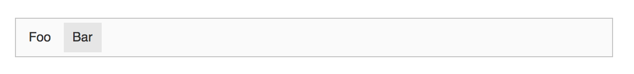
The toolbar renders correctly but it does not do much. To execute an action when the button is clicked, a listener must be defined. To shorten the code and instead of two listeners define just one, the buttons can delegate the execute event to their parent:
buttonFoo.delegate( 'execute' ).to( toolbar );
buttonBar.delegate( 'execute' ).to( toolbar );

toolbar.on( 'execute', evt => {
    console.log( `The "${ evt.source.label }" button was clicked!` );
} );
# Dropdowns
The framework implements the dropdown component which can host any sort of UI in its panel. It is composed of a button (to open the dropdown) and a panel (the container).
The button can be either:
- a standard
ButtonView, - a
SplitButtonView, for more complex use cases.
The dropdown panel exposes its children collection which aggregates the child views. The most common views displayed in the dropdown panel are:
The framework provides a set of helpers to make the dropdown creation process easier, although it is still possible to compose a custom dropdown from scratch using the base classes.
The createDropdown helper creates a DropdownView with either a ButtonView or a SplitButtonView.
import { createDropdown, SplitButtonView } from '@ckeditor/ckeditor5-ui';

const dropdownView = createDropdown( locale, SplitButtonView );
This kind of (default) dropdown comes with a set of behaviors:
- It closes the panel when it loses the focus, e.g. the user moved the focus elsewhere.
- It closes the panel upon the
executeevent. - It focuses the view hosted in the panel, e.g. when navigating the toolbar using the keyboard.
# Setting label, icon, and tooltip
To customize the button of the dropdown, use the buttonView property. It gives a direct access to the ButtonView instance used by your dropdown.
If your dropdown has been created using the SplitButtonView, use the actionView to access its main region, e.g. dropdownView.buttonView.actionView.set( /* ... */ ).
To control the label of the dropdown, first make it visible using the withText property and then set the text of the label:
const dropdownView = createDropdown( locale );

dropdownView.buttonView.set( {
    withText: true,
    label: 'Label of the button',
} );
The dropdown button can display an icon too. First, import the SVG file and then pass it to the icon property of the button:
import iconFile from 'path/to/icon.svg';

// The code that creates a dropdown view.
// ...

dropdownView.buttonView.set( {
    icon: iconFile
} );
Note that withText and icon properties are independent so your dropdown can have:
- just a text label,
- just an icon,
- both a label and an icon at the same time.
Keep in mind that even if your dropdown has no visible label (withText is false), we recommend to set the label property anyway because it is essential for assistive technologies like screen readers to work properly with the editor.
Dropdowns can also display tooltips when hovered. Use the tooltip property of the button to enable this feature. It is possible to include keystroke information in the tooltip or create custom tooltips. Check out the documentation of the property to learn more.
dropdownView.buttonView.set( {
    // The tooltip text will repeat the label.
    tooltip: true
} );
# Adding a list to a dropdown
The ListView can be added to a dropdown using the addListToDropdown helper.
import { Model, addListToDropdown, createDropdown } from '@ckeditor/ckeditor5-ui';
import { Collection } from '@ckeditor/ckeditor5-utils';

// The default dropdown.
const dropdownView = createDropdown( locale );

// The collection of the list items.
const items = new Collection();

items.add( {
    type: 'button',
    model: new Model( {
        withText: true,
        label: 'Foo'
    } )
} );

items.add( {
    type: 'button',
    model: new Model( {
        withText: true,
        label: 'Bar'
    } )
} );

// Create a dropdown with a list inside the panel.
addListToDropdown( dropdownView, items );
# Adding a toolbar to a dropdown
A ToolbarView can be added to a dropdown using the addToolbarToDropdown helper.
import { ButtonView, SplitButtonView, addToolbarToDropdown, createDropdown } from '@ckeditor/ckeditor5-ui';


const buttons = [];

// Add a simple button to the array of toolbar items.
buttons.push( new ButtonView() );

// Add another component to the array of toolbar items.
buttons.push( componentFactory.create( 'componentName' ) );

const dropdownView = createDropdown( locale, SplitButtonView );

// Create a dropdown with a toolbar inside the panel.
addToolbarToDropdown( dropdownView, buttons );
A common practice is making the main dropdown button enabled when one of the toolbar items is enabled:
// Enable the dropdown's button when any of the toolbar items is enabled.
dropdownView.bind( 'isEnabled' ).toMany( buttons, 'isEnabled',
    ( ...areEnabled ) => areEnabled.some( isEnabled => isEnabled )
);
# Best practices
It is advised that for the best user experience the editing view gets focused upon any user action (e.g. executing a command) to make sure the editor retains focus:
// Execute some action on dropdown#execute event.
dropdownView.buttonView.on( 'execute', () => {
    editor.execute( 'command', { value: "command-value" } );
    editor.editing.view.focus();
} );
# Keystrokes and focus management
The framework offers built–in classes that help manage keystrokes and focus in the UI. They are particularly useful when it comes to bringing accessibility features to the application.
If you want to know how the editor handles focus under the hood and what tools make it possible, check out the “Deep dive into focus tracking” guide.
# Focus tracker
The FocusTracker class can observe a number of HTML elements and determine if one of them is focused either by the user (clicking, typing) or using the HTMLElement.focus() DOM method.
import { FocusTracker } from '@ckeditor/ckeditor5-utils';

// More imports.
// ...

const focusTracker = new FocusTracker();
To register elements in the tracker, use the add() method:
focusTracker.add( document.querySelector( '.some-element' ) );
focusTracker.add( viewInstance.element );
Observing focus tracker’s isFocused observable property allows to determine whether one of the registered elements is currently focused:
focusTracker.on( 'change:isFocused', ( evt, name, isFocused ) => {
    if ( isFocused ) {
        console.log( 'The', focusTracker.focusedElement, 'is focused now.' );
    } else {
        console.log( 'The elements are blurred.' );
    }
} );
This information is useful when implementing a certain type of UI whose behavior depends on the focus, for example, contextual panels and floating balloons containing forms should hide when the user decides to abandon them.
Learn more about the focus tracker class in the “Deep dive into focus tracking” guide.
# Keystroke handler
The KeystrokeHandler listens to the keystroke events fired by an HTML element or any of its descendants and executes pre–defined actions when the keystroke is pressed. Usually, each view creates its own keystroke handler instance which takes care of the keystrokes fired by the elements the view has rendered.
import { KeystrokeHandler } from '@ckeditor/ckeditor5-utils';

// More imports.
// ...

const keystrokeHandler = new KeystrokeHandler();
To define the scope of the keystroke handler in the DOM, use the listenTo() method:
keystrokeHandler.listenTo( document.querySelector( '.some-element' ) );
keystrokeHandler.listenTo( viewInstance.element );
Check out the list of known key names supported by the keystroke handler.
Keystroke action callbacks are functions. To prevent the default action of the keystroke and stop further propagation, use the cancel() function provided in the callback.
keystrokeHandler.set( 'Tab', ( keyEvtData, cancel ) => {
    console.log( 'Tab was pressed!' );

    // This keystroke has been handled and can be canceled.
    cancel();
} );
There is also an EditingKeystrokeHandler class which has the same API as KeystrokeHandler but it offers direct keystroke bindings to editor commands.
The editor provides such keystroke handler under the editor.keystrokes property so any plugin can register keystrokes associated with editor commands. For example, the Undo plugin registers editor.keystrokes.set( 'Ctrl+Z', 'undo' ); to execute its undo command.
When multiple callbacks are assigned to the same keystroke, priorities can be used to decide which one should be handled first and whether other callbacks should be executed at all:
keystrokeHandler.set( 'Ctrl+A', ( keyEvtData ) => {
    console.log( 'A normal priority listener.' );
} );

keystrokeHandler.set( 'Ctrl+A', ( keyEvtData ) => {
    console.log( 'A high priority listener.' );

    // The normal priority listener will not be executed.
    cancel();
}, { priority: 'high' } );
Pressing Ctrl+A will only log:
"A high priority listener."
Check out the event system deep dive guide to learn more about event listener priorities.
Every day, we work hard to keep our documentation complete. Have you spotted outdated information? Is something missing? Please report it via our issue tracker.