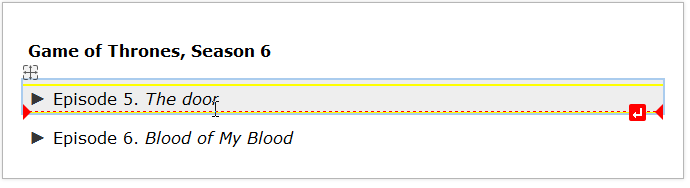
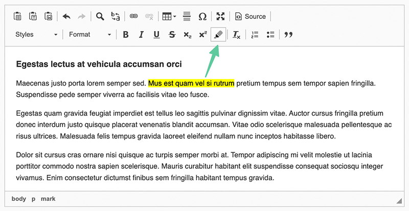
HTML <mark> Tag Button
- Categories: Semantics
- Author: peter-neumann-dev
- License: MIT
A CKEditor plugin to wrap text with an HTML <mark> Tag
Screenshots
Releases
| Plugin versions | CKEditor versions | |||
|---|---|---|---|---|
| 4.24 | 4.23 | 4.22 | ||
|
Version: 1.1.0 |
||||
|
See on GitHub |
||||
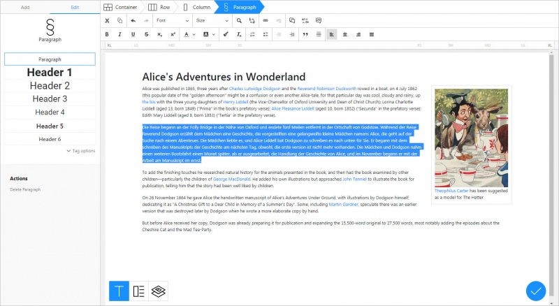
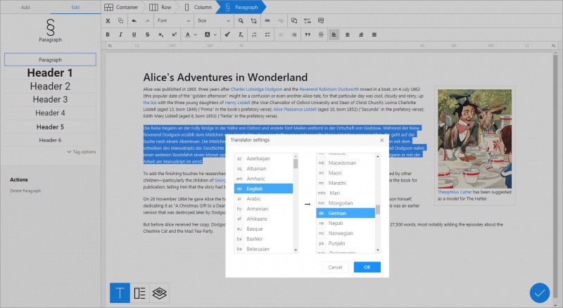
Translator
- Categories: Contents, Semantics, Tools
- Author: doksoft
- License: Commercial
Install this to instantly translate content you edit in CKEditor to 90+ world languages.
Main features:
- Works directly from CKEditor, no exporting of content is required
- Preserves the original HTML layout after translation
- One-click translation. Just select the text and click the Translate button or press Ctrl+Enter.
- The translation settings allow you to select the translation engine, the source language and the destination language.
The Translator plugin makes translation much easier and straightforward. Regardless of how complex the layout of your web page is, the plugin translates your content to the specified language in no time and with regards to context, and leaves the original formatting in place. No further adjustment or fine-tuning is required! This is literally click-and-go translation now available for CKEditor.
Screenshots
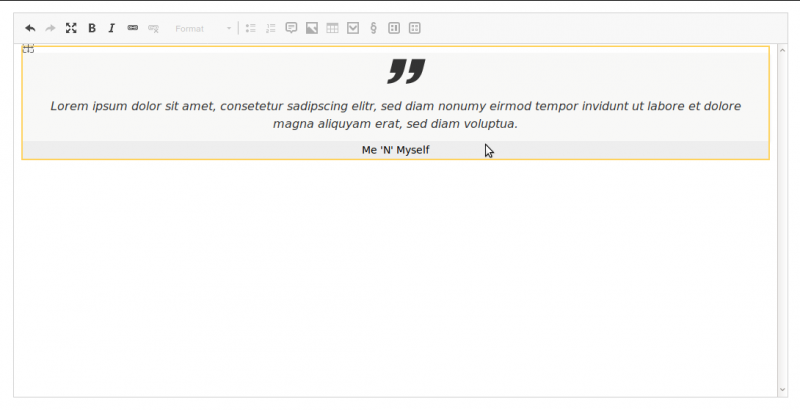
Quote Widget
This widget can be used as an alternative to the Blockquote Plugin. It allows to wrap a blockquote element within a figure element with the CSS class quote and to add a caption in order to "clearly relate a quote to its attribution" (see WHATWG).
So the resulting HTML will be
<figure class="quote>
    <blockquote>
        ...
    </blockquote>
    <figcaption>
        ...
    </figcaption>
</figure>
If the caption is empty, the blockquote element will be unwrapped, so the resulting HTML will just be
<blockquote>
    ...
</blockquote>
Demo
Screenshots
Releases
| Plugin versions | CKEditor versions | |||
|---|---|---|---|---|
| 4.24 | 4.23 | 4.22 | ||
|
Version: 2.10 |
||||
|
Technical release |
||||
Block Widget
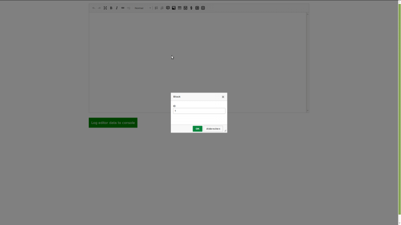
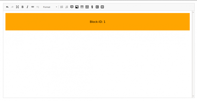
This widget lets you create and edit non-editable and optionally previewable placeholder blocks.
You can edit the placeholder block through a simple dialog where you can enter the ID of the block into a text input field. How you use the ID-field is completely up to you. Whatever makes sense for you or rather your application is fine.
Additionally, you can integrate a block browser similar to a file/media browser and select the block through that. Your block browser implementation can pass the id and optionally the content of the selected block. If the content is passed, the selected block will be previewable.
In order to make blocks previewable that are already in the initial content when you load the editor, you have to provide an URL to a block API that will return the content for a requested id.
Block Browser
To enable the block browser option, you need the browser plugin, a browser implementation that uses the browser plugin and have to configure the URL to the browser implementation, p.e.
config.blockBrowser = '/example/url/to/browser';
Your block browser implementation can currently send following keys with the message:
{
    id: ..., // required, the ID of the block,
    content: '...', // optional, the HTML for the preview
}
Block API
To enable the block API option, you just have to configure an URL callback function that will receive the ID of the block and must return the final URL to the block API, p.e.
config.blockApi = function (id) {
    return '/example/url/to/api/' + id ;
};
This widget will then issue a GET request to the final URL. The block API must only return the HTML content for the preview if the block with the requested ID exists.
Technical
When you save the editor content, i.e. on downcast, the resulting placeholder will be a block-element with an id attribute
<block id=""/>
When you load your content into the editor, i.e. on upcast, the block-element will be tranformed to a div-element with a data-block-attribute
<div data-block=""></div>
This widget will add some minimal CSS to the editor to make the placeholder somehow visible. You likely want add more styles to adjust the look to your needs, especially if you make use of the block browser and API options.
Demo
Screenshots
Releases
| Plugin versions | CKEditor versions | |||
|---|---|---|---|---|
| 4.24 | 4.23 | 4.22 | ||
|
Version: 2.10 |
||||
|
Use block API in block browser callback to set content if it is enabled and the browser does not provide the content itself |
||||
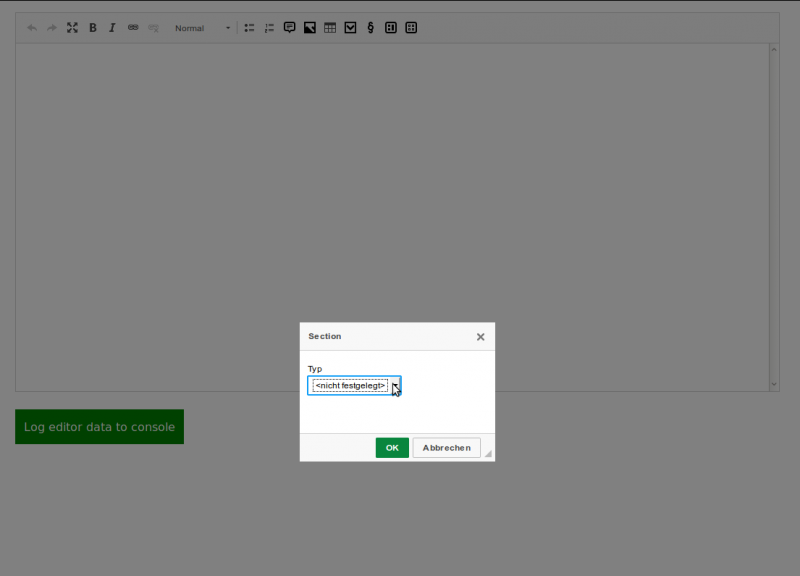
Section Widget
This widget offers the possibility to add section elements into the editor and make them optionally distinguishable by configurable CSS classes, so you can apply different styles on them.
All sections will have three editables: heading, media element and content. But all of them are optional. If all editables are filled with content and CSS classes are configured, the resulting HTML will be
<section class="...">
    <h2>...</h2>
    <figure class="...">...</figure>
    <div class="content">...</div>
</section>
The optional configuration expects an object with one or several CSS classes as the properties and the corresponding labels visible in the section dialog as the values, p.e.
config.section: {
    'block-content': 'Content Block',
    'block-info': 'Info Block',
    ...
};
Technical
This widget will always upcast all section elements, unless an element was already upcasted by another widget. To give other widgets the chance to do so, the value for upcastPriority (defaults to 10) is set to 20, so that the other widgets' upcast methods are called first.
Demo
Screenshots

Releases
| Plugin versions | CKEditor versions | |||
|---|---|---|---|---|
| 4.24 | 4.23 | 4.22 | ||
|
Version: 2.11 |
||||
|
Add ukrainian translations (thanks @Sensetivity) |
||||
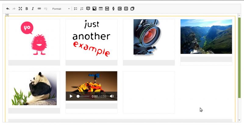
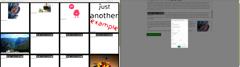
Gallery Widget
This widgets serves as a container for multiple instances of other media widgets in order to display them as a gallery, p.e. with the aid of flexbox or grid layout, or as a slider/carousel, p.e. with your own implementation or one of your choice, or as whatever else comes into your mind.
This widget itself does not provide any slider/carousel functionality! It only provides a HTML structure suitable for aforementioned purposes and allows to maintain it within the editor.
The resulting HTML will be p.e.
<figure class="gallery">
    <div class="content">
        <figure class="image">
            <img src="..." />
            <figcaption>
                ...
            </figcaption>
        </figure>
        ...
    </div>
    <figcaption>
        ...
    </figcaption>
</figure>
Technical
At current state this widget
- only allows figure elements as child elements (filtering takes place on
downcast), - does not offer any configuration options and
- does not offer a dialog to set custom classes or values.
This could change in one of the future versions.
Demo
Screenshots
Releases
| Plugin versions | CKEditor versions | |||
|---|---|---|---|---|
| 4.24 | 4.23 | 4.22 | ||
|
Version: 2.10 |
||||
|
Technical release |
||||
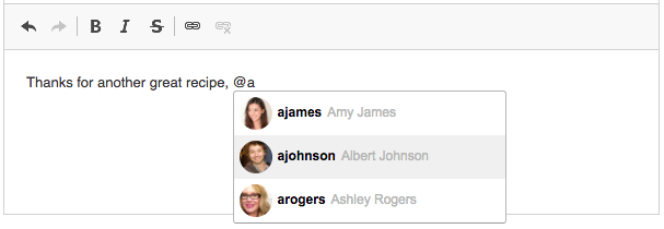
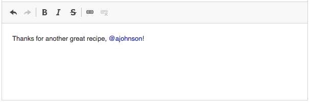
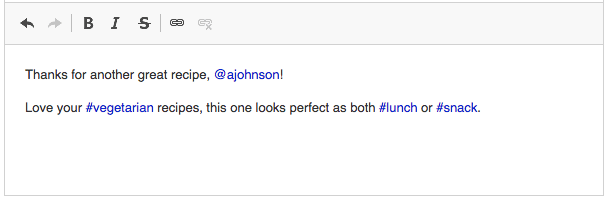
Mentions
This plugin allows you to type a pre-configured marker character, such as "@" or "#", and get suggested values for the text matches. The feed of items to be displayed in the autocomplete suggestion dropdown can be provided in a synchronous or asynchronous way. It allows you to add custom user mentions or tags to the editor.
The Mentions plugin that provides this functionality is an implementation of the Autocomplete feature.
Screenshots

This is an official plugin provided and supported by CKEditor developers.
You can submit bug reports directly to its GitHub issues tracker and discuss any integration issues on StackOverflow.
Releases
| Plugin versions | CKEditor versions | |||
|---|---|---|---|---|
| 4.24 | 4.23 | 4.22 | ||
|
Version: 4.23.0-lts |
||||
|
First major release of CKEditor 4.23.0-lts |
||||
|
Version: 4.22.1 |
||||
|
First minor release of CKEditor 4.22.1 |
||||
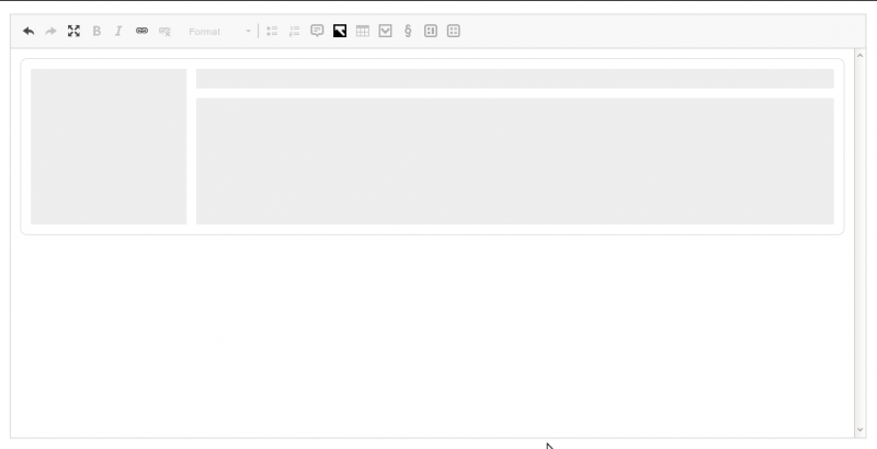
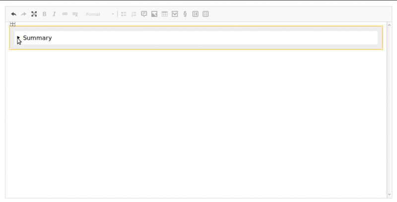
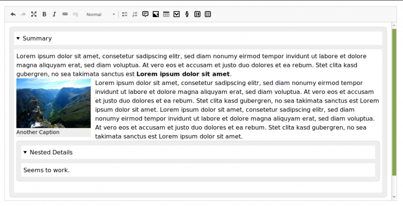
Details Widget
This widget provides support for details and summary elements.
No configuration necessary.
Demo
Screenshots

Releases
| Plugin versions | CKEditor versions | |||
|---|---|---|---|---|
| 4.24 | 4.23 | 4.22 | ||
|
Version: 2.10 |
||||
|
Technical release |
||||
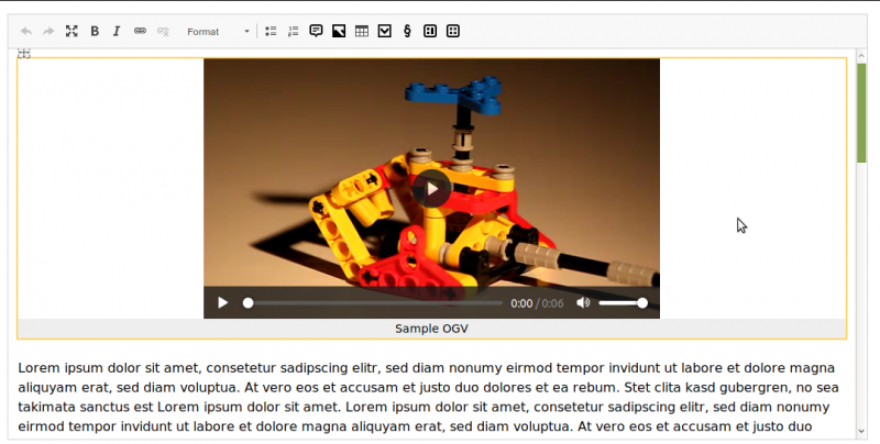
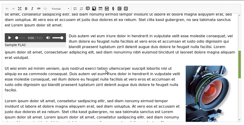
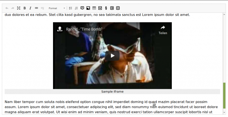
Media Widget
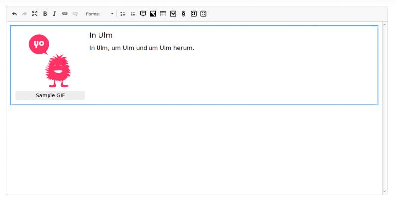
This widget embeds image, video, audio and iframe elements wrapped within a figure and optionally with a caption.
The figure will get an appropriate CSS class reflecting the media type (image, video, audio or iframe) and, if alignment is set, one of left or right.
Currently this widget supports setting the attributes width and height for all media types and alt for images. The controls (audio and video) and allowfullscreen (iframe) are automatically set.
The resulting HTML for an image with a caption will be p.e.
<figure class="image">
    <img src="/url/to/media" alt="Some Alternative" />
    <figcaption>An image with alternative text, but without width and height set</figcaption>
</figure>
Supported browser APIs
If you provide a browser implementation that uses one of the following browser APIs the Browse server button will appear:
This widget itself does not provide any browser!
The browser plugin (if installed) will be used as the preferred option, when the URL to your browser implementation is configured
config.mediaBrowser = '/url/to/browser';
Otherwise the mediabrowser plugin (if installed and configured) will be used as the second option, or the filebrowser plugin (if installed) as the third option.
Usage with browser and mediabrowser plugin
Your browser implementation can currently send following keys with the message:
{
    src: '...', // required, URL to media
    type: '...', // optional, audio, iframe, image or video
    alt: '...', // optional, alternative text (only for images)
    width: '...', // optional
    height: '...' // optional
}
Note
If you need inline media elements in the resulting HTML, please stick with version 0.20 or use another plugin, because this is not supported anymore.
Inline media elements initially loaded into the editor content will automatically be wrapped inside a figure and stay there when you save the editor content, even if you omit the caption.
Demo
Screenshots
Releases
| Plugin versions | CKEditor versions | |||
|---|---|---|---|---|
| 4.24 | 4.23 | 4.22 | ||
|
Version: 2.10 |
||||
|
Technical release |
||||
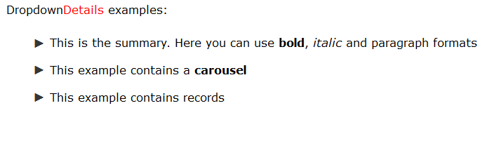
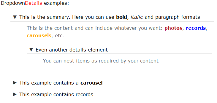
Dropdown Details
- Categories: Contents, Semantics, Usability
- Author: Uritec
- License: Commercial
Dropdown Details is a plugin to enable the creation and editing of HTML5 details elements in CKEditor.
If you've tried to work with a Details element in CKEditor, you know that there's a bunch of problems that need to be solved: you have to make the polyfill work for non-webkit browsers, in webkit you have to prevent the native behavior so you're able to correctly edit the legend, as it's a non-standard element with regards to CKEditor, you have to add it to the ACF system, enable a way to insert them, etc...
With Dropdown Details all these problems are solved so you don't have to spend your time with those issues and you can focus on more productive things.
Please, test our demo to see how easy is to use it and how you can add, edit, move around, delete and even nest one details element inside another one.
Don't be missguided by the screenshots below. This page at ckeditor.com seems to have problems at the moment and it doesn't allow to properly add and edit the screenshots
Screenshots