
Fighting meeting madness: this meeting could have been an email
Cut through meeting madness: learn when to opt for emails over meetings, and implement effective strategies to reduce unnecessary workplace gatherings.
Releases
CKEditor v41.3.0: New Multi-level Lists plugin and Menu Bar + accessibility report
CKEditor v41.3.0 introduces Multi-level Lists with legal style numbering support, Menu Bar and VPAT reports.
Read more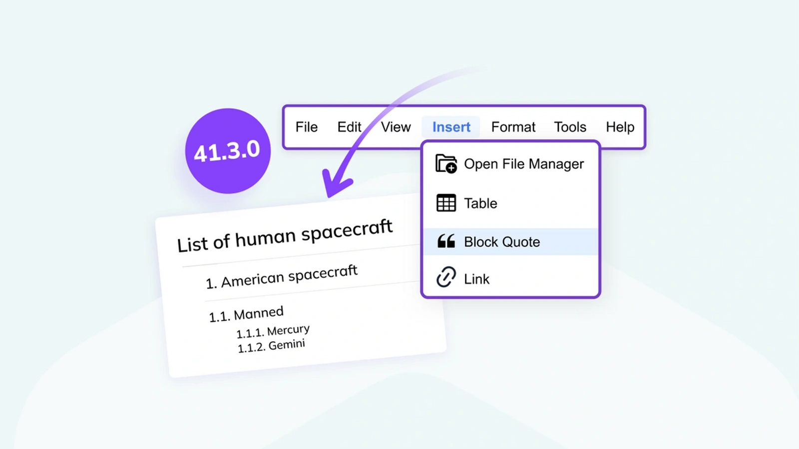
Fighting meeting madness: this meeting could have been an email
Cut through meeting madness: learn when to opt for emails over meetings, and implement effective strategies to reduce unnecessary workplace gatherings.

DevWorld wrap-up and CKEditor 2024 event schedule
Explore CKEditor's impactful presence at DevWorld 2024 and discover our full 2024 event lineup! Dive into exclusive insights on CKEditor's features, developer enhancements, and how we're fostering community involvement through
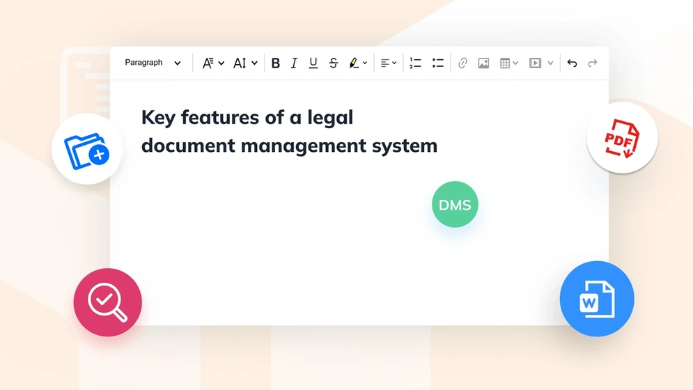
Navigating the complexities of legal document management software
Explore legal document management essentials, key software features, and how to select the best management solution for your firm's needs.
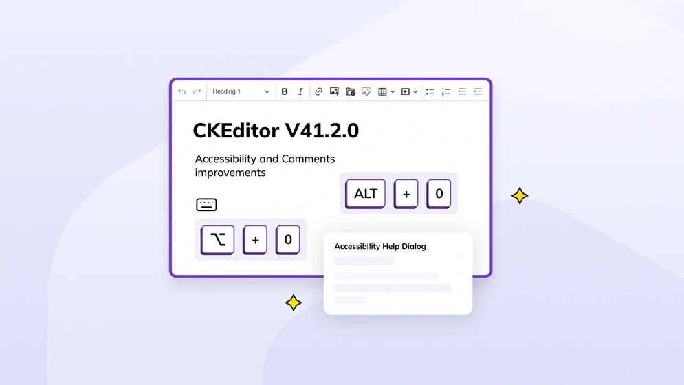
CKEditor v41.2.0: Accessibility and Comments improvements
CKEditor v42.0.0 introduces improvements for accessibility and the Comments feature.
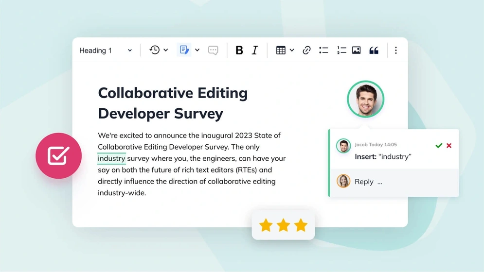
News flash! The 2024 Rich Text Editing Developer Survey is now live
The annual Rich Text Editing Developer Survey is now open. Have your say on the future of collaboration and rich text editors.

Understanding virtual classroom solutions: navigating the digital shift
Learn the essential features of a virtual classroom solution, including collaborative online learning management software
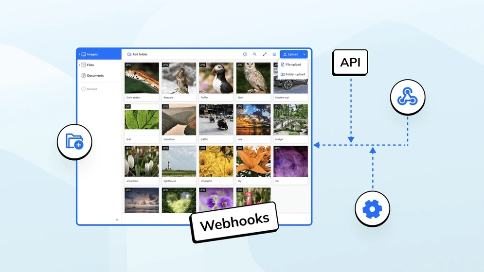
CKBox 2.4.0: Now featuring webhooks
Available as both a cloud and on-premises file management system, CKBox now supports Webhooks.

Drupal and CKEditor: a history of advanced content editing
Explore the evolution of content editing in Drupal with CKEditor 5, uncover key features, real-world applications, and future plans.
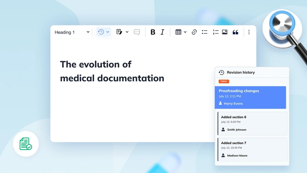
A look at the history of medical documentation
Explore the evolution of medical records from ancient times to the digital age, including key developments in health information management.

Overcoming common small business collaboration challenges
Discover key strategies to enhance SME productivity. Uncover common challenges and learn how CKEditor can streamline collaboration for small businesses.

5 best knowledge management tools for 2024
Discover the top knowledge management tools for 2024. Understand their importance, features, and compare the best options to enhance your workflow.
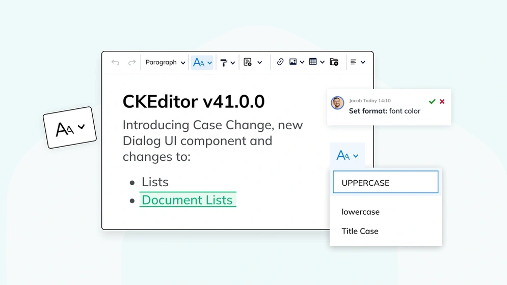
CKEditor v41.0.0: New Case Change, Dialog UI + Lists update
CKEditor v41.0.0 introduces the new Case Change feature, modals and dialogs API, improvements to Track Changes and Lists.
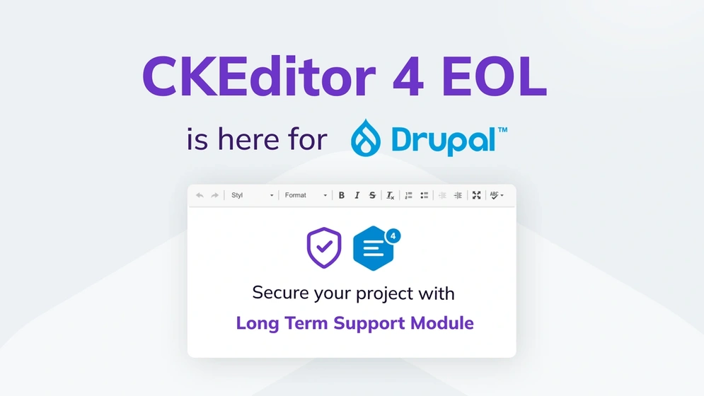
Drupal CKEditor 4 LTS – what to expect beyond EOL
From January 2024 and onwards, Drupal CKEditor 4 will no longer receive open source security updates. This comprehensive guide will help you transition from CKEditor 4 to its successors in the Drupal ecosystem.
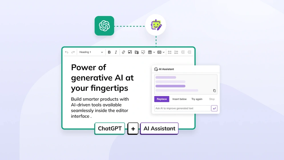
How to integrate ChatGPT with CKEditor 5
Integrate ChatGPT using the rich text editor in your app and use it to send prompts to help you answer questions.

Improving communication in customer relationship management
Explore the essence of communication in CRM, its significance, common pitfalls, and strategies to enhance interactions for stronger customer relationships
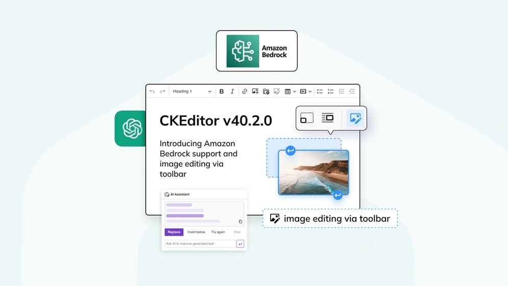
CKEditor v40.2.0: Introducing Amazon Bedrock support and image editing via toolbar
CKEditor v40.2.0 introduces official support for AI models available via Amazon Bedrock as well as the capability to integrate custom AI models, CKBox integration
How to reduce email back-and-forth with collaboration tools
Learn to reduce workplace email back-and-forth: understand causes, costs, and solutions for more efficient collaboration.

2024 trends in speech recognition
Dive into the world of speech recognition with insights on technology basics, market size, and key trends for 2024 — unveiling the future of voice-driven innovation.
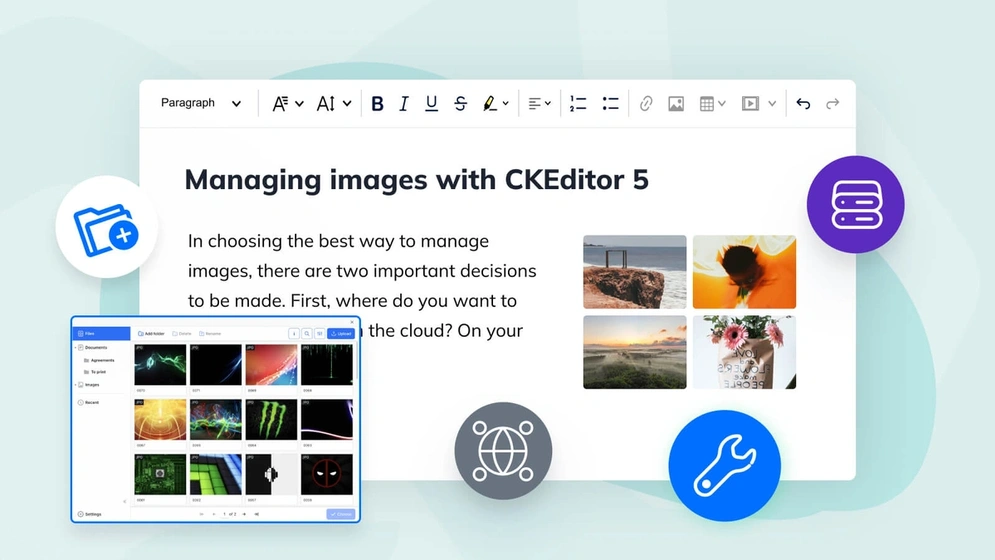
Image management with CKEditor 5
Learn how to use the rich, feature-packed image management in CKEditor 5 to create better, more breathtaking content.
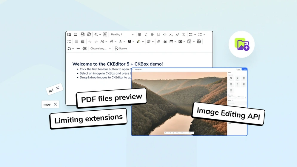
What’s new in CKBox?: Workspaces improvements, PDF preview and more
CKBox 2.2.0, along with 2.1.0 and 2.0.0 introduces multiple improvements for Workspaces, as well as standalone image editor API and PDF Preview.
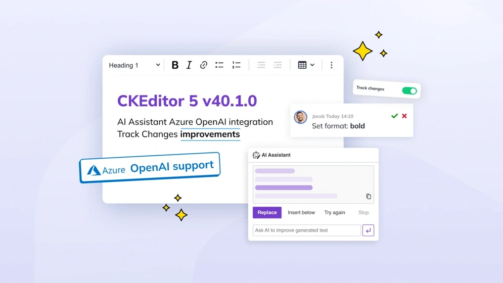
CKEditor v40.1.0: Azure AI support and Track Changes improvements
CKEditor latest version 40.0 introduces capability to preview styling suggestions made, Azure OpenAI service support for AI Assistant, UX and CKBox integration improvements.

AI and collaboration: Revolutionizing business operations and outcomes
Dive into AI's transformative role in business, enhancing collaboration and operations. Uncover its uses, benefits, and tips for optimal teamwork.
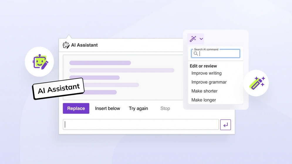
How to automate content creation with CKEditor AI Assistant
Explore the world of content automation and learn how to harness the power of CKEditor's AI Assistant. Dive into a step-by-step guide and uncover the benefits of automating content creation.
No entries
Hi there, any questions about products or pricing?
Questions about our products or pricing?
Contact our Sales Representatives.
We are happy to
hear from you!
Thank you for reaching out to the CKEditor Sales Team. We have received your message and we will contact you shortly.